|
| | Toast () |
| |
| | Toast (string title) |
| |
| | Toast (string title, Icon icon) |
| |
| | Toast (string title, Icon icon, string html) |
| |
| Toast.Builder | ToBuilder () |
| |
| override IControlBuilder | ToNativeBuilder () |
| |
| | Toast (Config config) |
| |
| | Window () |
| |
| | Window (string title) |
| |
| | Window (string title, Icon icon) |
| |
| | Window (string title, Icon icon, string html) |
| |
| string | ToScript (System.Web.UI.Control owner) |
| |
| Window.Builder | ToBuilder () |
| |
| override IControlBuilder | ToNativeBuilder () |
| |
| | Window (Config config) |
| |
| override void | Hide () |
| | Hides the window, setting it to invisible and applying negative offsets. More...
|
| |
| virtual void | Hide (Control animateTarget) |
| | Hides the window, setting it to invisible and applying negative offsets. More...
|
| |
| virtual void | Hide (Control animateTarget, string callback) |
| | Hides the window, setting it to invisible and applying negative offsets. More...
|
| |
| virtual void | Hide (Control animateTarget, string callback, string scope) |
| | Hides the window, setting it to invisible and applying negative offsets. More...
|
| |
| override void | Hide (string animateTarget) |
| | Hides the window, setting it to invisible and applying negative offsets. More...
|
| |
| override void | Hide (string animateTarget, string callback) |
| | Hides the window, setting it to invisible and applying negative offsets. More...
|
| |
| override void | Hide (string animateTarget, string callback, string scope) |
| | Hides the window, setting it to invisible and applying negative offsets. More...
|
| |
| virtual void | Maximize () |
| | Fits the window within its current container and automatically replaces the 'maximize' tool button with the 'restore' tool button. More...
|
| |
| virtual void | Minimize () |
| | Placeholder method for minimizing the window. By default, this method simply fires the minimize event since the behavior of minimizing a window is application-specific. To implement custom minimize behavior, either the minimize event can be handled or this method can be overridden. More...
|
| |
| virtual void | Restore () |
| | Restores a maximized window back to its original size and position prior to being maximized and also replaces the 'restore' tool button with the 'maximize' tool button. More...
|
| |
| virtual void | SetAnimateTarget (string element) |
| | Sets the target element from which the window should animate while opening. More...
|
| |
| virtual void | SetAnimateTarget (Control element) |
| | Sets the target element from which the window should animate while opening. More...
|
| |
| virtual void | ToggleMaximize () |
| | A shortcut method for toggling between maximize and restore based on the current maximized state of the window. More...
|
| |
| virtual void | SetTitlePosition (int titlePosition) |
| | Sets the value of titlePosition. More...
|
| |
| virtual void | AddDocked (AbstractComponent component, int pos) |
| | Adds docked item to the panel. Note : this method must be used during Ajax request (when the panel instance is created on the client side) More...
|
| |
| virtual void | AddDocked (AbstractComponent component) |
| | Adds docked item to the panel. Note : this method must be used during Ajax request (when the panel instance is created on the client side) More...
|
| |
| virtual void | AddTool (Tool tool) |
| | Add tool to the panel Note : this method must be used during Ajax request (when the panel instance is created on the client side) More...
|
| |
| virtual void | AddDocked (string componentId, int pos) |
| | Adds docked item to the panel. More...
|
| |
| virtual void | AddDocked (string componentId) |
| | Adds docked item to the panel. More...
|
| |
| virtual void | RemoveDocked (string id) |
| | Removes the docked item from the panel. More...
|
| |
| virtual void | RemoveDocked (string id, bool autoDestroy) |
| | Removes the docked item from the panel. More...
|
| |
| virtual void | ApplyBodyStyles (string style) |
| | Apply css styles for body More...
|
| |
| virtual void | AddBodyCls (string cls) |
| | Add new css class for body More...
|
| |
| virtual void | RemoveBodyCls (string cls) |
| | Remove body's css class More...
|
| |
| virtual void | Collapse () |
| | Collapses the panel body so that it becomes hidden. Fires the beforecollapse event which will cancel the collapse action if it returns false. More...
|
| |
| virtual void | Collapse (Direction direction, bool animate) |
| | Collapses the panel body so that it becomes hidden. Fires the beforecollapse event which will cancel the collapse action if it returns false. More...
|
| |
| virtual void | Collapse (Direction direction) |
| | Collapses the panel body so that it becomes hidden. Fires the beforecollapse event which will cancel the collapse action if it returns false. More...
|
| |
| virtual void | Expand () |
| | Expands the panel body so that it becomes visible. Fires the beforeexpand event which will cancel the expand action if it returns false. More...
|
| |
| virtual void | Expand (bool animate) |
| | Expands the panel body so that it becomes visible. Fires the beforeexpand event which will cancel the expand action if it returns false. More...
|
| |
| virtual void | SetCollapsed (bool collapsed) |
| | Collapses or expands the panel. - Parameters
-
| collapsed | Pass true to collapse the panel, false to expand it. |
More...
|
| |
| virtual void | SetTitle (string title) |
| | Sets the title text for the panel and optionally the icon class. More...
|
| |
| virtual void | ToggleCollapse () |
| | Shortcut for performing an expand or collapse based on the current state of the panel. More...
|
| |
| virtual void | Close () |
| | Closes the Panel. By default, this method, removes it from the DOM, destroys the Panel object and all its descendant Components. The beforeclose event is fired before the close happens and will cancel the close action if it returns false. More...
|
| |
| virtual void | Add (AbstractComponent component) |
| | Adds Component(s) to this Container. Description: Fires the beforeadd event before adding. The Container's default config values will be applied accordingly (see defaults for details). Fires the add event after the component has been added. Notes: If the Container is already rendered when add is called, it will render the newly added Component into its content area. More...
|
| |
| virtual void | Add (AbstractComponent component, bool render) |
| | Adds Component(s) to this Container. Description: Fires the beforeadd event before adding. The Container's default config values will be applied accordingly (see defaults for details). Fires the add event after the component has been added. Notes: If the Container is already rendered when add is called, it will render the newly added Component into its content area. More...
|
| |
| virtual void | Add (IEnumerable< AbstractComponent > collection) |
| | Adds a range of components to this container. More...
|
| |
| virtual void | Cascade (JFunction fn) |
| | Cascades down the component/container heirarchy from this component (passed in the first call), calling the specified function with each component. More...
|
| |
| virtual void | Cascade (JFunction fn, string scope) |
| | Cascades down the component/container heirarchy from this component (passed in the first call), calling the specified function with each component. More...
|
| |
| virtual void | UpdateLayout () |
| | Updates this component's layout. If this update affects this components ownerCt, that component's updateLayout method will be called to perform the layout instead. Otherwise, just this component (and its child items) will layout. More...
|
| |
| virtual void | Insert (int index, AbstractComponent component) |
| | Inserts a AbstractComponent into this Container at a specified index. Fires the beforeadd event before inserting, then fires the add event after the AbstractComponent has been inserted. More...
|
| |
| virtual void | Insert (int index, AbstractComponent component, bool render) |
| | Inserts a AbstractComponent into this Container at a specified index. Fires the beforeadd event before inserting, then fires the add event after the AbstractComponent has been inserted. Ext uses lazy rendering, and will only render the inserted Component should it become necessary. A Component config object may be passed in order to avoid the overhead of constructing a real Component object if lazy rendering might mean that the inserted Component will not be rendered immediately. To take advantage of this 'lazy instantiation', set the Ext.Component.xtype config property to the registered type of the Component wanted. More...
|
| |
| virtual void | Insert (int index, string id) |
| | Inserts a AbstractComponent into this Container at a specified index. Fires the beforeadd event before inserting, then fires the add event after the AbstractComponent has been inserted. More...
|
| |
| virtual void | Move (int fromIdx, int toIdx) |
| | Moves a AbstractComponent within the Container More...
|
| |
| virtual void | MoveAfter (AbstractComponent item, AbstractComponent after) |
| | Moves the given item into this container following after. This method will account for layout-generated components like splitters and should be used instead of index based move. If after is null then the item will be the first item in this container. More...
|
| |
| virtual void | MoveAfter (string item, string after) |
| | Moves the given item into this container following after. This method will account for layout-generated components like splitters and should be used instead of index based move. If after is null then the item will be the first item in this container. More...
|
| |
| virtual void | MoveBefore (AbstractComponent item, AbstractComponent before) |
| | Moves the given item into this container in front of before. This method will account for layout-generated components like splitters and should be used instead of index based move. If before is null then the item will be the last item in this container. More...
|
| |
| virtual void | MoveBefore (string item, string before) |
| | Moves the given item into this container in front of before. This method will account for layout-generated components like splitters and should be used instead of index based move. If before is null then the item will be the last item in this container. More...
|
| |
| virtual void | Remove (AbstractComponent component) |
| | Removes a component from this container. Fires the beforeremove event before removing, then fires the remove event after the component has been removed. More...
|
| |
| virtual void | Remove (AbstractComponent component, bool autoDestroy) |
| | Removes a component from this container. Fires the beforeremove event before removing, then fires the remove event after the component has been removed. More...
|
| |
| virtual void | Remove (string id) |
| | Removes a component from this container. Fires the beforeremove event before removing, then fires the remove event after the component has been removed. More...
|
| |
| virtual void | Remove (string id, bool autoDestroy) |
| | Removes a component from this container. Fires the beforeremove event before removing, then fires the remove event after the component has been removed. More...
|
| |
| virtual void | RemoveAll () |
| | Removes all components from this container. More...
|
| |
| virtual void | RemoveAll (bool autoDestroy) |
| | Removes all components from this container. More...
|
| |
| virtual void | SetActiveItem (string id) |
| | Sets a component as the active layout item. This only applies when using a Ext.layout.container.Card layout. More...
|
| |
| virtual void | SetActiveItem (AbstractComponent item) |
| | Sets a component as the active layout item. This only applies when using a Ext.layout.container.Card layout. More...
|
| |
| virtual void | SetActiveItem (int index) |
| | Sets a component as the active layout item. This only applies when using a Ext.layout.container.Card layout. More...
|
| |
| virtual void | NextItem (AnimConfig anim, bool wrap) |
| |
| virtual void | NextItem (bool anim, bool wrap) |
| |
| virtual void | NextItem (AnimConfig anim) |
| |
| virtual void | NextItem (bool anim) |
| |
| virtual void | NextItem () |
| |
| virtual void | PrevItem (AnimConfig anim, bool wrap) |
| |
| virtual void | PrevItem (bool anim, bool wrap) |
| |
| virtual void | PrevItem (AnimConfig anim) |
| |
| virtual void | PrevItem (bool anim) |
| |
|
virtual void | PrevItem () |
| |
| virtual string | ContentToScript (bool selfRendering) |
| |
| virtual string | ContentToScript () |
| |
| virtual void | UpdateContent (bool selfRendering) |
| |
| virtual void | UpdateContent () |
| |
| virtual void | ClearContent () |
| | Clear loaded content More...
|
| |
| virtual void | LoadContent () |
| | Loads this content panel immediately with content returned from an XHR call. More...
|
| |
| virtual void | LoadContent (string url) |
| | Loads this content panel immediately with content returned from an XHR call. More...
|
| |
| virtual void | LoadContent (string url, bool noCache) |
| | Loads this content panel immediately with content returned from an XHR call. More...
|
| |
| virtual void | LoadContent (ComponentLoader config) |
| | Loads this content panel immediately with content returned from an XHR call. More...
|
| |
| virtual void | Reload () |
| | Reloads the content panel based on the current LoadConfig. More...
|
| |
| virtual void | SetActions (object actions) |
| | Sets the value of actions. More...
|
| |
| virtual void | Bubble (string function) |
| | Bubbles up the component/container heirarchy, calling the specified function with each component. The scope (this) of function call will be the scope provided or the current component. The arguments to the function will be the args provided or the current component. If the function returns false at any point, the bubble is stopped. More...
|
| |
| virtual void | Bubble (string function, string scope) |
| | Bubbles up the component/container heirarchy, calling the specified function with each component. The scope (this) of function call will be the scope provided or the current component. The arguments to the function will be the args provided or the current component. If the function returns false at any point, the bubble is stopped. More...
|
| |
| virtual void | Bubble (string function, string scope, object[] args) |
| | Bubbles up the component/container heirarchy, calling the specified function with each component. The scope (this) of function call will be the scope provided or the current component. The arguments to the function will be the args provided or the current component. If the function returns false at any point, the bubble is stopped. More...
|
| |
| new virtual void | Focus () |
| | Try to focus this component. More...
|
| |
| virtual void | Focus (bool selectText) |
| | Try to focus this component. More...
|
| |
| virtual void | Focus (bool selectText, int delay) |
| | Try to focus this component. More...
|
| |
| virtual void | Hide (ComponentBase animateTarget) |
| | Hides this Component, setting it to invisible using the configured hideMode. More...
|
| |
| virtual void | Hide (ComponentBase animateTarget, string callback) |
| | Hides this Component, setting it to invisible using the configured hideMode. More...
|
| |
| virtual void | Hide (ComponentBase animateTarget, JFunction callback) |
| | Hides this Component, setting it to invisible using the configured hideMode. More...
|
| |
| virtual void | Hide (string animateTarget, JFunction callback) |
| | Hides this Component, setting it to invisible using the configured hideMode. More...
|
| |
| virtual void | Hide (ComponentBase animateTarget, string callback, string scope) |
| | Hides this Component, setting it to invisible using the configured hideMode. More...
|
| |
| virtual void | Hide (ComponentBase animateTarget, JFunction callback, string scope) |
| | Hides this Component, setting it to invisible using the configured hideMode. More...
|
| |
| virtual void | Hide (string animateTarget, JFunction callback, string scope) |
| | Hides this Component, setting it to invisible using the configured hideMode. More...
|
| |
| virtual void | SetPagePosition (int x, int y) |
| | Sets the page XY position of the component. To set the left and top instead, use setPosition. This method fires the move event. More...
|
| |
| virtual void | SetPagePosition (int x, int y, AnimConfig animate) |
| | Sets the page XY position of the component. To set the left and top instead, use setPosition. This method fires the move event. More...
|
| |
| virtual void | SetPagePosition (int x, int y, int animate) |
| | Sets the page XY position of the component. To set the left and top instead, use setPosition. This method fires the move event. More...
|
| |
| virtual void | SetPosition (int x, int y) |
| | Sets the left and top of the component. To set the page XY position instead, use setPagePosition. This method fires the move event. More...
|
| |
| virtual void | SetPosition (int x, int y, AnimConfig animate) |
| | Sets the left and top of the component. To set the page XY position instead, use setPagePosition. This method fires the move event. More...
|
| |
| virtual void | SetPosition (int x, int y, bool animate) |
| | Sets the left and top of the component. To set the page XY position instead, use setPagePosition. This method fires the move event. More...
|
| |
| virtual void | ScrollTo (int x, int y) |
| | Scrolls this component to the specified x and y coordinates. Only applicable for components that have been configured with scrollable or overflowX and overflowY. More...
|
| |
| virtual void | ScrollTo (int x, int y, bool animate) |
| | Scrolls this component to the specified x and y coordinates. Only applicable for components that have been configured with scrollable or overflowX and overflowY. More...
|
| |
| virtual void | ScrollTo (int x, int y, AnimConfig animate) |
| | Scrolls this component to the specified x and y coordinates. Only applicable for components that have been configured with scrollable or overflowX and overflowY. More...
|
| |
| virtual void | SetData (object data) |
| | Sets the value of the Data property. More...
|
| |
| virtual void | SetHidden (bool hidden) |
| | Sets the hidden state of this component. This is basically the same as setVisible but the boolean parameter has the opposite meaning. More...
|
| |
| virtual void | SetScrollable (ScrollableOption scrollable) |
| | Sets the new value of scrollable More...
|
| |
| virtual void | SetScrollX (int x) |
| | Sets the "x" scroll position for this component. Only applicable for components that have been configured with scrollable or overflowX. More...
|
| |
| virtual void | SetScrollY (int y) |
| | Sets the "y" scroll position for this component. Only applicable for components that have been configured with scrollable or overflowY. More...
|
| |
| virtual ComponentBase | SetStyle (JsonObject styles) |
| | Sets the style for this Component's primary element. More...
|
| |
| virtual ComponentBase | SetStyle (string property, string value) |
| | Sets the style for this Component's primary element. More...
|
| |
| virtual void | SetWeight (int weight) |
| | Sets the weight config property for this component. This is only valid if this component is in a border layout (Ext.layout.container.Border). More...
|
| |
| virtual void | Show () |
| | Shows this AbstractComponent, rendering it first if Ext.AbstractComponent-autoRender is true. For a Window, it activates it and brings it to front if hidden. More...
|
| |
| virtual void | Show (string animTarget) |
| | Shows this AbstractComponent, rendering it first if Ext.AbstractComponent-autoRender is true. For a Window, it activates it and brings it to front if hidden. More...
|
| |
| virtual void | Show (string animTarget, string callback) |
| | Shows this AbstractComponent, rendering it first if Ext.AbstractComponent-autoRender is true. For a Window, it activates it and brings it to front if hidden. More...
|
| |
| virtual void | Show (string animTarget, JFunction callback) |
| | Shows this AbstractComponent, rendering it first if Ext.AbstractComponent-autoRender is true. For a Window, it activates it and brings it to front if hidden. More...
|
| |
| virtual void | Show (string animTarget, string callback, string scope) |
| | Shows this AbstractComponent, rendering it first if Ext.AbstractComponent-autoRender is true. For a Window, it activates it and brings it to front if hidden. More...
|
| |
| virtual void | Show (string animTarget, JFunction callback, string scope) |
| | Shows this AbstractComponent, rendering it first if Ext.AbstractComponent-autoRender is true. For a Window, it activates it and brings it to front if hidden. More...
|
| |
| virtual void | UpdateBox (Unit x, Unit y, Unit width, Unit height) |
| | Sets the current box measurements of the component's underlying element. More...
|
| |
| virtual void | UpdateBox (int x, int y, int width, int height) |
| | Sets the current box measurements of the component's underlying element. More...
|
| |
| virtual void | SetLoading (LoadMask load, bool targetEl) |
| | This method allows you to show or hide a LoadMask on top of this component. More...
|
| |
| virtual void | SetLoading (LoadMask load) |
| | This method allows you to show or hide a LoadMask on top of this component. More...
|
| |
| void | SetLoading (bool load) |
| | This method allows you to show or hide a LoadMask on top of this component. More...
|
| |
| void | SetLoading (bool load, bool targetEl) |
| | This method allows you to show or hide a LoadMask on top of this component. More...
|
| |
| void | SetLoading (string message) |
| | This method allows you to show or hide a LoadMask on top of this component. More...
|
| |
| void | SetLoading (string message, bool targetEl) |
| | This method allows you to show or hide a LoadMask on top of this component. More...
|
| |
| void | SetOverflowXY (Overflow overflowX, Overflow overflowY) |
| | Sets the overflow x/y on the content element of the component. The x/y overflow values can be any valid CSS overflow (e.g., 'auto' or 'scroll'). By default, the value is 'hidden'. Passing null for one of the values will erase the inline style. Passing undefined will preserve the current value. More...
|
| |
| void | ShowAt (int x, int y) |
| | Displays component at specific xy position. A floating component (like a menu) is positioned relative to its ownerCt if any. Useful for popping up a context menu More...
|
| |
| void | ShowAt (int x, int y, bool animate) |
| | Displays component at specific xy position. A floating component (like a menu) is positioned relative to its ownerCt if any. Useful for popping up a context menu More...
|
| |
| void | ShowAt (int x, int y, AnimConfig animate) |
| | Displays component at specific xy position. A floating component (like a menu) is positioned relative to its ownerCt if any. Useful for popping up a context menu More...
|
| |
| virtual T | ConvertTag< T > () |
| |
| virtual void | SetKeyMap (KeyBindItem keyMap) |
| | Adds a key mapping. More...
|
| |
| virtual void | SetKeyMap (List< KeyBindItem > keyMap) |
| | Adds key mappings. More...
|
| |
| virtual void | CallEl (string name, params object[] args) |
| |
| virtual void | AddCls (string cls) |
| | Adds a CSS class to the component's underlying element. More...
|
| |
| virtual void | AddClsWithUI (string cls, bool skip) |
| | Adds a cls to the uiCls array, which will also call addUIClsToElement and adds to all elements of this component. More...
|
| |
| virtual void | AddClsWithUI (string[] cls, bool skip) |
| | Adds a cls to the uiCls array, which will also call addUIClsToElement and adds to all elements of this component. More...
|
| |
| virtual void | AddUIClsToElement (string cls) |
| | Method which adds a specified UI + uiCls to the components element. Can be overridden to remove the UI from more than just the components element. More...
|
| |
| virtual void | AddContainerCls (string cls) |
| | Adds a CSS class to the component's container. More...
|
| |
| void | AddLabelCls (string labelCls) |
| | Adds a CSS class to the component's label. More...
|
| |
| override void | Destroy () |
| | Destroys this component by purging any event listeners, removing the component's element from the DOM, removing the component from its Ext.Container (if applicable) and unregistering it from Ext.ComponentMgr. Destruction is generally handled automatically by the framework and this method should usually not need to be called directly. More...
|
| |
| virtual void | Disable () |
| |
|
virtual void | Disable (bool silent) |
| |
| virtual void | DoAutoRender () |
| | Handles autoRender. Floating Components may have an ownerCt. If they are asking to be constrained, constrain them within that ownerCt, and have their z-index managed locally. Floating Components are always rendered to document.body More...
|
| |
| virtual void | Enable () |
| |
| virtual void | Enable (bool silent) |
| |
| virtual void | Mask () |
| |
| virtual void | Mask (string msg) |
| |
|
virtual void | Mask (string msg, string msgCls) |
| |
| virtual void | ToggleCls (string cls) |
| | Toggles the specified CSS class on this component (removes it if it already exists, otherwise adds it). More...
|
| |
| virtual void | ToggleCls (string cls, bool state) |
| | Toggles the specified CSS class on this component (removes it if it already exists, otherwise adds it). More...
|
| |
| virtual void | Unmask () |
| | Removes the mask applied by a .mask() call More...
|
| |
|
virtual void | UpdateLayout (object options) |
| |
| virtual void | RemoveCls (string cls) |
| | Removes a CSS class from the top level element representing this component. More...
|
| |
| void | RemoveLabelCls (string labelCls) |
| | Removes a CSS class from the component's label. More...
|
| |
| virtual void | RemoveUIClsFromElement (string ui) |
| | Method which removes a specified UI + uiCls from the components element. The cls which is added to the element will be: this.baseCls + '-' + ui More...
|
| |
| virtual void | SetDock (Dock dock) |
| | Sets the dock position of this component in its parent panel. Note that this only has effect if this item is part of the dockedItems collection of a parent that has a DockLayout (note that any Panel has a DockLayout by default) More...
|
| |
| virtual void | SetHeight (Unit height) |
| | Sets the height of the component. This method fires the resize event. More...
|
| |
| virtual void | SetHeight (int height) |
| | Sets the height of the component. This method fires the resize event. More...
|
| |
| virtual void | SetHeight (string height) |
| | Sets the height of the component. This method fires the resize event. More...
|
| |
| virtual void | SetMaxHeight (int maxHeight) |
| | Sets the value of maxHeight. More...
|
| |
| virtual void | SetMaxWidth (int maxWidth) |
| | Sets the value of maxWidth. More...
|
| |
| virtual void | SetMinHeight (int minHeight) |
| | Sets the value of minHeight. More...
|
| |
| virtual void | SetMinWidth (int minWidth) |
| | Sets the value of minWidth. More...
|
| |
| virtual void | SetSize (int width, int height) |
| | Sets the width and height of this AbstractComponent. This method fires the resize event. More...
|
| |
| virtual void | SetSize (string width, string height) |
| | Sets the width and height of this AbstractComponent. This method fires the resize event. More...
|
| |
| virtual void | SetTouchAction (object touchAction) |
| | Sets the value of touchAction. More...
|
| |
| void | SetTpl (XTemplate tpl) |
| | Sets the new XTemplate for this AbstractComponent More...
|
| |
| virtual void | SetWidth (Unit width) |
| | Sets the width of the component. This method fires the resize event. More...
|
| |
| virtual void | SetWidth (int width) |
| | Sets the width of the component. This method fires the resize event. More...
|
| |
| virtual void | SetWidth (string width) |
| | Sets the width of the component. This method fires the resize event. More...
|
| |
| virtual void | Update (string html) |
| | Update the html of the Body, optionally searching for and processing scripts. More...
|
| |
| virtual void | Update (string html, bool loadScripts) |
| | Update the html of the Body, optionally searching for and processing scripts. More...
|
| |
| virtual void | Update (string html, bool loadScripts, string callback) |
| | Update the html of the Body, optionally searching for and processing scripts. More...
|
| |
| virtual void | Update (string html, bool loadScripts, JFunction callback) |
| | Update the html of the Body, optionally searching for and processing scripts. More...
|
| |
|
virtual void | Update (object data) |
| |
| virtual void | DestroyContentWidgets () |
| |
| virtual void | AddStateEvents (string events) |
| | Add events that will trigger the state to be saved. More...
|
| |
| virtual void | AddStateEvents (string[] events) |
| | Add events that will trigger the state to be saved. More...
|
| |
|
virtual void | DoAnimation (AnimConfig cfg) |
| |
| virtual void | SequenceFx () |
| |
| virtual void | StopAnimation () |
| |
|
virtual void | SyncFx () |
| |
| virtual void | AlignTo (string element, string position, int xOffset, int yOffset) |
| | Aligns this floating AbstractComponent to the specified element More...
|
| |
| virtual void | AlignTo (string element, string position) |
| | Aligns this floating AbstractComponent to the specified element More...
|
| |
| virtual void | AlignTo (string element) |
| | Aligns this floating AbstractComponent to the specified element More...
|
| |
| virtual void | Center () |
| | Center this AbstractComponent in its container. More...
|
| |
| virtual void | DoConstrain () |
| | Moves this floating AbstractComponent into a constrain region. By default, this AbstractComponent is constrained to be within the container it was added to, or the element it was rendered to. More...
|
| |
| virtual void | DoConstrain (string element) |
| | Moves this floating AbstractComponent into a constrain region. By default, this AbstractComponent is constrained to be within the container it was added to, or the element it was rendered to. More...
|
| |
| virtual void | DoConstrain (Rectangle region) |
| | Moves this floating AbstractComponent into a constrain region. By default, this AbstractComponent is constrained to be within the container it was added to, or the element it was rendered to. More...
|
| |
| virtual void | SetActive () |
| | Makes this the active AbstractComponent by showing its shadow, or deactivates it by hiding its shadow. This method also fires the activate or deactivate event depending on which action occurred. This method is called internally by Ext.ZIndexManager. More...
|
| |
| virtual void | SetActive (bool active) |
| | Makes this the active AbstractComponent by showing its shadow, or deactivates it by hiding its shadow. This method also fires the activate or deactivate event depending on which action occurred. This method is called internally by Ext.ZIndexManager. More...
|
| |
| virtual void | SetAlwaysOnTop (bool alwaysOnTop) |
| | Sets the value of alwaysOnTop. More...
|
| |
| virtual void | SetAlwaysOnTopIndex (int alwaysOnTopIndex) |
| | Sets the value of alwaysOnTop. More...
|
| |
| virtual void | ToBack () |
| | Sends this AbstractComponent to the back of (lower z-index than) any other visible windows More...
|
| |
| virtual void | ToFront () |
| | Brings this floating AbstractComponent to the front of any other visible, floating Components managed by the same ZIndexManager More...
|
| |
| virtual void | ToFront (bool preventFocus) |
| | Brings this floating AbstractComponent to the front of any other visible, floating Components managed by the same ZIndexManager More...
|
| |
| virtual void | EnsureLoadPostData () |
| |
| virtual void | ApplyStyles (string styles) |
| | More flexible version of setStyle for setting style properties. More...
|
| |
| virtual void | RemoveContainerCls (string cls) |
| | Removes a CSS class from the component's container. More...
|
| |
| virtual void | SetAnchor (string anchor, bool doLayout) |
| |
| void | Replace (string id) |
| |
| void | Replace (AbstractComponent cmp) |
| |
| void | ReRender () |
| |
| virtual void | AddListener (string eventName, JFunction fn) |
| | Appends an event handler to this component More...
|
| |
| virtual void | AddListener (string eventName, JFunction fn, string scope) |
| | Appends an event handler to this component More...
|
| |
| virtual void | AddListener (string eventName, JFunction fn, string scope, HandlerConfig options) |
| | Appends an event handler to this component More...
|
| |
| virtual void | AddListener (string eventName, string fn) |
| | Appends an event handler to this component More...
|
| |
| virtual void | AddListener (string eventName, string fn, string scope) |
| | Appends an event handler to this component More...
|
| |
| virtual void | AddListener (string eventName, string fn, string scope, HandlerConfig options) |
| | Appends an event handler to this component More...
|
| |
| virtual void | AddManagedListener (string item, string eventName, string fn, string scope, HandlerConfig options) |
| | Adds listeners to any Observable object (or Element) which are automatically removed when this AbstractComponent is destroyed. More...
|
| |
| virtual void | AddManagedListener (string item, string eventName, string fn, string scope) |
| | Adds listeners to any Observable object (or Element) which are automatically removed when this AbstractComponent is destroyed. More...
|
| |
| virtual void | AddManagedListener (string item, string eventName, string fn) |
| | Adds listeners to any Observable object (or Element) which are automatically removed when this AbstractComponent is destroyed. More...
|
| |
| virtual void | ClearListeners () |
| | Removes all listeners for this object including the managed listeners More...
|
| |
| virtual void | ClearManagedListeners () |
| | Removes all managed listeners for this object. More...
|
| |
| virtual void | EnableBubble (params string[] events) |
| | Enables events fired by this Observable to bubble up an owner hierarchy by calling this.getBubbleTarget() if present. There is no implementation in the Observable base class. This is commonly used by Ext.Components to bubble events to owner Containers. See Ext.AbstractComponent-getBubbleTarget. The default implementation in Ext.AbstractComponent returns the AbstractComponent's immediate owner. But if a known target is required, this can be overridden to access the required target more quickly. More...
|
| |
| virtual void | FireEvent (string eventName, params object[] args) |
| | Fires the specified event with the passed parameters (minus the event name) More...
|
| |
| virtual void | FireEventedAction (string eventName, object[] args, string fn) |
| | Fires the specified event with the passed parameters and executes a function (action). Evented Actions will automatically dispatch a 'before' event passing. This event will be given a special controller that allows for pausing/resuming of the event flow. By pausing the controller the updater and events will not run until resumed. Pausing, however, will not stop the processing of any other before events. More...
|
| |
| virtual void | FireEventedAction (string eventName, object[] args, string fn, string scope) |
| | Fires the specified event with the passed parameters and executes a function (action). Evented Actions will automatically dispatch a 'before' event passing. This event will be given a special controller that allows for pausing/resuming of the event flow. By pausing the controller the updater and events will not run until resumed. Pausing, however, will not stop the processing of any other before events. More...
|
| |
| virtual void | FireEventedAction (string eventName, object[] args, string fn, string scope, object[] fnArgs) |
| | Fires the specified event with the passed parameters and executes a function (action). Evented Actions will automatically dispatch a 'before' event passing. This event will be given a special controller that allows for pausing/resuming of the event flow. By pausing the controller the updater and events will not run until resumed. Pausing, however, will not stop the processing of any other before events. More...
|
| |
| virtual void | FireEventedAction (string eventName, object[] args, JFunction fn) |
| | Fires the specified event with the passed parameters and executes a function (action). Evented Actions will automatically dispatch a 'before' event passing. This event will be given a special controller that allows for pausing/resuming of the event flow. By pausing the controller the updater and events will not run until resumed. Pausing, however, will not stop the processing of any other before events. More...
|
| |
| virtual void | FireEventedAction (string eventName, object[] args, JFunction fn, string scope) |
| | Fires the specified event with the passed parameters and executes a function (action). Evented Actions will automatically dispatch a 'before' event passing. This event will be given a special controller that allows for pausing/resuming of the event flow. By pausing the controller the updater and events will not run until resumed. Pausing, however, will not stop the processing of any other before events. More...
|
| |
| virtual void | FireEventedAction (string eventName, object[] args, JFunction fn, string scope, object[] fnArgs) |
| | Fires the specified event with the passed parameters and executes a function (action). Evented Actions will automatically dispatch a 'before' event passing. This event will be given a special controller that allows for pausing/resuming of the event flow. By pausing the controller the updater and events will not run until resumed. Pausing, however, will not stop the processing of any other before events. More...
|
| |
| virtual void | On (string eventName, string fn) |
| | Appends an event handler to this element (shorthand for addListener) More...
|
| |
| virtual void | On (string eventName, string fn, string scope) |
| | Appends an event handler to this element (shorthand for addListener) More...
|
| |
| virtual void | On (string eventName, string fn, string scope, HandlerConfig options) |
| | Appends an event handler to this element (shorthand for addListener) More...
|
| |
| virtual void | On (string eventName, JFunction fn) |
| | Appends an event handler to this element (shorthand for addListener) More...
|
| |
| virtual void | On (string eventName, JFunction fn, string scope) |
| | Appends an event handler to this element (shorthand for addListener) More...
|
| |
| virtual void | On (string eventName, JFunction fn, string scope, HandlerConfig options) |
| | Appends an event handler to this element (shorthand for addListener) More...
|
| |
| virtual void | RelayEvents (string origin, string[] events) |
| | Relays selected events from the specified Observable as if the events were fired by this. More...
|
| |
| virtual void | RemoveListener (string eventName, string fn) |
| | Removes an event handler. More...
|
| |
| virtual void | RemoveListener (string eventName, string fn, string scope) |
| | Removes an event handler. More...
|
| |
| virtual void | RemoveManagedListener (string item, string eventName, string fn) |
| | Removes listeners that were added by the mon method. More...
|
| |
| virtual void | RemoveManagedListener (string item, string eventName, string fn, string scope) |
| | Removes listeners that were added by the mon method. More...
|
| |
| virtual void | ResumeEvents () |
| | Resume firing events. (see suspendEvents) If events were suspended using the queueSuspended parameter, then all events fired during event suspension will be sent to any listeners now. More...
|
| |
| virtual void | SuspendEvents (bool queueSuspended) |
| | Suspend the firing of all events. (see resumeEvents) More...
|
| |
| virtual void | SuspendEvents () |
| | Suspend the firing of all events. (see resumeEvents) More...
|
| |
| virtual void | SuspendEvent (string name) |
| | Suspends firing of the named event(s). More...
|
| |
| virtual void | ResumeEvent (string name) |
| | Resumes firing of the named event(s). More...
|
| |
| virtual void | RemoveDirectListener (string name) |
| |
| virtual void | Un (string eventName, string fn) |
| | Removes a listener (shorthand for removeListener) More...
|
| |
| virtual void | Un (string eventName, string fn, string scope) |
| | Removes a listener (shorthand for removeListener) More...
|
| |
| virtual void | Mon (Element el, string eventName, JFunction fn) |
| | Adds listeners to any Observable object (or Element) which are automatically removed when this AbstractComponent is destroyed. More...
|
| |
| virtual void | Mon (Observable el, string eventName, JFunction fn) |
| | Adds listeners to any Observable object (or Element) which are automatically removed when this AbstractComponent is destroyed. More...
|
| |
| virtual void | Mon (Element el, string eventName, JFunction fn, string scope) |
| | Adds listeners to any Observable object (or Element) which are automatically removed when this AbstractComponent is destroyed. More...
|
| |
| virtual void | Mon (Observable el, string eventName, JFunction fn, string scope) |
| | Adds listeners to any Observable object (or Element) which are automatically removed when this AbstractComponent is destroyed. More...
|
| |
| virtual void | Mon (Element el, string eventName, string fn, string scope, HandlerConfig options) |
| | Adds listeners to any Observable object (or Element) which are automatically removed when this AbstractComponent is destroyed. More...
|
| |
| virtual void | Mon (Observable el, string eventName, string fn, string scope, HandlerConfig options) |
| | Adds listeners to any Observable object (or Element) which are automatically removed when this AbstractComponent is destroyed. More...
|
| |
| virtual void | Mun (Element el, string eventName, string fn) |
| | Removes listeners that were added by the mon method. More...
|
| |
| virtual void | Mun (Observable el, string eventName, string fn) |
| | Removes listeners that were added by the mon method. More...
|
| |
| virtual void | Mun (Element el, string eventName, string fn, string scope) |
| | Removes listeners that were added by the mon method. More...
|
| |
| virtual void | Mun (Observable el, string eventName, string fn, string scope) |
| | Removes listeners that were added by the mon method. More...
|
| |
| delegate void | OnBeforeClientInitializedHandler (Observable sender) |
| |
| delegate void | OnAfterClientInitializedHandler (Observable sender) |
| |
| virtual bool | HasExplicitValue (string name) |
| |
| virtual T | ToBuilder< T > () |
| |
| T | Apply< T > (IApply config) |
| |
| object | Apply (IApply config) |
| |
| BaseControl | Apply (object from, bool ignoreDefaultValues) |
| |
| BaseControl | Apply (object from) |
| |
| virtual bool | HasLayout () |
| |
| virtual bool | HasContent () |
| |
| virtual string | ResolveUrlLink (string url) |
| |
| bool | IsInHierarchy (params Type[] types) |
| |
| T | GetParentByLevel< T > (int level) |
| |
| virtual string | DefineInstance () |
| |
| virtual string | DefineInstance (string config) |
| |
| virtual string | DefineInstance (string instanceOf, string config) |
| |
| virtual string | ToConfig () |
| |
| virtual string | ToConfig (LazyMode mode) |
| |
| virtual string | ToConfig (LazyMode mode, bool registerResourcesInManager) |
| |
| virtual string | ToScript (bool selfRendering) |
| |
| virtual string | ToScript () |
| |
| string | ToScript (RenderMode mode, string element) |
| |
| string | ToScript (RenderMode mode, string element, bool selfRendering) |
| |
| string | ToScript (RenderMode mode, string element, int index) |
| |
| string | ToScript (RenderMode mode, string element, int index, bool selfRendering) |
| |
| string | ToScript (RenderMode mode, string element, int? index, bool? selfRendering, bool forceResources, string method, bool forceLazy, bool clearContainer) |
| |
| virtual void | AddScript (string script) |
| | Adds the script to be be called on the client. More...
|
| |
| virtual void | AddScript (string template, params object[] args) |
| | Adds the script to be be called on the client. The script is formatted using the template and args. More...
|
| |
| virtual void | Set (string name, object value) |
| |
| virtual void | Set (ScriptPosition position, string name, object value) |
| |
| virtual void | Call (string name) |
| |
| virtual void | Call (string name, params object[] args) |
| |
| virtual void | Call (string name, string[] arg) |
| | Calls the JavaScript function on the Control with a string[] parameter More...
|
| |
| virtual void | Call (ScriptPosition mode, string name, params object[] args) |
| |
| virtual string | SelfRender () |
| |
| virtual void | AddBeforeClientInitScript (string script) |
| | Adds the script directly before the ClientInitScript. More...
|
| |
| virtual void | AddAfterClientInitScript (string script) |
| | Adds the script directly after the ClientInitScript. More...
|
| |
| override void | RenderBeginTag (HtmlTextWriter writer) |
| |
| virtual void | Render (bool selfRendering) |
| |
| virtual void | Render (Control control) |
| |
| virtual void | Render () |
| |
| virtual void | Render (string element, RenderMode mode) |
| |
| virtual void | Render (string element, int index, RenderMode mode) |
| |
| virtual void | Render (Control control, RenderMode mode) |
| |
| virtual void | Render (Control control, int index, RenderMode mode) |
| |
| virtual void | Render (string element, RenderMode mode, bool selfRendering) |
| |
| virtual void | Render (string element, int index, RenderMode mode, bool selfRendering) |
| |
| virtual void | Render (RenderMode mode, string element, int? index, bool? selfRendering, bool forceResources, string method, bool forceLazy, bool clearContainer) |
| |
| virtual void | Render (Control control, RenderMode mode, bool selfRendering) |
| |
| virtual void | Render (Control control, int index, RenderMode mode, bool selfRendering) |
| |
| virtual void | AddTo (string element) |
| |
| virtual void | AddTo (Control control) |
| |
| virtual void | AddTo (string element, bool selfRendering) |
| |
| virtual void | AddTo (Control control, bool selfRendering) |
| |
| virtual void | InsertTo (int index, string element) |
| |
| virtual void | InsertTo (int index, Control control) |
| |
| virtual void | InsertTo (int index, string element, bool selfRendering) |
| |
| virtual void | InsertTo (int index, Control control, bool selfRendering) |
| |
| virtual void | Update () |
| |
| virtual bool | SuspendScripting () |
| |
| virtual void | ResumeScripting (bool oldValue) |
| |
| virtual void | ResumeScripting () |
| |
| List< T > | GetCustomResources< T > () |
| |
| virtual void | SetResources () |
| |
| List< ClientStyleItem > | GetStyles () |
| |
| List< ClientStyleItem > | GetThemes () |
| |
| List< ClientScriptItem > | GetScripts () |
| |
| string | GetGeneratedScripts () |
| | Get generated and added javascript methods calling More...
|
| |
| virtual bool | HasOwnState (string name) |
| |
| virtual void | SetControlFor (ModelMetadata meta) |
| |
| string | ToScript (Control owner) |
| |
|
| override string | InstanceOf [get] |
| |
| override string | XType [get] |
| |
| virtual ToastAlign | Align [get, set] |
| | Specifies the basic alignment of the toast message with its anchor. This controls many aspects of the toast animation as well. For fine grain control of the final placement of the toast and its anchor you may set anchorAlign as well. More...
|
| |
| virtual string | AnchorAlign [get, set] |
| | This string is a full specification of how to position the toast with respect to its anchor. More...
|
| |
| virtual ? bool? | Animate [get, set] |
| | Set this to false to make toasts appear and disappear without animation. More...
|
| |
| virtual ? bool? | AutoClose [get, set] |
| | This config ensures that the Toast is closed automatically after a certain amount of time. More...
|
| |
| virtual int | AutoCloseDelay [get, set] |
| | The number of milliseconds a Toast waits before automatically closing. More...
|
| |
| virtual ? bool? | CloseOnMouseDown [get, set] |
| | This config will prevent the Toast from closing when the user produces a mousedown event. More...
|
| |
| virtual int | HideDuration [get, set] |
| | The number of milliseconds it takes for a Toast to hide. More...
|
| |
| virtual string | SlideBackAnimation [get, set] |
| | The animation used for the Toast to slide back. More...
|
| |
| virtual int | SlideBackDuration [get, set] |
| | The number of milliseconds it takes for a Toast to slide back. More...
|
| |
| virtual string | SlideInAnimation [get, set] |
| | The animation used for the Toast to slide in. More...
|
| |
| virtual int | SlideInDuration [get, set] |
| | The number of milliseconds it takes for a Toast to slide in. More...
|
| |
| virtual int | Spacing [get, set] |
| | The number of pixels between each Toast notification. More...
|
| |
| virtual ? bool? | StickOnClick [get, set] |
| | This config will prevent the Toast from closing when you click on it. If this is set to true, closing the Toast will have to be handled some other way (e.g., Setting closable as true). More...
|
| |
| virtual ? bool? | StickWhileHover [get, set] |
| | This config will prevent the Toast from closing while you're hovered over it. More...
|
| |
| virtual ? bool? | UseXAxis [get, set] |
| | Directs the toast message to animate on the x-axis (if true) or y-axis (if false). More...
|
| |
| override ConfigOptionsCollection | ConfigOptions [get] |
| |
| override string | InstanceOf [get] |
| |
| override string | XType [get] |
| |
| WindowListeners | Listeners [get] |
| | Client-side JavaScript Event Handlers More...
|
| |
| WindowDirectEvents | DirectEvents [get] |
| | Server-side Ajax Event Handlers More...
|
| |
| override ConfigOptionsCollection | ConfigOptions [get] |
| |
| override string | ContainerStyle [get] |
| |
| virtual string | AnimateTarget [get, set] |
| | Id or element from which the window should animate while opening (defaults to null with no animation). More...
|
| |
| override bool | Closable [get, set] |
| | True to display the 'close' tool button and allow the user to close the window, false to hide the button and disallow closing the window (defaults to true). More...
|
| |
| override CloseAction | CloseAction [get, set] |
| | The action to take when the close button is clicked. The default action is 'close' which will actually remove the window from the DOM and destroy it. The other valid option is 'hide' which will simply hide the window by setting visibility to hidden and applying negative offsets, keeping the window available to be redisplayed via the show method. More...
|
| |
| virtual bool | ConstrainHeader [get, set] |
| | True to constrain the window header within its containing element (allowing the window body to fall outside of its containing element) or false to allow the header to fall outside its containing element (defaults to false). Optionally the entire window can be constrained using constrain. More...
|
| |
| virtual string | DefaultFocus [get, set] |
| | Specifies a Component to receive focus when this Window is focused. More...
|
| |
| virtual string | DefaultFocusProxy [get] |
| |
| virtual DefaultRenderTo? | DefaultRenderTo [get, set] |
| | The default render to Element (Body or Form). Using when AutoRender="false" or when the Window is a lazy item (i.e. defined in a container's items). More...
|
| |
| override bool | Draggable [get, set] |
| | True to allow the window to be dragged by the header bar, false to disable dragging (defaults to true). Note that by default the window will be centered in the viewport, so if dragging is disabled the window may need to be positioned programmatically after render (e.g., myWindow.setPosition(100, 100);). More...
|
| |
| override bool | DraggableProxy [get] |
| |
| virtual bool | ExpandOnShow [get, set] |
| | True to always expand the window when it is displayed, false to keep it in its current state (which may be collapsed) when displayed (defaults to true). More...
|
| |
| bool? | ExpandOnShowProxy [get] |
| |
| override bool | Hidden [get, set] |
| | Render this Window hidden (default is false). If true, the hide method will be called internally. More...
|
| |
| virtual string | HiddenProxy [get] |
| |
| override HideMode | HideMode [get, set] |
| | Windows hide using offsets in order to preserve the scroll positions of their descendants. More...
|
| |
| virtual ClickableAction | MaskClickAction [get, set] |
| | The method to call when the window's modal mask is clicked or tapped. More...
|
| |
| virtual ? bool? | Maximizable [get, set] |
| | True to display the 'maximize' tool button and allow the user to maximize the window, false to hide the button and disallow maximizing the window (defaults to false). Note that when a window is maximized, the tool button will automatically change to a 'restore' button with the appropriate behavior already built-in that will restore the window to its previous size. More...
|
| |
| virtual bool | Maximized [get, set] |
| | True to initially display the window in a maximized state. (Defaults to false). More...
|
| |
| virtual ? bool? | Minimizable [get, set] |
| | True to display the 'minimize' tool button and allow the user to minimize the window, false to hide the button and disallow minimizing the window (defaults to false). Note that this button provides no implementation – the behavior of minimizing a window is implementation-specific, so the minimize event must be handled and a custom minimize behavior implemented for this option to be useful. More...
|
| |
| virtual bool | Modal [get, set] |
| | True to make the window modal and mask everything behind it when displayed, false to display it without restricting access to other UI elements (defaults to false). More...
|
| |
| virtual string | OnEsc [get, set] |
| | Allows override of the built-in processing for the escape key. Default action is to close the Window (performing whatever action is specified in closeAction. To prevent the Window closing when the escape key is pressed, specify this as Ext.emptyFn (See Ext.emptyFn). More...
|
| |
| virtual bool | Plain [get, set] |
| | True to render the window body with a transparent background so that it will blend into the framing elements, false to add a lighter background color to visually highlight the body element and separate it more distinctly from the surrounding frame (defaults to false). More...
|
| |
| virtual bool | Ghost [get, set] |
| | Set to false to disable the ghost panel during dragging the window. More...
|
| |
| override Unit | Width [get, set] |
| | The width of this component in pixels. More...
|
| |
| override bool | AutoRender [get, set] |
| | Windows render to the body on first show. This config is intended mainly for floating Components which may or may not be shown. Instead of using renderTo in the configuration, and rendering upon construction, this allows a Component to render itself upon first show. Specify as true to have this AbstractComponent render to the document body upon first show. Specify as an element, or the ID of an element to have this AbstractComponent render to a specific element upon first show. This defaults to true for the Window class. More...
|
| |
| override bool | RemoveContainer [get] |
| |
| override ConfigOptionsCollection | ConfigOptions [get] |
| |
| virtual Button | TabConfig [get, set] |
| | A standard Ext.button.Button config object. More...
|
| |
| virtual string | BodyCls [get, set] |
| | A CSS class, space-delimited string of classes, or array of classes to be applied to the panel's body element. More...
|
| |
| virtual string | BodyStyle [get, set] |
| | Custom CSS styles to be applied to the body element. More...
|
| |
| virtual bool | ShrinkWrapDock [get, set] |
| | Allows for this panel to include the DockedItems when trying to determine the overall size of the panel. This option is only applicable when this panel is also shrink wrapping in the same dimensions. See ShrinkWrap for an explanation of the configuration options. More...
|
| |
| virtual bool | SimpleDrag [get, set] |
| | When Draggable is true, specify this as true to cause the Draggable config to work the same as it does in Window. This Panel just becomes movable. No DragDrop instances receive any notifications. Defaults to false. More...
|
| |
| virtual bool | AnimCollapse [get, set] |
| | true to animate the transition when the panel is collapsed, false to skip the animation (defaults to true if the Ext.fx.Anim class is available, otherwise false). May also be specified as the animation duration in milliseconds with AnimCollapseDuration. More...
|
| |
| virtual int | AnimCollapseDuration [get, set] |
| | This should be used when you want to specify a duration to AnimCollapse instead of a true/false value. More...
|
| |
| virtual string | AnimCollapseProxy [get] |
| | This is the effective interpretation of AnimCollapse + AnimCollapseDuration; More...
|
| |
| virtual ? int? | BodyBorder [get, set] |
| |
| virtual ? int? | BodyPadding [get, set] |
| |
|
virtual string | BodyPaddingSummary [get, set] |
| |
| virtual ToolbarCollection | BottomBar [get] |
| | The bottom toolbar of the panel. This can be a Ext.Toolbar object, a toolbar config, or an array of buttons/button configs to be added to the toolbar. Equivalent to a toolbar with Dock="Bottom" in DockedItems More...
|
| |
| virtual Alignment | ButtonAlign [get, set] |
| | The alignment of any buttons added to this panel. Valid values are 'right', 'left' and 'center' (defaults to 'right' for buttons/fbar, 'left' for other toolbar types). NOTE: The prefered way to specify toolbars is to use the dockedItems config. Instead of buttonAlign you would add the layout: { pack: 'start' | 'center' | 'end' } option to the dockedItem config. More...
|
| |
| virtual ItemsCollection< ButtonBase > | Buttons [get] |
| | Convenience method used for adding buttons docked to the bottom right of the panel. This is a synonym for the fbar config. More...
|
| |
| virtual bool | Closable [get, set] |
| | True to display the 'close' tool button and allow the user to close the window, false to hide the button and disallow closing the window (defaults to false). More...
|
| |
| virtual CloseAction | CloseAction [get, set] |
| | The action to take when the close header tool is clicked: More...
|
| |
| virtual string | CloseToolText [get, set] |
| | Text to be announced by screen readers when the close tool is focused. Will also be set as the close tool's tooltip text. Note: Applicable when the panel is closable: true Defaults to: 'Close panel' More...
|
| |
| virtual Direction | CollapseDirection [get, set] |
| | The direction to collapse the Panel when the toggle button is clicked. More...
|
| |
| virtual bool | CollapseFirst [get, set] |
| | true to make sure the collapse/expand toggle button always renders first (to the left of) any other tools in the panel's title bar, false to render it last (defaults to true). More...
|
| |
| CollapseMode | CollapseMode [get, set] |
| | Important: this config is only effective for collapsible Panels which are direct child items of a border layout. When not a direct child item of a border layout, then the Panel's header remains visible, and the body is collapsed to zero dimensions. If the Panel has no header, then a new header (orientated correctly depending on the collapseDirection) will be inserted to show a the title and a re- expand tool. When a child item of a border layout, this config has three possible values: Default - When collapsed, a placeholder Header is injected into the layout to represent the Panel and to provide a UI with a Tool to allow the user to re-expand the Panel. Header - The Panel collapses to leave its header visible as when not inside a border layout. Mini - The Panel collapses without a visible header. More...
|
| |
| virtual bool | Collapsed [get, set] |
| | True to render the panel collapsed, false to render it expanded (defaults to false). More...
|
| |
| virtual string???? | CollapsedProxy [get] |
| |
| virtual string | CollapsedCls [get, set] |
| | A CSS class to add to the panel's element after it has been collapsed (defaults to 'x-collapsed'). More...
|
| |
| virtual string | CollapseToolText [get, set] |
| | Text to be announced by screen readers when collapse tool is focused. Will also be set as the collapse tool's tooltip text. Note: Applicable when the panel is collapsible: true Defaults to: 'Collapse panel' More...
|
| |
| virtual bool | Collapsible [get, set] |
| | True to make the panel collapsible and have an expand/collapse toggle Tool added into the header tool button area. False to keep the panel sized either statically, or by an owning layout manager, with no toggle Tool (defaults to false). More...
|
| |
| virtual string | DefaultButtonTarget [get, set] |
| | Name of the element that will be the target of defaultButton keydown listener. The default element is Panel body, which means that pressing Enter key while focus is on docked items will not fire defaultButton action. More...
|
| |
| virtual ItemsCollection< AbstractComponent > | DockedItems [get] |
| | A component or series of components to be added as docked items to this panel. The docked items can be docked to either the top, right, left or bottom of a panel. More...
|
| |
| virtual ItemsCollection< AbstractComponent > | DockedItemsProxy [get] |
| | Items Collection More...
|
| |
| virtual string | ExpandToolText [get, set] |
| | Text to be announced by screen readers when expand tool is focused. Will also be set as the expand tool's tooltip text. Note: Applicable when the panel is collapsible: true. Defaults to: 'Expand panel'. More...
|
| |
| virtual ToolbarCollection | FooterBar [get] |
| | Convenience method used for adding items to the bottom right of the panel. More...
|
| |
| virtual ToolbarCollection | LeftBar [get] |
| | Convenience method. Short for 'Left Bar' (left-docked, vertical toolbar). More...
|
| |
| virtual ToolbarCollection | RightBar [get] |
| | Convenience method. Short for 'Right Bar' (right-docked, vertical toolbar). More...
|
| |
| virtual bool | Floatable [get, set] |
| | Important: This config is only effective for collapsible Panels which are direct child items of a border layout. More...
|
| |
| virtual bool | FrameHeader [get, set] |
| | True to apply a frame to the panel header (if 'frame' is true). More...
|
| |
| virtual ? int? | Glyph [get, set] |
| | A numeric unicode character code to use as the icon for the panel header. The default font-family for glyphs can be set globally using Ext.setGlyphFontFamily() or a ResourceManager's GlyphFontFamily. More...
|
| |
| virtual string | GlyphSpec [get, set] |
| | A numeric unicode character code to use as the icon for the panel header. The default font-family for glyphs can be set globally using Ext.setGlyphFontFamily() or a ResourceManager's GlyphFontFamily. Alternatively, this config option accepts a string with the charCode and font-family separated by the @ symbol. For example '65@My Font Family'. More...
|
| |
| virtual bool | Header [get, set] |
| | Pass as false to prevent a Header from being created and shown. More...
|
| |
| virtual PanelHeader | HeaderConfig [get, set] |
| | Pass as a config object (optionally containing an xtype) to custom-configure this Panel's header. More...
|
| |
| Direction | HeaderPosition [get, set] |
| | Specify as 'top', 'bottom', 'left' or 'right'. Defaults to 'top'. More...
|
| |
| virtual bool | HideCollapseTool [get, set] |
| | True to hide the expand/collapse toggle button when collapsible == true, false to display it (defaults to false). More...
|
| |
| virtual ? bool? | MaintainTitlePosition [get, set] |
| | For panels that are collapsed to the left or right, Ext.panel.Header::titlePosition may be temporarily changed for UI consistency. More...
|
| |
| virtual bool | ManageHeight [get, set] |
| | When true, the dock component layout writes height information to the panel's DOM elements based on its shrink wrap height calculation. This ensures that the browser respects the calculated height. When false, the dock component layout will not write heights on the panel or its body element. In some simple layout cases, not writing the heights to the DOM may be desired because this allows the browser to respond to direct DOM manipulations (like animations). More...
|
| |
| virtual int | MinButtonWidth [get, set] |
| | Minimum width of all footer toolbar buttons in pixels (defaults to undefined). If set, this will be used as the default value for the Ext.button.Button-minWidth config of each Button added to the footer toolbar. Will be ignored for buttons that have this value configured some other way, e.g. in their own config object or via the defaults of their parent container More...
|
| |
| virtual ? bool? | OverlapHeader [get, set] |
| | True to overlap the header in a panel over the framing of the panel itself. This is needed when frame:true (and is done automatically for you). Otherwise it is undefined. If you manually add rounded corners to a panel header which does not have frame:true, this will need to be set to true. More...
|
| |
| virtual ItemsCollection< AbstractComponent > | PlaceHolder [get] |
| | Important: This config is only effective for collapsible Panels which are direct child items of a border layout when not using the 'header' collapseMode. Optional. A Component (or config object for a Component) to show in place of this Panel when this Panel is collapsed by a border layout. Defaults to a generated Header containing a Tool to re-expand the Panel. More...
|
| |
| virtual HideMode | PlaceholderCollapseHideMode [get, set] |
| | The mode for hiding collapsed panels when using collapseMode "placeholder". More...
|
| |
| virtual ToolbarCollection | TopBar [get] |
| | Convenience method used for adding items to the top of the panel. More...
|
| |
| virtual string | Title [get, set] |
| | The title text to display in the panel header (defaults to ''). When a title is specified the header element will automatically be created and displayed unless header is explicitly set to false. If you don't want to specify a title at config time, but you may want one later, you must either specify a non-empty title (a blank space ' ' will do) or header:true so that the content Container element will get created. More...
|
| |
| virtual PanelTitle | TitleConfig [get, set] |
| | Pass title as a Ext.Net.PanelTitle object to custom-configure this Panel's title. More...
|
| |
| TitleAlign | TitleAlign [get, set] |
| | May be "left", "right" or "center". The alignment of the title text within the available space between the icon and the tools. Defaults to: "left" More...
|
| |
| virtual bool | TitleCollapse [get, set] |
| | true to allow expanding and collapsing the panel (when collapsible = true) by clicking anywhere in the header bar, false) to allow it only by clicking to tool button (defaults to false)). More...
|
| |
| virtual ? int? | TitlePosition [get, set] |
| | The ordinal position among the header items (tools and other components specified using the cfg-items config) at which the title component is inserted. More...
|
| |
| virtual int | TitleRotation [get, set] |
| | The rotation of the header's title text. Can be one of the following values: More...
|
| |
| override string? | DraggableConfigProxy [get] |
| |
| override bool | DraggableProxy [get] |
| |
| virtual DragSource | DraggablePanelConfig [get, set] |
| | Drag config object. More...
|
| |
| virtual string | DefaultDockWeights [get, set] |
| | This object holds the default weights applied to dockedItems that have no weight. These start with a weight of 1, to allow negative weights to insert before top items and are odd numbers so that even weights can be used to get between different dock orders. Defaults to: {top: 1, left: 3, right: 5, bottom: 7}. More...
|
| |
| virtual Icon | Icon [get, set] |
| | The icon to use in the Title bar. See also, IconCls to set an icon with a custom Css class. More...
|
| |
| virtual string | IconCls [get, set] |
| | A CSS class that will provide a background image to be used as the panel header icon (defaults to ''). More...
|
| |
| virtual string | IconPath [get, set] |
| | Path to image for an icon in the header. Used for displaying an icon to the left of a title. More...
|
| |
| virtual IconAlign | IconAlign [get, set] |
| | The side of the title to render the icon: 'top', 'right', 'bottom', 'left'. Defaults to "left". More...
|
| |
| virtual ToolsCollection | Tools [get] |
| | An array of Ext.panel.Tool configs/instances to be added to the header tool area. The tools are stored as child components of the header container. They can be accessed using down and {#query}, as well as the other component methods. The toggle tool is automatically created if collapsible is set to true. More...
|
| |
| virtual bool | Unstyled [get, set] |
| | Overrides the baseCls setting to baseCls = 'x-plain' which renders the panel unstyled except for required attributes for Ext layouts to function (e.g. overflow:hidden). More...
|
| |
| virtual Element | Body [get] |
| |
| virtual List< Icon > | Icons [get] |
| |
| EventHandler | StateChanged |
| | Fires when the panels state is changed. More...
|
| |
| virtual bool | HasLoadPostData [get, set] |
| |
| override ConfigOptionsCollection | ConfigOptions [get] |
| |
| override string | InstanceOf [get] |
| |
| virtual object | Actions [get, set] |
| | An object containing properties which define named Ext.Action for this container and any descendant components. More...
|
| |
| virtual int | AnchorHeight [get, set] |
| | The height of this Anchor in pixels (defaults to auto). If anchorSize is specifed, the anchor layout will use it as a virtual container for the purposes of calculating anchor measurements based on it instead, allowing the container to be sized independently of the anchoring logic if necessary. More...
|
| |
| virtual int | AnchorWidth [get, set] |
| | The width of this Anchor in pixels (defaults to auto). If anchorSize is specifed, the anchor layout will use it as a virtual container for the purposes of calculating anchor measurements based on it instead, allowing the container to be sized independently of the anchoring logic if necessary. More...
|
| |
| virtual string | AnchorSizeProxy [get] |
| |
| virtual string | ActiveItem [get, set] |
| | A string component id or the numeric index of the component that should be initially activated within the container's layout on render. For example, activeItem: 'item-1' or activeItem: 0 (index 0 = the first item in the container's collection). activeItem only applies to layout styles that can display items one at a time (like Ext.layout.container.Card and Ext.layout.container.Fit) More...
|
| |
| virtual int | ActiveIndex [get, set] |
| | A string component id or the numeric index of the component that should be initially activated within the container's layout on render. For example, activeItem: 'item-1' or activeItem: 0 (index 0 = the first item in the container's collection). activeItem only applies to layout styles that can display items one at a time (like Ext.layout.container.Card and Ext.layout.container.Fit) More...
|
| |
| virtual bool | AutoDestroy [get, set] |
| | If true the container will automatically destroy any contained component that is removed from it, else destruction must be handled manually. Defaults to true. More...
|
| |
| virtual bool | AutoUpdateLayout [get, set] |
| | If true .updateLayout() is called after render. Default is false. More...
|
| |
| virtual string[] | BubbleEvents [get, set] |
| | An array of events that, when fired, should be bubbled to any parent container. See Ext.util.Observable-enableBubble. Defaults to ['add', 'remove']. More...
|
| |
| virtual string | DefaultType [get, set] |
| | The default xtype of child Components to create in this Container when a child item is specified as a raw configuration object, rather than as an instantiated AbstractComponent. Defaults to 'panel'. More...
|
| |
| virtual bool | DefaultButtonStopEvent [get, set] |
| |
| virtual string | DefaultFocus [get, set] |
| | Specifies a child Component to receive focus when this Container's focus method is called. Should be a valid query selector. More...
|
| |
| virtual string | DefaultButton [get, set] |
| | A button is used after Enter is pressed. Can be ID, index or selector More...
|
| |
| virtual string? | DefaultButtonProxy [get] |
| |
| virtual ParameterCollection | Defaults [get] |
| | This option is a means of applying default settings to all added items whether added through the items config or via the add or insert methods. If an added item is a config object, and not an instantiated AbstractComponent, then the default properties are unconditionally applied. If the added item is an instantiated AbstractComponent, then the default properties are applied conditionally so as not to override existing properties in the item. If the defaults option is specified as a function, then the function will be called using this Container as the scope (this reference) and passing the added item as the first parameter. Any resulting object from that call is then applied to the item as default properties. For example, to automatically apply padding to the body of each of a set of contained Ext.panel.Panel items, you could pass: defaults: {bodyStyle:'padding:15px'}. More...
|
| |
| virtual object | DefaultsObject [get, set] |
| |
| virtual bool | DetachOnRemove [get, set] |
| | True to move any component to the detachedBody when the component is removed from this container. This option is only applicable when the component is not destroyed while being removed, see autoDestroy and remove. If this option is set to false, the DOM of the component will remain in the current place until it is explicitly moved. Defaults to: true More...
|
| |
| virtual ? bool? | ReferenceHolder [get, set] |
| | If true, this container will be marked as being a point in the hierarchy where references to items with a specified reference config will be held. The container will automatically become a referenceHolder if a controller is specified. See the introductory docs for Ext.container.Container for more information about references & reference holders. More...
|
| |
| virtual bool | SuspendLayout [get, set] |
| | If true, suspend calls to doLayout. Usefule when batching multiple adds to a container and not passing them as multiple arguments or an array. More...
|
| |
| virtual ItemsCollection< AbstractComponent > | Items [get] |
| | A single item, or an array of child Components to be added to this container More...
|
| |
| virtual ItemsCollection< AbstractComponent > | ItemsProxy [get] |
| | Items Collection More...
|
| |
| virtual string | ItemsToRenderProxy [get] |
| |
| override bool | PreventContent [get] |
| |
| virtual MenuCollection | TabMenu [get] |
| | Tab's menu More...
|
| |
| virtual bool? | TabMenuHidden [get, set] |
| | Defaults to false. True to hide tab's menu More...
|
| |
| virtual string | Layout [get, set] |
| | *Important: In order for child items to be correctly sized and positioned, typically a layout manager must be specified through the layout configuration option. The sizing and positioning of child items is the responsibility of the Container's layout manager which creates and manages the type of layout you have in mind. For example: More...
|
| |
| virtual LayoutConfigCollection?? | LayoutConfig [get] |
| | This is a config object containing properties specific to the chosen layout More...
|
| |
| virtual string | DefaultLayout [get] |
| |
| override ConfigOptionsCollection | ConfigOptions [get] |
| |
| virtual string | DefaultBindProperty [get, set] |
| | This property is used to determine the property of a bind config that is just the value. For example, if defaultBindProperty="value", then this shorthand bind config: More...
|
| |
| virtual bool | Draggable [get, set] |
| | Allows the component to be dragged via the touch event. More...
|
| |
| virtual bool? | DraggableProxy [get] |
| |
| virtual ComponentDragger | DraggableConfig [get, set] |
| | Specify as true to make a floating AbstractComponent draggable using the AbstractComponent's encapsulating element as the drag handle. This may also be specified as a config object for the ComponentDragger which is instantiated to perform dragging. For example to create a AbstractComponent which may only be dragged around using a certain internal element as the drag handle, use the delegate option More...
|
| |
| virtual string? | DraggableConfigProxy [get] |
| |
| virtual bool | MaintainFlex [get, set] |
| | Only valid when a sibling element of a Splitter within a VBox or HBox layout. Specifies that if an immediate sibling Splitter is moved, the AbstractComponent on the other side is resized, and this AbstractComponent maintains its configured flex value. More...
|
| |
| virtual object | MaskDefaults [get, set] |
| | Default LoadMask configuration for method-setLoading. More...
|
| |
| virtual Overflow | OverflowX [get, set] |
| | Possible values are: * 'auto' to enable automatic horizontal scrollbar (overflow-x: 'auto'). * 'scroll' to always enable horizontal scrollbar (overflow-x: 'scroll'). The default is overflow-x: 'hidden'. This should not be combined with scrollable. More...
|
| |
| virtual Overflow | OverflowY [get, set] |
| | Possible values are: * 'auto' to enable automatic vertical scrollbar (overflow-y: 'auto'). * 'scroll' to always enable vertical scrollbar (overflow-y: 'scroll'). The default is overflow-y: 'hidden'. This should not be combined with scrollable. More...
|
| |
| virtual ? bool? | Resizable [get, set] |
| | Specify as true to apply a Resizer to this AbstractComponent after rendering. More...
|
| |
| virtual Resizer? | ResizableConfig [get, set] |
| | Specify as a config object to apply a Resizer to this AbstractComponent after rendering. May also be specified as a config object to be passed to the constructor of Resizer to override any defaults. By default the AbstractComponent passes its minimum and maximum size, and uses Ext.resizer.Resizer-dynamic: false More...
|
| |
| virtual string? | ResizableConfigProxy [get] |
| |
| virtual ResizeHandle | ResizeHandles [get, set] |
| | A valid Ext.resizer.Resizer handles config string (defaults to 'all'). Only applies when resizable = true. More...
|
| |
| virtual string | ResizeHandlesSummary [get, set] |
| | A valid Ext.resizer.Resizer handles config string (defaults to 'all'). Only applies when resizable = true. More...
|
| |
| string | ResizeHandlesProxy [get] |
| | Serializes the ResizeHandles property More...
|
| |
| virtual ScrollableOption | Scrollable [get, set] |
| | Configuration options to make the Component scrollable More...
|
| |
| virtual bool | ToFrontOnShow [get, set] |
| | True to automatically call toFront when the show method is called on an already visible, floating component (default is true). More...
|
| |
| override ConfigOptionsCollection | ConfigOptions [get] |
| |
| override string | AliasPrefix [get] |
| |
| override List< ResourceItem > | Resources [get] |
| |
| override string | InitialConfig [get] |
| |
| override LazyMode | LazyMode [get, set] |
| |
| override string | InstanceOf [get] |
| |
| virtual string | Action [get, set] |
| | Specifies an action for this component More...
|
| |
| virtual string | TagHiddenName [get, set] |
| |
| virtual object?? | Tag [get, set] |
| | An Object that contains data about the Component. The default is a null reference. More...
|
| |
| virtual string? | TagString [get, set] |
| |
| virtual string | AlignTarget [get, set] |
| | A Component or Element by which to position this component according to the defaultAlign. Defaults to ths owning Container. Only applicable if this component is floating. Used upon first show. More...
|
| |
| virtual JsonObject | AriaAttributes [get, set] |
| | An object containing ARIA attributes to be set on this Component's ARIA element. Use this to set the attributes that cannot be determined by the Component's state. Defaults to: {$value: null, lazy: true} More...
|
| |
| virtual string | AriaDescribedBy [get, set] |
| | DOM selector for a child element that is to be used as description for this Component, set in aria-describedby attribute. The selector works the same way as ariaLabelledBy. More...
|
| |
| virtual string | AriaLabel [get, set] |
| | ARIA label for this Component. It is best to use ariaLabelledBy option instead, because screen readers prefer aria-labelledby attribute to aria-label. ariaLabelledBy takes precedence if both specified. More...
|
| |
| virtual string | AriaLabelledBy [get, set] |
| | DOM selector for a child element that is to be used as label for this Component, set in aria-labelledby attribute. If the selector is by #id, the label element can be any existing element, not necessarily a child of the main Component element. Overrides ariaLabel if both specified. More...
|
| |
| virtual string | AriaRole [get, set] |
| | ARIA role for this Component, defaults to no role. With no role, no other ARIA attributes are set. More...
|
| |
| virtual DomObject?? | AutoEl [get] |
| | A tag name or DomHelper spec used to create the Element which will encapsulate this AbstractComponent. You do not normally need to specify this. For the base classes Ext.AbstractComponent and Ext.container.Container, this defaults to 'div'. The more complex Sencha classes use a more complex DOM structure specified by their own renderTpls. This is intended to allow the developer to create application-specific utility Components encapsulated by different DOM elements. More...
|
| |
| virtual ParameterCollection | Bind [get] |
| | Setting this config option adds or removes data bindings for other configs. More...
|
| |
| virtual object | ViewModel [get, set] |
| |
| virtual object | BindObject [get, set] |
| |
| virtual string | BindString [get, set] |
| |
| virtual bool | DestroyContent [get, set] |
| | If true then component will search components inside Content area and destroy it during own destroy More...
|
| |
| virtual bool | AutoRender [get, set] |
| | This config is intended mainly for floating Components which may or may not be shown. Instead of using renderTo in the configuration, and rendering upon construction, this allows a Component to render itself upon first show. Specify as true to have this AbstractComponent render to the document body upon first show. Specify as an element, or the ID of an element to have this AbstractComponent render to a specific element upon first show. This defaults to true for the Window class. More...
|
| |
| virtual string | AutoRenderElement [get, set] |
| | This config is intended mainly for floating Components which may or may not be shown. Instead of using renderTo in the configuration, and rendering upon construction, this allows a AbstractComponent to render itself upon first show. Specify as true to have this AbstractComponent render to the document body upon first show. Specify as an element, or the ID of an element to have this AbstractComponent render to a specific element upon first show. This defaults to true for the Window class. More...
|
| |
| virtual bool | AutoShow [get, set] |
| | True to automatically show the component upon creation. This config option may only be used for floating components or components that use autoRender. Defaults to false. More...
|
| |
| virtual string | BaseCls [get, set] |
| | The base CSS class to apply to this components's element. This will also be prepended to elements within this component like Panel's body will get a class x-panel-body. This means that if you create a subclass of Panel, and you want it to get all the Panels styling for the element and the body, you leave the baseCls x-panel and use componentCls to add specific styling for this component. More...
|
| |
| virtual ? bool? | Border [get, set] |
| |
|
virtual string | BorderSpec [get, set] |
| |
| virtual ChildElementCollection?? | ChildEls [get] |
| | An array describing the child elements of the Component. Each member of the array is an object with these properties: More...
|
| |
| virtual string | Cls [get, set] |
| | An optional extra CSS class that will be added to this component's Element (defaults to ''). This can be useful for adding customized styles to the component or any of its children using standard CSS rules. More...
|
| |
| virtual string | ComponentCls [get, set] |
| | CSS Class to be added to a components root level element to give distinction to it via styling. More...
|
| |
| virtual string | ComponentLayout [get, set] |
| | The sizing and positioning of a AbstractComponent's internal Elements is the responsibility of the AbstractComponent's layout manager which sizes a AbstractComponent's internal structure in response to the AbstractComponent being sized. Generally, developers will not use this configuration as all provided Components which need their internal elements sizing (Such as input fields) come with their own componentLayout managers. The default layout manager will be used on instances of the base Ext.AbstractComponent class which simply sizes the AbstractComponent's encapsulating element to the height and width specified in the setSize method. More...
|
| |
| virtual string | CtCls [get, set] |
| | An optional extra CSS class that will be added to this component's container. This can be useful for adding customized styles to the container or any of its children using standard CSS rules. More...
|
| |
| virtual bool | Constrain [get, set] |
| | True to constrain this Components within its containing element, false to allow it to fall outside of its containing element. By default this Component will be rendered to document.body. To render and constrain this Component within another element specify renderTo. Defaults to: false More...
|
| |
| virtual string | ConstrainToElement [get, set] |
| | A Region (or an element from which a Region measurement will be read) which is used to constrain the component. Only applies when the component is floating. More...
|
| |
| virtual System.Drawing.? Rectangle? | ConstrainToRegion [get, set] |
| | A Region (or an element from which a Region measurement will be read) which is used to constrain the component. Only applies when the component is floating. More...
|
| |
| virtual string | ConstrainToRegionProxy [get] |
| |
|
virtual string | ConstraintInsets [get, set] |
| |
| virtual object | Data [get, set] |
| | The initial set of data to apply to the tpl to update the content area of the AbstractComponent. More...
|
| |
| virtual string | DefaultAlign [get, set] |
| | The default Ext.dom.Element::getAlignToXY anchor position value for this component relative to its alignTarget (which defaults to its owning Container). Only applicable if this component is floating. Used upon first show. Defaults to: "c-c" More...
|
| |
| virtual bool | Disabled [get, set] |
| | Render this component disabled (default is false). More...
|
| |
| virtual string | DisabledCls [get, set] |
| | CSS class to add when the AbstractComponent is disabled. Defaults to 'x-item-disabled'. More...
|
| |
| virtual Dock | Dock [get, set] |
| | The dock position of this component in its parent panel More...
|
| |
| virtual bool | Fixed [get, set] |
| | Configure as true to have this Component fixed at its X, Y coordinates in the browser viewport, immune to scrolling the document. Defaults to: false More...
|
| |
| virtual bool | Floating [get, set] |
| | Specify as true to float the AbstractComponent outside of the document flow using CSS absolute positioning. Components such as Windows and Menus are floating by default. Floating Components that are programatically rendered will register themselves with the global ZIndexManager Floating Components as child items of a Container A floating AbstractComponent may be used as a child item of a Container. This just allows the floating AbstractComponent to seek a ZIndexManager by examining the ownerCt chain. When configured as floating, Components acquire, at render time, a ZIndexManager which manages a stack of related floating Components. The ZIndexManager brings a single floating AbstractComponent to the top of its stack when the AbstractComponent's toFront method is called. The ZIndexManager is found by traversing up the ownerCt chain to find an ancestor which itself is floating. This is so that descendant floating Components of floating Containers (Such as a ComboBox dropdown within a Window) can have its zIndex managed relative to any siblings, but always above that floating ancestor Container. If no floating ancestor is found, a floating AbstractComponent registers itself with the default ZIndexManager. Floating components do not participate in the Container's layout. Because of this, they are not rendered until you explicitly show them. After rendering, the ownerCt reference is deleted, and the floatParent property is set to the found floating ancestor Container. If no floating ancestor Container was found the floatParent property will not be set. More...
|
| |
| virtual bool? | FloatingProxy [get] |
| |
| virtual LayerConfig | FloatingConfig [get, set] |
| | Additional floating configs More...
|
| |
| virtual string? | FloatingConfigProxy [get] |
| |
| virtual bool | Frame [get, set] |
| | Specify as true to have the AbstractComponent inject framing elements within the AbstractComponent at render time to provide a graphical rounded frame around the AbstractComponent content. This is only necessary when running on outdated, or non standard-compliant browsers such as Microsoft's Internet Explorer prior to version 9 which do not support rounded corners natively. The extra space taken up by this framing is available from the read only property frameSize. More...
|
| |
| virtual bool | FormBind [get, set] |
| | Any component within the FormPanel can be configured with formBind: true. This will cause that component to be automatically disabled when the form is invalid, and enabled when it is valid. This is most commonly used for Button components to prevent submitting the form in an invalid state, but can be used on any component type. More...
|
| |
| virtual ? bool? | Focusable [get, set] |
| | Set to true for interactive Components, false for static Components. For Containers, this property reflects interactiveness of the Container itself, not its children. Defaults to false. More...
|
| |
| virtual string | FocusCls [get, set] |
| | CSS class that will be added to focused Component, and removed when Component blurs. More...
|
| |
| override Unit | Height [get, set] |
| | The height of this component in pixels. More...
|
| |
| virtual string | HeightSpec [get, set] |
| | The height of this component as a CSS value with units. More...
|
| |
| virtual bool | Hidden [get, set] |
| | Render this component hidden (default is false). If true, the hide method will be called internally. More...
|
| |
| virtual HideMode | HideMode [get, set] |
| | A String which specifies how this AbstractComponent's encapsulating DOM element will be hidden. Values may be 'display' : The AbstractComponent will be hidden using the display: none style. 'visibility' : The AbstractComponent will be hidden using the visibility: hidden style. 'offsets' : The AbstractComponent will be hidden by absolutely positioning it out of the visible area of the document. This is useful when a hidden AbstractComponent must maintain measurable dimensions. Hiding using display results in a AbstractComponent having zero dimensions. Defaults to 'display'. More...
|
| |
| virtual string | Html [get, set] |
| | An HTML fragment, or a DomHelper specification to use as the layout element content (defaults to ''). The HTML content is added after the component is rendered, so the document will not contain this HTML at the time the render event is fired. This content is inserted into the body before any configured contentEl is appended. More...
|
| |
| virtual ? bool? | LiquidLayout [get, set] |
| | Components that achieve their internal layout results using solely CSS with no JS intervention must set this to true. This allows the component to opt out of the layout run when used inside certain container layouts such as Form and Auto resulting in a performance gain. The following components currently use liquid layout (liquidLayout: true): All Form Fields (subclasses of Ext.form.field.Base) Ext.button.Button More...
|
| |
| virtual ComponentLoader | Loader [get, set] |
| | A configuration object or an instance of a Ext.ComponentLoader to load remote content for this AbstractComponent. More...
|
| |
| virtual ? int? | Margin [get, set] |
| |
| virtual string | MarginSpec [get, set] |
| |
|
virtual string | MaskElement [get, set] |
| |
| virtual ? bool? | MaskOnDisable [get, set] |
| | This is an internal flag that you use when creating custom components. More...
|
| |
| virtual ? int? | MaxHeight [get, set] |
| |
| virtual ? int? | MaxWidth [get, set] |
| |
| virtual ? int? | MinHeight [get, set] |
| |
| virtual ? int? | MinWidth [get, set] |
| |
|
virtual ? bool? | ModelValidation [get, set] |
| |
| virtual string | OverCls [get, set] |
| | An optional extra CSS class that will be added to this component's Element when the mouse moves over the Element, and removed when the mouse moves out. (defaults to ''). This can be useful for adding customized 'active' or 'hover' styles to the component or any of its children using standard CSS rules. More...
|
| |
| virtual ? int? | Padding [get, set] |
| |
|
virtual string | PaddingSpec [get, set] |
| |
| virtual ItemsCollection< Plugin > | Plugins [get] |
| | An object or array of objects that will provide custom functionality for this component. The only requirement for a valid plugin is that it contain an init method that accepts a reference of type Ext.AbstractComponent. When a component is created, if any plugins are available, the component will call the init method on each plugin, passing a reference to itself. Each plugin can then call methods or respond to events on the component as needed to provide its functionality. More...
|
| |
| virtual string | Publishes [get, set] |
| | One or more names of config properties that this component should publish to its ViewModel. Some components override this and publish their most useful configs by default. This config uses the reference to determine the name of the data object to place in the ViewModel. If reference is not set then this config is ignored. More...
|
| |
| virtual string[] | PublishesArray [get, set] |
| | One or more names of config properties that this component should publish to its ViewModel. Some components override this and publish their most useful configs by default. This config uses the reference to determine the name of the data object to place in the ViewModel. If reference is not set then this config is ignored. More...
|
| |
| virtual object | PublishesObject [get, set] |
| | One or more names of config properties that this component should publish to its ViewModel. Some components override this and publish their most useful configs by default. This config uses the reference to determine the name of the data object to place in the ViewModel. If reference is not set then this config is ignored. More...
|
| |
| virtual string | Reference [get, set] |
| | Specifies a name for this component inside its component hierarchy. This name must be unique within its view or its ViewController. See the documentation in Ext.container.Container for more information about references. Note: Valid identifiers start with a letter or underscore and are followed by zero or more additional letters, underscores or digits. References are case sensitive. More...
|
| |
| virtual ParameterCollection?? | RenderData [get] |
| | The data used by renderTpl in addition to the following property values of the component: id ui uiCls baseCls componentCls frame More...
|
| |
| virtual object | RenderDataObject [get, set] |
| | The data used by renderTpl in addition to the following property values of the component More...
|
| |
| virtual ParameterCollection?? | RenderSelectors [get] |
| | An object containing properties specifying DomQuery selectors which identify child elements created by the render process. After the AbstractComponent's internal structure is rendered according to the renderTpl, this object is iterated through, and the found Elements are added as properties to the AbstractComponent using the renderSelector property name. For example, a AbstractComponent which rendered an image, and description into its element might use the following properties coded into its prototype: More...
|
| |
| virtual string | RenderTo [get, set] |
| | Specify the id of the element, a DOM element or an existing Element that this component will be rendered into. Notes : Do not use this option if the AbstractComponent is to be a child item of a Container. It is the responsibility of the Container's layout manager to render and manage its child items. When using this config, a call to render() is not required. More...
|
| |
| virtual ? bool? | RTL [get, set] |
| | True to layout this component and its descendants in "rtl" (right-to-left) mode. Can be explicitly set to false to override a true value inherited from an ancestor. More...
|
| |
| virtual bool | Session [get, set] |
| | If provided this creates a new Session instance for this component. If this is a Container, this will then be inherited by all child components. More...
|
| |
| virtual object | TouchAction [get, set] |
| | Emulates the behavior of the CSS touch-action property in a cross-browser compatible manner. More...
|
| |
| override bool | RenderTags [get] |
| |
| virtual XTemplate | RenderTpl [get, set] |
| | An XTemplate used to create the internal structure inside this AbstractComponent's encapsulating Element. You do not normally need to specify this. For the base classes Ext.AbstractComponent and Ext.container.Container, this defaults to null which means that they will be initially rendered with no internal structure; they render their Element empty. The more specialized ExtJS and Touch classes which use a more complex DOM structure, provide their own template definitions. This is intended to allow the developer to create application-specific utility Components with customized internal structure. Upon rendering, any created child elements may be automatically imported into object properties using the renderSelectors option. More...
|
| |
| virtual ShrinkWrap | ShrinkWrap [get, set] |
| | In CSS terms, shrink-wrap width is analogous to an inline-block element as opposed to a block-level element. Some container layouts always shrink-wrap their children, effectively ignoring this property (e.g., Ext.layout.container.HBox, Ext.layout.container.VBox, Ext.layout.component.Dock). The Default is "Height". More...
|
| |
| virtual string | StyleSpec [get, set] |
| | A custom style specification to be applied to this component's Element. More...
|
| |
| virtual string | StyleHtmlCls [get, set] |
| | The class that is added to the content target when you set styleHtmlContent to true. Defaults to 'x-html' More...
|
| |
| virtual bool | StyleHtmlContent [get, set] |
| | True to automatically style the html inside the content target of this component (body for panels). Defaults to false. More...
|
| |
| virtual XTemplate | Tpl [get, set] |
| | An Ext.Template, Ext.XTemplate or an array of strings to form an Ext.XTemplate. Used in conjunction with the data and tplWriteMode configurations. More...
|
| |
| virtual TemplateWriteMode | TplWriteMode [get, set] |
| | The Ext.(X)Template method to use when updating the content area of the AbstractComponent. Defaults to 'overwrite' (see Ext.XTemplate-overwrite). More...
|
| |
| override short | TabIndex [get, set] |
| | DOM tabIndex attribute for this Focusable More...
|
| |
| virtual UI | UI [get, set] |
| | A set of predefined ui styles for individual components. Most components support 'light' and 'dark'. Extra string added to the baseCls with an extra '-'. More...
|
| |
| virtual string | UIName [get, set] |
| | A set of predefined ui styles for individual components. Most components support 'light' and 'dark'. Extra string added to the baseCls with an extra '-'. More...
|
| |
| virtual string?? | UIProxy [get] |
| |
| virtual string | UserCls [get, set] |
| | One or more CSS classes to add to the component's primary element. This config is intended solely for use by the component instantiator (the "user"), not by derived classes. More...
|
| |
| override Unit | Width [get, set] |
| | The width of this component in pixels. More...
|
| |
| virtual string | WidthSpec [get, set] |
| | The width of this component as a CSS value with units. More...
|
| |
| virtual string | XType [get] |
| |
| virtual bool | RenderXType [get, set] |
| |
| virtual string?? | XTypeProxy [get] |
| | The registered xtype to create. This config option is not used when passing a config object into a constructor. This config option is used only when lazy instantiation is being used, and a child items of a Container is being specified not as a fully instantiated AbstractComponent, but as a AbstractComponent config object. The xtype will be looked up at render time up to determine what type of child AbstractComponent to create. More...
|
| |
| virtual JFunction | PreInit [get, set] |
| |
| virtual KeyBindItemCollection | KeyMap [get, set] |
| | An object containing handlers for keyboard events. More...
|
| |
| virtual KeyNav | KeyNav [get, set] |
| |
| virtual ResponsiveRules | ResponsiveConfig [get] |
| | This object consists of keys that represent the conditions on which configs will be applied. More...
|
| |
| virtual string | ResponsiveConfigProxy [get] |
| |
| virtual ResponsiveFormulas | ResponsiveFormulas [get] |
| | It is common when using responsiveConfig to have recurring expressions that make for complex configurations. Using responsiveFormulas allows you to cut down on this repetition by adding new properties to the "scope" for the rules in a responsiveConfig. More...
|
| |
| virtual string | ResponsiveFormulasProxy [get] |
| |
| virtual string | Anchor [get, set] |
| | This configuation option is to be applied to child items of a container managed by this layout (ie. configured with layout:'anchor'). This value is what tells the layout how an item should be anchored to the container. items added to an AnchorLayout accept an anchoring-specific config property of anchor which is a string containing two values: the horizontal anchor value and the vertical anchor value (for example, '100% 50'). More...
|
| |
| virtual string | DefaultAnchor [get, set] |
| | The DefaultAnchor is applied as the Anchor config item to all child Items during render. More...
|
| |
| virtual string | AnchorHorizontal [get, set] |
| | See Anchor property More...
|
| |
| virtual string | AnchorVertical [get, set] |
| | See Anchor property More...
|
| |
| virtual string | AnchorProxy [get] |
| |
| virtual Region | Region [get, set] |
| | Note: this config is only used when this AbstractComponent is rendered by a Container which has been configured to use the BorderLayout layout manager (e.g. specifying layout:'border'). More...
|
| |
| virtual bool | SplitterResize [get, set] |
| | This configuration option is to be applied to the child items managed by this layout and is used in conjunction with split. By default, when specifying split, the region can be dragged to be resized. Set this option to false to show the split bar but prevent resizing. Defaults to: true More...
|
| |
| virtual bool | Split [get, set] |
| | Only actual for items managed by Border layout. Each region with Split="true" will get a Splitter that allows for manual resizing of the container. Except for the center region. Defaults to false. More...
|
| |
| virtual bool? | SplitProxy [get] |
| | A proxy property to render a split config option. More...
|
| |
| virtual BoxSplitter | SplitterConfig [get, set] |
| | Only actual for items managed by Border layout. Each region with a SplitterConfig will get a Splitter that allows for manual resizing of the container. Except for the center region. More...
|
| |
| virtual string? | SplitterConfigProxy [get] |
| | A proxy property to render a split config option. More...
|
| |
| virtual double | ColumnWidth [get, set] |
| | The ColumnWidth property is only used with ColumnLayout is used. The ColumnWidth property is always evaluated as a percentage, and must be a decimal value greater than 0 and less than 1. More...
|
| |
| string | ColumnWidthProxy [get] |
| |
| virtual int | Flex [get, set] |
| | NOTE: This property is only used when the parent Layout is HBoxLayout or VBoxLayout. This configuation option is to be applied to child items of the container managed by this layout. Each child item with a flex property will be flexed horizontally according to each item's relative flex value compared to the sum of all items with a flex value specified. Any child items that have either a flex = 0 or flex = undefined will not be 'flexed' (the initial size will not be changed). More...
|
| |
| virtual bool | Reorderable [get, set] |
| | False to disallow reordering for this Component. More...
|
| |
| virtual int | RowSpan [get, set] |
| | Applied to the table cell containing the item. More...
|
| |
| virtual int | ColSpan [get, set] |
| | Applied to the table cell containing the item. More...
|
| |
| virtual string | CellCls [get, set] |
| | CSS class name added to the table cell containing the item. More...
|
| |
| virtual string | CellId [get, set] |
| | An id applied to the table cell containing the item. More...
|
| |
| virtual AbstractContainer? | OwnerCt [get] |
| | This AbstractComponent's owner Container (defaults to undefined, and is set automatically when this AbstractComponent is added to a Container). Read-only. More...
|
| |
| virtual Element | Element [get] |
| |
| virtual string | ContextMenuID [get, set] |
| |
| virtual string | ContextMenuIDProxy [get] |
| |
| virtual ItemsCollection< Observable > | Bin [get] |
| |
| virtual ItemsCollection< Observable > | BinProxy [get] |
| |
| virtual bool | PreventContent [get] |
| |
| virtual string? | ContentEl [get] |
| | The id of an existing HTML node to use as the panel's body content (defaults to ''). More...
|
| |
| virtual ITemplate | Content [get, set] |
| |
| virtual ITemplate | HtmlBin [get, set] |
| |
| virtual ContentContainer?? | ContentContainer [get, set] |
| |
| ControlCollection | ContentControls [get] |
| |
| virtual int | SaveDelay [get, set] |
| | A buffer to be applied if many state events are fired within a short period (defaults to 100). More...
|
| |
| virtual string[] | StateEvents [get, set] |
| | An array of events that, when fired, should trigger this component to save its state (defaults to none). These can be any types of events supported by this component, including browser or custom events (e.g., ['click', 'customerchange']). More...
|
| |
| virtual string | StateID [get, set] |
| | The unique id for this component to use for state management purposes (defaults to the component id). More...
|
| |
| virtual bool | Stateful [get, set] |
| | A flag which causes the AbstractComponent to attempt to restore the state of internal properties from a saved state on startup. Defaults to false. More...
|
| |
| virtual JFunction?? | GetState [get] |
| | Return component's data which should be saved by StateProvider More...
|
| |
| virtual bool | AlwaysOnTop [get, set] |
| | A flag indicating that this component should be on the top of the z-index stack for use by the zIndexManager to sort its stack. This may be a positive number to prioritize the ordering of multiple visible always on top components. This may be set to a negative number to prioritize a component to the bottom of the z-index stack. Defaults to false. More...
|
| |
| virtual int | AlwaysOnTopIndex [get, set] |
| | A flag indicating that this component should be on the top of the z-index stack for use by the zIndexManager to sort its stack. This may be a positive number to prioritize the ordering of multiple visible always on top components. This may be set to a negative number to prioritize a component to the bottom of the z-index stack. Defaults to false. More...
|
| |
| virtual ? bool? | AnimateShadow [get, set] |
| | True to animate the shadow along with the component while the component is animating. By default the shadow is hidden while the component is animating. Defaults to false. More...
|
| |
| virtual bool | FocusOnToFront [get, set] |
| | Specifies whether the floated component should be automatically focused when it is brought to the front. Defaults to true. More...
|
| |
| virtual bool | Shadow [get, set] |
| | Specifies whether the floating component should be given a shadow. Set to true to automatically create an Ext.Shadow, or a string indicating the shadow's display Ext.Shadow.mode. Set to false to disable the shadow. (Defaults to 'sides'.) More...
|
| |
| virtual ShadowMode | ShadowMode [get, set] |
| | Specifies whether the floating component should be given a shadow. Set to true to automatically create an Ext.Shadow, or a string indicating the shadow's display Ext.Shadow.mode. Set to false to disable the shadow. (Defaults to 'sides'.) More...
|
| |
| virtual int | ShadowOffset [get, set] |
| | Number of pixels to offset the shadow More...
|
| |
| virtual ? bool? | Shim [get, set] |
| | True to enable an iframe shim for this Component to keep windowed objects from showing through. Defaults to false. More...
|
| |
| virtual ItemsCollection< ToolTip > | ToolTips [get] |
| | A collection of ToolTip configs used to add ToolTips to the AbstractComponent More...
|
| |
| virtual ItemsCollection< Callout > | Callouts [get] |
| |
| virtual bool | AutoFocus [get, set] |
| | True to automatically set the focus after render (defaults to false). More...
|
| |
| virtual int | AutoFocusDelay [get, set] |
| | Focus delay (in milliseconds) when AutoFocus is true. More...
|
| |
| virtual bool | Selectable [get, set] |
| | Determines if this component is selectable. (default is true). More...
|
| |
| virtual Unit | PageX [get, set] |
| | The page level x coordinate for this component if contained within a positioning container. More...
|
| |
| virtual Unit | PageY [get, set] |
| | The page level y coordinate for this component if contained within a positioning container. More...
|
| |
| virtual int | X [get, set] |
| | The local x (left) coordinate for this component if contained within a positioning container. More...
|
| |
| virtual int | Y [get, set] |
| | The local y (addToStart) coordinate for this component if contained within a positioning container. More...
|
| |
| virtual int | Weight [get, set] |
| | Weight of docked item More...
|
| |
| override ConfigOptionsCollection | ConfigOptions [get] |
| |
| virtual List< Observable >?? | LazyItems [get] |
| |
| virtual bool | SingleItemMode [get] |
| |
| virtual ConfigItemCollection?? | CustomConfig [get] |
| | Collection of custom js config More...
|
| |
| DynamicConfigDictionary | ConfigsProxy [get] |
| |
| virtual string | DirectEventsKey [get] |
| |
| MessageBusListeners | MessageBusListeners [get] |
| |
| MessageBusDirectEvents | MessageBusDirectEvents [get] |
| |
| virtual string | MessageBusListenersProxy [get] |
| |
| virtual string | MessageBusDirectEventsProxy [get] |
| |
| override ConfigOptionsCollection | ConfigOptions [get] |
| |
| string | ProductName [get] |
| | The product name More...
|
| |
| virtual string | Version [get] |
| | The Version number of this build More...
|
| |
| string | DynamicID [get] |
| |
| override string | ID [get, set] |
| | The unique id of this component instance (defaults to an auto-assigned id). Components created with an id may be accessed globally using Ext.getCmp. You can use the itemId config, and ComponentQuery which provides selector-based searching for Sencha Components analogous to DOM querying. The Container class contains shortcut methods to query its descendant Components by selector. Note that this id will also be used as the element id for the containing HTML element that is rendered to the page for this component. This allows you to write id-based CSS rules to style the specific instance of this component uniquely, and also to select sub-elements using this component's id as the parent. Note: to avoid complications imposed by a unique id also see itemId. Note: to access the container of a AbstractComponent see ownerCt. More...
|
| |
| override string | ClientID [get] |
| |
| virtual string | ItemID [get, set] |
| | An itemId can be used as an alternative way to get a reference to a component when no object reference is available. Instead of using an id with Ext.getCmp, use itemId with Ext.container.Container.getComponent which will retrieve itemId's or id's. Since itemId's are an index to the container's internal MixedCollection, the itemId is scoped locally to the container – avoiding potential conflicts with Ext.ComponentMgr which requires a unique id More...
|
| |
| virtual string???? | ConfigID [get] |
| |
| virtual string | BaseClientID [get] |
| | The base .ClientID property derived from .NET Framework More...
|
| |
| virtual string | ConfigIDProxy [get] |
| |
| bool | HasOwnIDMode [get] |
| |
| virtual IDMode | IDMode [get, set] |
| | Options for controlling how the .ClientID property is rendered in the client. More...
|
| |
| virtual bool | StopIDModeInheritance [get, set] |
| |
| virtual bool | StopLazyModeInheritance [get, set] |
| |
| virtual LazyMode? | LazyMode [get, set] |
| | Options for controlling how the lazy control is instantiated in the client. More...
|
| |
| bool | HasOwnNamespace [get] |
| |
| virtual string | ClientNamespace [get] |
| |
| virtual string | Namespace [get, set] |
| |
| virtual string? | ClientNamespaceProxy [get] |
| |
| virtual string??? | InitialConfig [get] |
| | This AbstractComponent's initial configuration specification. Read-only. More...
|
| |
| virtual bool | AutoDataBind [get, set] |
| |
| virtual FactoryConfig | Factory [get, set] |
| |
| virtual string | FactoryAlias [get, set] |
| |
| virtual string | FactoryInstance [get, set] |
| |
| virtual bool | TemplateWidget [get, set] |
| |
| virtual string | TemplateWidgetFnName [get, set] |
| |
| virtual ConfigOptionsCollection | ConfigOptions [get] |
| |
| virtual ConfigOptionsExtraction | ConfigOptionsExtraction [get] |
| |
| virtual DefaultValueMode | DefaultValueMode [get, set] |
| |
| virtual bool | RemoveContainer [get] |
| |
| virtual bool | IsMVC [get] |
| |
| static ClientScriptItem | UXScriptItem [get] |
| |
| static ClientStyleItem | UXStyleItem [get] |
| |
| virtual bool | IsDebugging [get] |
| |
| virtual bool | IsAjaxRequestInitiator [get] |
| |
| virtual bool | IsDefault [get] |
| | Does this object currently represent it's default state. More...
|
| |
| virtual bool | IsLazy [get] |
| |
| virtual string? | ContainerID [get] |
| |
| virtual string | ContainerStyle [get] |
| |
| virtual bool | IsInHead [get] |
| |
| virtual bool | IsInForm [get] |
| |
| virtual string | ClientForm [get] |
| |
| virtual System.Web.UI.HtmlControls.HtmlForm | ParentForm [get] |
| |
| virtual AbstractComponent | ParentComponent [get] |
| |
| virtual BaseControl | ParentWebControl [get] |
| |
| virtual string | InstanceOf [get] |
| |
| virtual string | AliasPrefix [get] |
| |
| virtual string? | ClassName [get] |
| |
| virtual string | CallID [get] |
| |
| virtual bool | IsGeneratedID [get] |
| |
| bool | IsDynamic [get, set] |
| | Set to true if a control is meant to be dynamically rendered. In absolutely most cases, this is set to true automatically if needed and originally the property was internal. Though, in some very specific and edge cases a developer might need to set it to true by his own. Setting it to true you should be absolutelly sure it is required. For example, if it is recommended by Ext.NET support team. Also it can be changed only to true, but not backwards. Defaults to false. More...
|
| |
| virtual bool | ContentUpdated [get, set] |
| |
| string | BeforeScript [get] |
| |
| string | AfterScript [get] |
| |
| virtual AbstractComponent | ParentComponentNotLazyOrDynamic [get] |
| |
| virtual bool | RenderTags [get] |
| |
| bool | RegisterAllResources [get, set] |
| |
| override string | ToolTip [get, set] |
| |
| override string | AccessKey [get, set] |
| |
| override Color | BackColor [get, set] |
| |
| override Color | BorderColor [get, set] |
| |
| override System.Web.UI.WebControls.BorderStyle | BorderStyle [get, set] |
| |
| override System.Web.UI.WebControls.Unit | BorderWidth [get, set] |
| |
| override string | CssClass [get, set] |
| |
| override System.Web.UI.WebControls.FontInfo | Font [get] |
| |
| override Color | ForeColor [get, set] |
| |
| override Unit | Height [get, set] |
| |
| override Unit | Width [get, set] |
| |
| virtual string | PostBackArgument [get, set] |
| |
| virtual string | PostBackConfig [get] |
| |
| virtual bool | HasResourceManager [get] |
| |
| virtual ResourceManager | ResourceManager [get] |
| |
| virtual List< ResourceItem > | Resources [get] |
| |
| virtual List< ClientResourceItem > | ResourceItems [get] |
| |
| virtual List< ResourceItem > | GlobalResources [get] |
| |
| virtual string? | ClientInitScript [get] |
| |
| virtual bool | IsInUpdatePanelRefresh [get] |
| |
| virtual Control | MyUpdatePanel [get] |
| |
| System.Web.Mvc.HtmlHelper?? | HtmlHelper [get, set] |
| |
| System.Web.Mvc.ViewContext | ViewContext [get, set] |
| |
| System.Web.Mvc.ControllerBase | Controller [get, set] |
| |
| virtual ViewDataDictionary | ViewData [get] |
| |
| virtual ControllerContext | ControllerContext [get] |
| |
| virtual string | ControlFor [get, set] |
| |
| virtual bool | IDFromControlFor [get, set] |
| |
| string | FormatControlForValue [get, set] |
| |
| Func< object, object > | ConvertControlForValue [get, set] |
| |
| ConfigOptionsCollection | ConfigOptions [get] |
| |
| ConfigOptionsExtraction | ConfigOptionsExtraction [get] |
| |
| DefaultValueMode | DefaultValueMode [get, set] |
| |
| List< Observable > | LazyItems [get] |
| |
| ITemplate | Content [get, set] |
| |
| ContentContainer | ContentContainer [get] |
| |
| ControlCollection | ContentControls [get] |
| |
| string | ContentEl [get] |
| |
| IList | ItemsList [get] |
| |
| string | DefaultType [get, set] |
| |
| List< Icon > | Icons [get] |
| |
 Properties inherited from Ext.Net.IXPostBackDataHandler Properties inherited from Ext.Net.IXPostBackDataHandler |
| bool | HasLoadPostData [get, set] |
| |
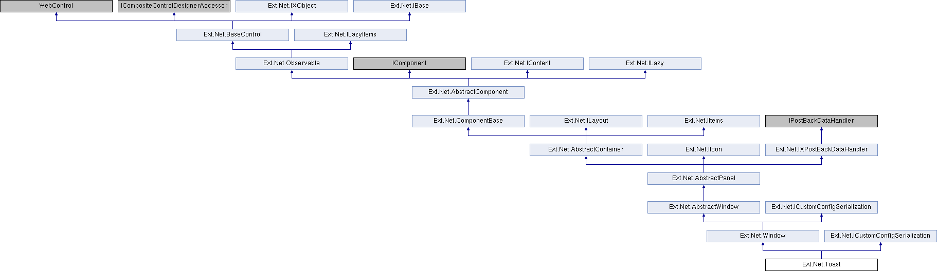