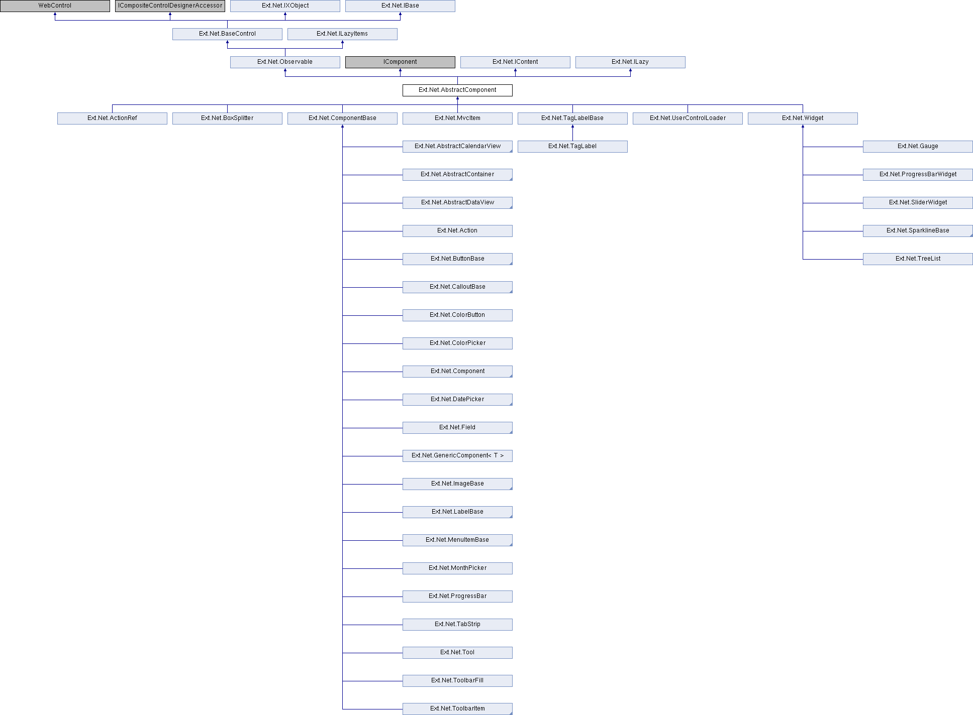
Base class for all Ext components. All subclasses of AbstractComponent may participate in the automated Ext component lifecycle of creation, rendering and destruction which is provided by the Container class. Components may be added to a Container through the items config option at the time the Container is created, or they may be added dynamically via the add method. The AbstractComponent base class has built-in support for basic hide/show and enable/disable and size control behavior. All Components are registered with the Ext.ComponentMgr on construction so that they can be referenced at any time via Ext.getCmp, passing the id. All user-developed visual widgets that are required to participate in automated lifecycle and size management should subclass AbstractComponent. See the Creating new UI controls tutorial for details on how and to either extend or augment ExtJs base classes to create custom Components. Every component has a specific xtype, which is its Ext-specific type name, along with methods for checking the xtype like getXType and isXType. More...
Classes | |
| class | Builder |
| class | Builder |
| class | Builder |
| class | Builder |
| class | Config |
Public Member Functions | |
| virtual T | ConvertTag< T > () |
| virtual void | SetKeyMap (KeyBindItem keyMap) |
| Adds a key mapping. More... | |
| virtual void | SetKeyMap (List< KeyBindItem > keyMap) |
| Adds key mappings. More... | |
| virtual void | CallEl (string name, params object[] args) |
| virtual void | AddCls (string cls) |
| Adds a CSS class to the component's underlying element. More... | |
| virtual void | AddClsWithUI (string cls, bool skip) |
| Adds a cls to the uiCls array, which will also call addUIClsToElement and adds to all elements of this component. More... | |
| virtual void | AddClsWithUI (string[] cls, bool skip) |
| Adds a cls to the uiCls array, which will also call addUIClsToElement and adds to all elements of this component. More... | |
| virtual void | AddUIClsToElement (string cls) |
| Method which adds a specified UI + uiCls to the components element. Can be overridden to remove the UI from more than just the components element. More... | |
| virtual void | AddContainerCls (string cls) |
| Adds a CSS class to the component's container. More... | |
| void | AddLabelCls (string labelCls) |
| Adds a CSS class to the component's label. More... | |
| override void | Destroy () |
| Destroys this component by purging any event listeners, removing the component's element from the DOM, removing the component from its Ext.Container (if applicable) and unregistering it from Ext.ComponentMgr. Destruction is generally handled automatically by the framework and this method should usually not need to be called directly. More... | |
| virtual void | Disable () |
| virtual void | Disable (bool silent) |
| virtual void | DoAutoRender () |
| Handles autoRender. Floating Components may have an ownerCt. If they are asking to be constrained, constrain them within that ownerCt, and have their z-index managed locally. Floating Components are always rendered to document.body More... | |
| virtual void | Enable () |
| virtual void | Enable (bool silent) |
| virtual void | Mask () |
| virtual void | Mask (string msg) |
| virtual void | Mask (string msg, string msgCls) |
| virtual void | ToggleCls (string cls) |
| Toggles the specified CSS class on this component (removes it if it already exists, otherwise adds it). More... | |
| virtual void | ToggleCls (string cls, bool state) |
| Toggles the specified CSS class on this component (removes it if it already exists, otherwise adds it). More... | |
| virtual void | Unmask () |
| Removes the mask applied by a .mask() call More... | |
| virtual void | UpdateLayout () |
| virtual void | UpdateLayout (object options) |
| virtual void | RemoveCls (string cls) |
| Removes a CSS class from the top level element representing this component. More... | |
| void | RemoveLabelCls (string labelCls) |
| Removes a CSS class from the component's label. More... | |
| virtual void | RemoveUIClsFromElement (string ui) |
| Method which removes a specified UI + uiCls from the components element. The cls which is added to the element will be: this.baseCls + '-' + ui More... | |
| virtual void | SetDock (Dock dock) |
| Sets the dock position of this component in its parent panel. Note that this only has effect if this item is part of the dockedItems collection of a parent that has a DockLayout (note that any Panel has a DockLayout by default) More... | |
| virtual void | SetHeight (Unit height) |
| Sets the height of the component. This method fires the resize event. More... | |
| virtual void | SetHeight (int height) |
| Sets the height of the component. This method fires the resize event. More... | |
| virtual void | SetHeight (string height) |
| Sets the height of the component. This method fires the resize event. More... | |
| virtual void | SetMaxHeight (int maxHeight) |
| Sets the value of maxHeight. More... | |
| virtual void | SetMaxWidth (int maxWidth) |
| Sets the value of maxWidth. More... | |
| virtual void | SetMinHeight (int minHeight) |
| Sets the value of minHeight. More... | |
| virtual void | SetMinWidth (int minWidth) |
| Sets the value of minWidth. More... | |
| virtual void | SetSize (int width, int height) |
| Sets the width and height of this AbstractComponent. This method fires the resize event. More... | |
| virtual void | SetSize (string width, string height) |
| Sets the width and height of this AbstractComponent. This method fires the resize event. More... | |
| virtual void | SetTouchAction (object touchAction) |
| Sets the value of touchAction. More... | |
| void | SetTpl (XTemplate tpl) |
| Sets the new XTemplate for this AbstractComponent More... | |
| virtual void | SetWidth (Unit width) |
| Sets the width of the component. This method fires the resize event. More... | |
| virtual void | SetWidth (int width) |
| Sets the width of the component. This method fires the resize event. More... | |
| virtual void | SetWidth (string width) |
| Sets the width of the component. This method fires the resize event. More... | |
| virtual void | Update (string html) |
| Update the html of the Body, optionally searching for and processing scripts. More... | |
| virtual void | Update (string html, bool loadScripts) |
| Update the html of the Body, optionally searching for and processing scripts. More... | |
| virtual void | Update (string html, bool loadScripts, string callback) |
| Update the html of the Body, optionally searching for and processing scripts. More... | |
| virtual void | Update (string html, bool loadScripts, JFunction callback) |
| Update the html of the Body, optionally searching for and processing scripts. More... | |
| virtual void | Update (object data) |
| virtual void | DestroyContentWidgets () |
| virtual void | AddStateEvents (string events) |
| Add events that will trigger the state to be saved. More... | |
| virtual void | AddStateEvents (string[] events) |
| Add events that will trigger the state to be saved. More... | |
| virtual void | DoAnimation (AnimConfig cfg) |
| virtual void | SequenceFx () |
| virtual void | StopAnimation () |
| virtual void | SyncFx () |
| virtual void | AlignTo (string element, string position, int xOffset, int yOffset) |
| Aligns this floating AbstractComponent to the specified element More... | |
| virtual void | AlignTo (string element, string position) |
| Aligns this floating AbstractComponent to the specified element More... | |
| virtual void | AlignTo (string element) |
| Aligns this floating AbstractComponent to the specified element More... | |
| virtual void | Center () |
| Center this AbstractComponent in its container. More... | |
| virtual void | DoConstrain () |
| Moves this floating AbstractComponent into a constrain region. By default, this AbstractComponent is constrained to be within the container it was added to, or the element it was rendered to. More... | |
| virtual void | DoConstrain (string element) |
| Moves this floating AbstractComponent into a constrain region. By default, this AbstractComponent is constrained to be within the container it was added to, or the element it was rendered to. More... | |
| virtual void | DoConstrain (Rectangle region) |
| Moves this floating AbstractComponent into a constrain region. By default, this AbstractComponent is constrained to be within the container it was added to, or the element it was rendered to. More... | |
| virtual void | SetActive () |
| Makes this the active AbstractComponent by showing its shadow, or deactivates it by hiding its shadow. This method also fires the activate or deactivate event depending on which action occurred. This method is called internally by Ext.ZIndexManager. More... | |
| virtual void | SetActive (bool active) |
| Makes this the active AbstractComponent by showing its shadow, or deactivates it by hiding its shadow. This method also fires the activate or deactivate event depending on which action occurred. This method is called internally by Ext.ZIndexManager. More... | |
| virtual void | SetAlwaysOnTop (bool alwaysOnTop) |
| Sets the value of alwaysOnTop. More... | |
| virtual void | SetAlwaysOnTopIndex (int alwaysOnTopIndex) |
| Sets the value of alwaysOnTop. More... | |
| virtual void | ToBack () |
| Sends this AbstractComponent to the back of (lower z-index than) any other visible windows More... | |
| virtual void | ToFront () |
| Brings this floating AbstractComponent to the front of any other visible, floating Components managed by the same ZIndexManager More... | |
| virtual void | ToFront (bool preventFocus) |
| Brings this floating AbstractComponent to the front of any other visible, floating Components managed by the same ZIndexManager More... | |
| virtual void | EnsureLoadPostData () |
| virtual void | ApplyStyles (string styles) |
| More flexible version of setStyle for setting style properties. More... | |
| virtual void | RemoveContainerCls (string cls) |
| Removes a CSS class from the component's container. More... | |
| virtual void | SetAnchor (string anchor, bool doLayout) |
| void | Replace (string id) |
| void | Replace (AbstractComponent cmp) |
| void | ReRender () |
 Public Member Functions inherited from Ext.Net.Observable Public Member Functions inherited from Ext.Net.Observable | |
| virtual void | AddListener (string eventName, JFunction fn) |
| Appends an event handler to this component More... | |
| virtual void | AddListener (string eventName, JFunction fn, string scope) |
| Appends an event handler to this component More... | |
| virtual void | AddListener (string eventName, JFunction fn, string scope, HandlerConfig options) |
| Appends an event handler to this component More... | |
| virtual void | AddListener (string eventName, string fn) |
| Appends an event handler to this component More... | |
| virtual void | AddListener (string eventName, string fn, string scope) |
| Appends an event handler to this component More... | |
| virtual void | AddListener (string eventName, string fn, string scope, HandlerConfig options) |
| Appends an event handler to this component More... | |
| virtual void | AddManagedListener (string item, string eventName, string fn, string scope, HandlerConfig options) |
| Adds listeners to any Observable object (or Element) which are automatically removed when this AbstractComponent is destroyed. More... | |
| virtual void | AddManagedListener (string item, string eventName, string fn, string scope) |
| Adds listeners to any Observable object (or Element) which are automatically removed when this AbstractComponent is destroyed. More... | |
| virtual void | AddManagedListener (string item, string eventName, string fn) |
| Adds listeners to any Observable object (or Element) which are automatically removed when this AbstractComponent is destroyed. More... | |
| virtual void | ClearListeners () |
| Removes all listeners for this object including the managed listeners More... | |
| virtual void | ClearManagedListeners () |
| Removes all managed listeners for this object. More... | |
| virtual void | EnableBubble (params string[] events) |
| Enables events fired by this Observable to bubble up an owner hierarchy by calling this.getBubbleTarget() if present. There is no implementation in the Observable base class. This is commonly used by Ext.Components to bubble events to owner Containers. See Ext.AbstractComponent-getBubbleTarget. The default implementation in Ext.AbstractComponent returns the AbstractComponent's immediate owner. But if a known target is required, this can be overridden to access the required target more quickly. More... | |
| virtual void | FireEvent (string eventName, params object[] args) |
| Fires the specified event with the passed parameters (minus the event name) More... | |
| virtual void | FireEventedAction (string eventName, object[] args, string fn) |
| Fires the specified event with the passed parameters and executes a function (action). Evented Actions will automatically dispatch a 'before' event passing. This event will be given a special controller that allows for pausing/resuming of the event flow. By pausing the controller the updater and events will not run until resumed. Pausing, however, will not stop the processing of any other before events. More... | |
| virtual void | FireEventedAction (string eventName, object[] args, string fn, string scope) |
| Fires the specified event with the passed parameters and executes a function (action). Evented Actions will automatically dispatch a 'before' event passing. This event will be given a special controller that allows for pausing/resuming of the event flow. By pausing the controller the updater and events will not run until resumed. Pausing, however, will not stop the processing of any other before events. More... | |
| virtual void | FireEventedAction (string eventName, object[] args, string fn, string scope, object[] fnArgs) |
| Fires the specified event with the passed parameters and executes a function (action). Evented Actions will automatically dispatch a 'before' event passing. This event will be given a special controller that allows for pausing/resuming of the event flow. By pausing the controller the updater and events will not run until resumed. Pausing, however, will not stop the processing of any other before events. More... | |
| virtual void | FireEventedAction (string eventName, object[] args, JFunction fn) |
| Fires the specified event with the passed parameters and executes a function (action). Evented Actions will automatically dispatch a 'before' event passing. This event will be given a special controller that allows for pausing/resuming of the event flow. By pausing the controller the updater and events will not run until resumed. Pausing, however, will not stop the processing of any other before events. More... | |
| virtual void | FireEventedAction (string eventName, object[] args, JFunction fn, string scope) |
| Fires the specified event with the passed parameters and executes a function (action). Evented Actions will automatically dispatch a 'before' event passing. This event will be given a special controller that allows for pausing/resuming of the event flow. By pausing the controller the updater and events will not run until resumed. Pausing, however, will not stop the processing of any other before events. More... | |
| virtual void | FireEventedAction (string eventName, object[] args, JFunction fn, string scope, object[] fnArgs) |
| Fires the specified event with the passed parameters and executes a function (action). Evented Actions will automatically dispatch a 'before' event passing. This event will be given a special controller that allows for pausing/resuming of the event flow. By pausing the controller the updater and events will not run until resumed. Pausing, however, will not stop the processing of any other before events. More... | |
| virtual void | On (string eventName, string fn) |
| Appends an event handler to this element (shorthand for addListener) More... | |
| virtual void | On (string eventName, string fn, string scope) |
| Appends an event handler to this element (shorthand for addListener) More... | |
| virtual void | On (string eventName, string fn, string scope, HandlerConfig options) |
| Appends an event handler to this element (shorthand for addListener) More... | |
| virtual void | On (string eventName, JFunction fn) |
| Appends an event handler to this element (shorthand for addListener) More... | |
| virtual void | On (string eventName, JFunction fn, string scope) |
| Appends an event handler to this element (shorthand for addListener) More... | |
| virtual void | On (string eventName, JFunction fn, string scope, HandlerConfig options) |
| Appends an event handler to this element (shorthand for addListener) More... | |
| virtual void | RelayEvents (string origin, string[] events) |
| Relays selected events from the specified Observable as if the events were fired by this. More... | |
| virtual void | RemoveListener (string eventName, string fn) |
| Removes an event handler. More... | |
| virtual void | RemoveListener (string eventName, string fn, string scope) |
| Removes an event handler. More... | |
| virtual void | RemoveManagedListener (string item, string eventName, string fn) |
| Removes listeners that were added by the mon method. More... | |
| virtual void | RemoveManagedListener (string item, string eventName, string fn, string scope) |
| Removes listeners that were added by the mon method. More... | |
| virtual void | ResumeEvents () |
| Resume firing events. (see suspendEvents) If events were suspended using the queueSuspended parameter, then all events fired during event suspension will be sent to any listeners now. More... | |
| virtual void | SuspendEvents (bool queueSuspended) |
| Suspend the firing of all events. (see resumeEvents) More... | |
| virtual void | SuspendEvents () |
| Suspend the firing of all events. (see resumeEvents) More... | |
| virtual void | SuspendEvent (string name) |
| Suspends firing of the named event(s). More... | |
| virtual void | ResumeEvent (string name) |
| Resumes firing of the named event(s). More... | |
| virtual void | RemoveDirectListener (string name) |
| virtual void | Un (string eventName, string fn) |
| Removes a listener (shorthand for removeListener) More... | |
| virtual void | Un (string eventName, string fn, string scope) |
| Removes a listener (shorthand for removeListener) More... | |
| virtual void | Mon (Element el, string eventName, JFunction fn) |
| Adds listeners to any Observable object (or Element) which are automatically removed when this AbstractComponent is destroyed. More... | |
| virtual void | Mon (Observable el, string eventName, JFunction fn) |
| Adds listeners to any Observable object (or Element) which are automatically removed when this AbstractComponent is destroyed. More... | |
| virtual void | Mon (Element el, string eventName, JFunction fn, string scope) |
| Adds listeners to any Observable object (or Element) which are automatically removed when this AbstractComponent is destroyed. More... | |
| virtual void | Mon (Observable el, string eventName, JFunction fn, string scope) |
| Adds listeners to any Observable object (or Element) which are automatically removed when this AbstractComponent is destroyed. More... | |
| virtual void | Mon (Element el, string eventName, string fn, string scope, HandlerConfig options) |
| Adds listeners to any Observable object (or Element) which are automatically removed when this AbstractComponent is destroyed. More... | |
| virtual void | Mon (Observable el, string eventName, string fn, string scope, HandlerConfig options) |
| Adds listeners to any Observable object (or Element) which are automatically removed when this AbstractComponent is destroyed. More... | |
| virtual void | Mun (Element el, string eventName, string fn) |
| Removes listeners that were added by the mon method. More... | |
| virtual void | Mun (Observable el, string eventName, string fn) |
| Removes listeners that were added by the mon method. More... | |
| virtual void | Mun (Element el, string eventName, string fn, string scope) |
| Removes listeners that were added by the mon method. More... | |
| virtual void | Mun (Observable el, string eventName, string fn, string scope) |
| Removes listeners that were added by the mon method. More... | |
| delegate void | OnBeforeClientInitializedHandler (Observable sender) |
| delegate void | OnAfterClientInitializedHandler (Observable sender) |
| Public Member Functions inherited from Ext.Net.BaseControl | |
| virtual bool | HasExplicitValue (string name) |
| virtual IControlBuilder | ToNativeBuilder () |
| virtual T | ToBuilder< T > () |
| T | Apply< T > (IApply config) |
| object | Apply (IApply config) |
| BaseControl | Apply (object from, bool ignoreDefaultValues) |
| BaseControl | Apply (object from) |
| virtual bool | HasLayout () |
| virtual bool | HasContent () |
| virtual string | ResolveUrlLink (string url) |
| bool | IsInHierarchy (params Type[] types) |
| T | GetParentByLevel< T > (int level) |
| virtual string | DefineInstance () |
| virtual string | DefineInstance (string config) |
| virtual string | DefineInstance (string instanceOf, string config) |
| virtual string | ToConfig () |
| virtual string | ToConfig (LazyMode mode) |
| virtual string | ToConfig (LazyMode mode, bool registerResourcesInManager) |
| virtual string | ToScript (bool selfRendering) |
| virtual string | ToScript () |
| string | ToScript (RenderMode mode, string element) |
| string | ToScript (RenderMode mode, string element, bool selfRendering) |
| string | ToScript (RenderMode mode, string element, int index) |
| string | ToScript (RenderMode mode, string element, int index, bool selfRendering) |
| string | ToScript (RenderMode mode, string element, int? index, bool? selfRendering, bool forceResources, string method, bool forceLazy, bool clearContainer) |
| virtual void | AddScript (string script) |
| Adds the script to be be called on the client. More... | |
| virtual void | AddScript (string template, params object[] args) |
| Adds the script to be be called on the client. The script is formatted using the template and args. More... | |
| virtual void | Set (string name, object value) |
| virtual void | Set (ScriptPosition position, string name, object value) |
| virtual void | Call (string name) |
| virtual void | Call (string name, params object[] args) |
| virtual void | Call (string name, string[] arg) |
| Calls the JavaScript function on the Control with a string[] parameter More... | |
| virtual void | Call (ScriptPosition mode, string name, params object[] args) |
| virtual string | SelfRender () |
| virtual void | AddBeforeClientInitScript (string script) |
| Adds the script directly before the ClientInitScript. More... | |
| virtual void | AddAfterClientInitScript (string script) |
| Adds the script directly after the ClientInitScript. More... | |
| override void | RenderBeginTag (HtmlTextWriter writer) |
| virtual void | Render (bool selfRendering) |
| virtual void | Render (Control control) |
| virtual void | Render () |
| virtual void | Render (string element, RenderMode mode) |
| virtual void | Render (string element, int index, RenderMode mode) |
| virtual void | Render (Control control, RenderMode mode) |
| virtual void | Render (Control control, int index, RenderMode mode) |
| virtual void | Render (string element, RenderMode mode, bool selfRendering) |
| virtual void | Render (string element, int index, RenderMode mode, bool selfRendering) |
| virtual void | Render (RenderMode mode, string element, int? index, bool? selfRendering, bool forceResources, string method, bool forceLazy, bool clearContainer) |
| virtual void | Render (Control control, RenderMode mode, bool selfRendering) |
| virtual void | Render (Control control, int index, RenderMode mode, bool selfRendering) |
| virtual void | AddTo (string element) |
| virtual void | AddTo (Control control) |
| virtual void | AddTo (string element, bool selfRendering) |
| virtual void | AddTo (Control control, bool selfRendering) |
| virtual void | InsertTo (int index, string element) |
| virtual void | InsertTo (int index, Control control) |
| virtual void | InsertTo (int index, string element, bool selfRendering) |
| virtual void | InsertTo (int index, Control control, bool selfRendering) |
| virtual void | Update () |
| virtual bool | SuspendScripting () |
| virtual void | ResumeScripting (bool oldValue) |
| virtual void | ResumeScripting () |
| List< T > | GetCustomResources< T > () |
| virtual void | SetResources () |
| List< ClientStyleItem > | GetStyles () |
| List< ClientStyleItem > | GetThemes () |
| List< ClientScriptItem > | GetScripts () |
| string | GetGeneratedScripts () |
| Get generated and added javascript methods calling More... | |
| virtual bool | HasOwnState (string name) |
| virtual void | SetControlFor (ModelMetadata meta) |
Protected Member Functions | |
| virtual List< ResourceItem > | RegisterUIResources (List< ResourceItem > list) |
| void | SetTag (object tag) |
| virtual void | Bind_AfterItemAdd (Parameter item) |
| virtual void | AfterPluginAdd (Plugin plugin) |
| virtual void | AfterPluginRemove (Plugin plugin) |
| override void | OnInit (EventArgs e) |
| virtual void | SetUI (UI ui) |
| Sets the UI for the component. This will remove any existing UIs on the component. It will also loop through any uiCls set on the component and rename them so they include the new UI More... | |
| virtual void | SetUIName (string ui) |
| Sets the UI for the component. This will remove any existing UIs on the component. It will also loop through any uiCls set on the component and rename them so they include the new UI More... | |
| virtual void | AfterBinItemAdd (Observable item) |
| override object | SaveViewState () |
| override void | OnLoad (EventArgs e) |
| override void | PagePreLoad (object sender, EventArgs e) |
| override void | OnPreRender (EventArgs e) |
| virtual void | SetAnchor (string anchor) |
| void | SetBorder (bool? border) |
| void | SetBorderSpec (string border) |
| Protected Member Functions inherited from Ext.Net.Observable | |
| override void | OnInit (EventArgs e) |
| virtual void | RegisterCustomAttribute (string key, string value) |
| virtual void | OnBeforeClientInit (Observable sender) |
| virtual void | OnAfterClientInit (Observable sender) |
| virtual void | OnBeforeClientInitHandler () |
| virtual void | OnAfterClientInitHandler () |
| override void | OnPreRender (EventArgs e) |
| override void | PreRenderAction () |
| virtual void | AfterItemAdd (Observable item) |
| virtual void | AfterItemRemove (Observable item) |
| override void | SetModelAdditionalValue (KeyValuePair< string, object > value) |
| Protected Member Functions inherited from Ext.Net.BaseControl | |
| virtual string | GetNamespace (bool parseDot) |
| virtual string | AddNamespaceToID (string id) |
| virtual ContentContainer | CreateContainer () |
| virtual void | CheckForceId () |
| virtual string | ParseTarget (string target) |
| Unit | UnitPixelTypeCheck (object obj, Unit defaultValue, string propertyName) |
| virtual void | CallTemplate (string template) |
| virtual void | CallTemplate (string template, string name, params object[] args) |
| virtual void | CallTemplate (ScriptPosition position, string template, string name, params object[] args) |
| override void | OnInit (EventArgs e) |
| virtual void | PageLoad (object sender, EventArgs e) |
| virtual void | PageLoadComplete (object sender, EventArgs e) |
| override void | AddAttributesToRender (HtmlTextWriter writer) |
| virtual void | SimpleRender (HtmlTextWriter writer) |
| virtual void | RecreateChildControls () |
| override void | CreateChildControls () |
| override void | OnPreRender (EventArgs e) |
| virtual void | RenderScript (string script) |
| override void | OnDataBinding (EventArgs e) |
| override void | Render (HtmlTextWriter writer) |
| virtual bool | IsGlobalResourceRegistered (ResourceItem item) |
| virtual string | FormatValue (object value, string format) |
| virtual void | OnMetadataProcess (ModelMetadata meta, string name, ViewDataDictionary viewData, ControllerContext context) |
| virtual void | SetModelValidationRule (ModelClientValidationRule rule) |
| virtual void | SetModelValue (object value, ModelMetadata meta) |
Properties | |
| override string | AliasPrefix [get] |
| override List< ResourceItem > | Resources [get] |
| override string | InitialConfig [get] |
| override LazyMode | LazyMode [get, set] |
| override string | InstanceOf [get] |
| virtual string | Action [get, set] |
| Specifies an action for this component More... | |
| virtual string | TagHiddenName [get, set] |
| virtual object?? | Tag [get, set] |
| An Object that contains data about the Component. The default is a null reference. More... | |
| virtual string? | TagString [get, set] |
| virtual string | AlignTarget [get, set] |
| A Component or Element by which to position this component according to the defaultAlign. Defaults to ths owning Container. Only applicable if this component is floating. Used upon first show. More... | |
| virtual JsonObject | AriaAttributes [get, set] |
| An object containing ARIA attributes to be set on this Component's ARIA element. Use this to set the attributes that cannot be determined by the Component's state. Defaults to: {$value: null, lazy: true} More... | |
| virtual string | AriaDescribedBy [get, set] |
| DOM selector for a child element that is to be used as description for this Component, set in aria-describedby attribute. The selector works the same way as ariaLabelledBy. More... | |
| virtual string | AriaLabel [get, set] |
| ARIA label for this Component. It is best to use ariaLabelledBy option instead, because screen readers prefer aria-labelledby attribute to aria-label. ariaLabelledBy takes precedence if both specified. More... | |
| virtual string | AriaLabelledBy [get, set] |
| DOM selector for a child element that is to be used as label for this Component, set in aria-labelledby attribute. If the selector is by #id, the label element can be any existing element, not necessarily a child of the main Component element. Overrides ariaLabel if both specified. More... | |
| virtual string | AriaRole [get, set] |
| ARIA role for this Component, defaults to no role. With no role, no other ARIA attributes are set. More... | |
| virtual DomObject?? | AutoEl [get] |
| A tag name or DomHelper spec used to create the Element which will encapsulate this AbstractComponent. You do not normally need to specify this. For the base classes Ext.AbstractComponent and Ext.container.Container, this defaults to 'div'. The more complex Sencha classes use a more complex DOM structure specified by their own renderTpls. This is intended to allow the developer to create application-specific utility Components encapsulated by different DOM elements. More... | |
| virtual ParameterCollection | Bind [get] |
| Setting this config option adds or removes data bindings for other configs. More... | |
| virtual object | ViewModel [get, set] |
| virtual object | BindObject [get, set] |
| virtual string | BindString [get, set] |
| virtual bool | DestroyContent [get, set] |
| If true then component will search components inside Content area and destroy it during own destroy More... | |
| virtual bool | AutoRender [get, set] |
| This config is intended mainly for floating Components which may or may not be shown. Instead of using renderTo in the configuration, and rendering upon construction, this allows a Component to render itself upon first show. Specify as true to have this AbstractComponent render to the document body upon first show. Specify as an element, or the ID of an element to have this AbstractComponent render to a specific element upon first show. This defaults to true for the Window class. More... | |
| virtual string | AutoRenderElement [get, set] |
| This config is intended mainly for floating Components which may or may not be shown. Instead of using renderTo in the configuration, and rendering upon construction, this allows a AbstractComponent to render itself upon first show. Specify as true to have this AbstractComponent render to the document body upon first show. Specify as an element, or the ID of an element to have this AbstractComponent render to a specific element upon first show. This defaults to true for the Window class. More... | |
| virtual bool | AutoShow [get, set] |
| True to automatically show the component upon creation. This config option may only be used for floating components or components that use autoRender. Defaults to false. More... | |
| virtual string | BaseCls [get, set] |
| The base CSS class to apply to this components's element. This will also be prepended to elements within this component like Panel's body will get a class x-panel-body. This means that if you create a subclass of Panel, and you want it to get all the Panels styling for the element and the body, you leave the baseCls x-panel and use componentCls to add specific styling for this component. More... | |
| virtual ? bool? | Border [get, set] |
| virtual string | BorderSpec [get, set] |
| virtual ChildElementCollection?? | ChildEls [get] |
| An array describing the child elements of the Component. Each member of the array is an object with these properties: More... | |
| virtual string | Cls [get, set] |
| An optional extra CSS class that will be added to this component's Element (defaults to ''). This can be useful for adding customized styles to the component or any of its children using standard CSS rules. More... | |
| virtual string | ComponentCls [get, set] |
| CSS Class to be added to a components root level element to give distinction to it via styling. More... | |
| virtual string | ComponentLayout [get, set] |
| The sizing and positioning of a AbstractComponent's internal Elements is the responsibility of the AbstractComponent's layout manager which sizes a AbstractComponent's internal structure in response to the AbstractComponent being sized. Generally, developers will not use this configuration as all provided Components which need their internal elements sizing (Such as input fields) come with their own componentLayout managers. The default layout manager will be used on instances of the base Ext.AbstractComponent class which simply sizes the AbstractComponent's encapsulating element to the height and width specified in the setSize method. More... | |
| virtual string | CtCls [get, set] |
| An optional extra CSS class that will be added to this component's container. This can be useful for adding customized styles to the container or any of its children using standard CSS rules. More... | |
| virtual bool | Constrain [get, set] |
| True to constrain this Components within its containing element, false to allow it to fall outside of its containing element. By default this Component will be rendered to document.body. To render and constrain this Component within another element specify renderTo. Defaults to: false More... | |
| virtual string | ConstrainToElement [get, set] |
| A Region (or an element from which a Region measurement will be read) which is used to constrain the component. Only applies when the component is floating. More... | |
| virtual System.Drawing.? Rectangle? | ConstrainToRegion [get, set] |
| A Region (or an element from which a Region measurement will be read) which is used to constrain the component. Only applies when the component is floating. More... | |
| virtual string | ConstrainToRegionProxy [get] |
| virtual string | ConstraintInsets [get, set] |
| virtual object | Data [get, set] |
| The initial set of data to apply to the tpl to update the content area of the AbstractComponent. More... | |
| virtual string | DefaultAlign [get, set] |
| The default Ext.dom.Element::getAlignToXY anchor position value for this component relative to its alignTarget (which defaults to its owning Container). Only applicable if this component is floating. Used upon first show. Defaults to: "c-c" More... | |
| virtual bool | Disabled [get, set] |
| Render this component disabled (default is false). More... | |
| virtual string | DisabledCls [get, set] |
| CSS class to add when the AbstractComponent is disabled. Defaults to 'x-item-disabled'. More... | |
| virtual Dock | Dock [get, set] |
| The dock position of this component in its parent panel More... | |
| virtual bool | Fixed [get, set] |
| Configure as true to have this Component fixed at its X, Y coordinates in the browser viewport, immune to scrolling the document. Defaults to: false More... | |
| virtual bool | Floating [get, set] |
| Specify as true to float the AbstractComponent outside of the document flow using CSS absolute positioning. Components such as Windows and Menus are floating by default. Floating Components that are programatically rendered will register themselves with the global ZIndexManager Floating Components as child items of a Container A floating AbstractComponent may be used as a child item of a Container. This just allows the floating AbstractComponent to seek a ZIndexManager by examining the ownerCt chain. When configured as floating, Components acquire, at render time, a ZIndexManager which manages a stack of related floating Components. The ZIndexManager brings a single floating AbstractComponent to the top of its stack when the AbstractComponent's toFront method is called. The ZIndexManager is found by traversing up the ownerCt chain to find an ancestor which itself is floating. This is so that descendant floating Components of floating Containers (Such as a ComboBox dropdown within a Window) can have its zIndex managed relative to any siblings, but always above that floating ancestor Container. If no floating ancestor is found, a floating AbstractComponent registers itself with the default ZIndexManager. Floating components do not participate in the Container's layout. Because of this, they are not rendered until you explicitly show them. After rendering, the ownerCt reference is deleted, and the floatParent property is set to the found floating ancestor Container. If no floating ancestor Container was found the floatParent property will not be set. More... | |
| virtual bool? | FloatingProxy [get] |
| virtual LayerConfig | FloatingConfig [get, set] |
| Additional floating configs More... | |
| virtual string? | FloatingConfigProxy [get] |
| virtual bool | Frame [get, set] |
| Specify as true to have the AbstractComponent inject framing elements within the AbstractComponent at render time to provide a graphical rounded frame around the AbstractComponent content. This is only necessary when running on outdated, or non standard-compliant browsers such as Microsoft's Internet Explorer prior to version 9 which do not support rounded corners natively. The extra space taken up by this framing is available from the read only property frameSize. More... | |
| virtual bool | FormBind [get, set] |
| Any component within the FormPanel can be configured with formBind: true. This will cause that component to be automatically disabled when the form is invalid, and enabled when it is valid. This is most commonly used for Button components to prevent submitting the form in an invalid state, but can be used on any component type. More... | |
| virtual ? bool? | Focusable [get, set] |
| Set to true for interactive Components, false for static Components. For Containers, this property reflects interactiveness of the Container itself, not its children. Defaults to false. More... | |
| virtual string | FocusCls [get, set] |
| CSS class that will be added to focused Component, and removed when Component blurs. More... | |
| override Unit | Height [get, set] |
| The height of this component in pixels. More... | |
| virtual string | HeightSpec [get, set] |
| The height of this component as a CSS value with units. More... | |
| virtual bool | Hidden [get, set] |
| Render this component hidden (default is false). If true, the hide method will be called internally. More... | |
| virtual HideMode | HideMode [get, set] |
| A String which specifies how this AbstractComponent's encapsulating DOM element will be hidden. Values may be 'display' : The AbstractComponent will be hidden using the display: none style. 'visibility' : The AbstractComponent will be hidden using the visibility: hidden style. 'offsets' : The AbstractComponent will be hidden by absolutely positioning it out of the visible area of the document. This is useful when a hidden AbstractComponent must maintain measurable dimensions. Hiding using display results in a AbstractComponent having zero dimensions. Defaults to 'display'. More... | |
| virtual string | Html [get, set] |
| An HTML fragment, or a DomHelper specification to use as the layout element content (defaults to ''). The HTML content is added after the component is rendered, so the document will not contain this HTML at the time the render event is fired. This content is inserted into the body before any configured contentEl is appended. More... | |
| virtual ? bool? | LiquidLayout [get, set] |
| Components that achieve their internal layout results using solely CSS with no JS intervention must set this to true. This allows the component to opt out of the layout run when used inside certain container layouts such as Form and Auto resulting in a performance gain. The following components currently use liquid layout (liquidLayout: true): All Form Fields (subclasses of Ext.form.field.Base) Ext.button.Button More... | |
| virtual ComponentLoader | Loader [get, set] |
| A configuration object or an instance of a Ext.ComponentLoader to load remote content for this AbstractComponent. More... | |
| virtual ? int? | Margin [get, set] |
| virtual string | MarginSpec [get, set] |
| virtual string | MaskElement [get, set] |
| virtual ? bool? | MaskOnDisable [get, set] |
| This is an internal flag that you use when creating custom components. More... | |
| virtual ? int? | MaxHeight [get, set] |
| virtual ? int? | MaxWidth [get, set] |
| virtual ? int? | MinHeight [get, set] |
| virtual ? int? | MinWidth [get, set] |
| virtual ? bool? | ModelValidation [get, set] |
| virtual string | OverCls [get, set] |
| An optional extra CSS class that will be added to this component's Element when the mouse moves over the Element, and removed when the mouse moves out. (defaults to ''). This can be useful for adding customized 'active' or 'hover' styles to the component or any of its children using standard CSS rules. More... | |
| virtual ? int? | Padding [get, set] |
| virtual string | PaddingSpec [get, set] |
| virtual ItemsCollection< Plugin > | Plugins [get] |
| An object or array of objects that will provide custom functionality for this component. The only requirement for a valid plugin is that it contain an init method that accepts a reference of type Ext.AbstractComponent. When a component is created, if any plugins are available, the component will call the init method on each plugin, passing a reference to itself. Each plugin can then call methods or respond to events on the component as needed to provide its functionality. More... | |
| virtual string | Publishes [get, set] |
| One or more names of config properties that this component should publish to its ViewModel. Some components override this and publish their most useful configs by default. This config uses the reference to determine the name of the data object to place in the ViewModel. If reference is not set then this config is ignored. More... | |
| virtual string[] | PublishesArray [get, set] |
| One or more names of config properties that this component should publish to its ViewModel. Some components override this and publish their most useful configs by default. This config uses the reference to determine the name of the data object to place in the ViewModel. If reference is not set then this config is ignored. More... | |
| virtual object | PublishesObject [get, set] |
| One or more names of config properties that this component should publish to its ViewModel. Some components override this and publish their most useful configs by default. This config uses the reference to determine the name of the data object to place in the ViewModel. If reference is not set then this config is ignored. More... | |
| virtual string | Reference [get, set] |
| Specifies a name for this component inside its component hierarchy. This name must be unique within its view or its ViewController. See the documentation in Ext.container.Container for more information about references. Note: Valid identifiers start with a letter or underscore and are followed by zero or more additional letters, underscores or digits. References are case sensitive. More... | |
| virtual ParameterCollection?? | RenderData [get] |
| The data used by renderTpl in addition to the following property values of the component: id ui uiCls baseCls componentCls frame More... | |
| virtual object | RenderDataObject [get, set] |
| The data used by renderTpl in addition to the following property values of the component More... | |
| virtual ParameterCollection?? | RenderSelectors [get] |
| An object containing properties specifying DomQuery selectors which identify child elements created by the render process. After the AbstractComponent's internal structure is rendered according to the renderTpl, this object is iterated through, and the found Elements are added as properties to the AbstractComponent using the renderSelector property name. For example, a AbstractComponent which rendered an image, and description into its element might use the following properties coded into its prototype: More... | |
| virtual string | RenderTo [get, set] |
| Specify the id of the element, a DOM element or an existing Element that this component will be rendered into. Notes : Do not use this option if the AbstractComponent is to be a child item of a Container. It is the responsibility of the Container's layout manager to render and manage its child items. When using this config, a call to render() is not required. More... | |
| virtual ? bool? | RTL [get, set] |
| True to layout this component and its descendants in "rtl" (right-to-left) mode. Can be explicitly set to false to override a true value inherited from an ancestor. More... | |
| virtual bool | Session [get, set] |
| If provided this creates a new Session instance for this component. If this is a Container, this will then be inherited by all child components. More... | |
| virtual object | TouchAction [get, set] |
| Emulates the behavior of the CSS touch-action property in a cross-browser compatible manner. More... | |
| override bool | RenderTags [get] |
| virtual XTemplate | RenderTpl [get, set] |
| An XTemplate used to create the internal structure inside this AbstractComponent's encapsulating Element. You do not normally need to specify this. For the base classes Ext.AbstractComponent and Ext.container.Container, this defaults to null which means that they will be initially rendered with no internal structure; they render their Element empty. The more specialized ExtJS and Touch classes which use a more complex DOM structure, provide their own template definitions. This is intended to allow the developer to create application-specific utility Components with customized internal structure. Upon rendering, any created child elements may be automatically imported into object properties using the renderSelectors option. More... | |
| virtual ShrinkWrap | ShrinkWrap [get, set] |
| In CSS terms, shrink-wrap width is analogous to an inline-block element as opposed to a block-level element. Some container layouts always shrink-wrap their children, effectively ignoring this property (e.g., Ext.layout.container.HBox, Ext.layout.container.VBox, Ext.layout.component.Dock). The Default is "Height". More... | |
| virtual string | StyleSpec [get, set] |
| A custom style specification to be applied to this component's Element. More... | |
| virtual string | StyleHtmlCls [get, set] |
| The class that is added to the content target when you set styleHtmlContent to true. Defaults to 'x-html' More... | |
| virtual bool | StyleHtmlContent [get, set] |
| True to automatically style the html inside the content target of this component (body for panels). Defaults to false. More... | |
| virtual XTemplate | Tpl [get, set] |
| An Ext.Template, Ext.XTemplate or an array of strings to form an Ext.XTemplate. Used in conjunction with the data and tplWriteMode configurations. More... | |
| virtual TemplateWriteMode | TplWriteMode [get, set] |
| The Ext.(X)Template method to use when updating the content area of the AbstractComponent. Defaults to 'overwrite' (see Ext.XTemplate-overwrite). More... | |
| override short | TabIndex [get, set] |
| DOM tabIndex attribute for this Focusable More... | |
| virtual UI | UI [get, set] |
| A set of predefined ui styles for individual components. Most components support 'light' and 'dark'. Extra string added to the baseCls with an extra '-'. More... | |
| virtual string | UIName [get, set] |
| A set of predefined ui styles for individual components. Most components support 'light' and 'dark'. Extra string added to the baseCls with an extra '-'. More... | |
| virtual string?? | UIProxy [get] |
| virtual string | UserCls [get, set] |
| One or more CSS classes to add to the component's primary element. This config is intended solely for use by the component instantiator (the "user"), not by derived classes. More... | |
| override Unit | Width [get, set] |
| The width of this component in pixels. More... | |
| virtual string | WidthSpec [get, set] |
| The width of this component as a CSS value with units. More... | |
| virtual string | XType [get] |
| virtual bool | RenderXType [get, set] |
| virtual string?? | XTypeProxy [get] |
| The registered xtype to create. This config option is not used when passing a config object into a constructor. This config option is used only when lazy instantiation is being used, and a child items of a Container is being specified not as a fully instantiated AbstractComponent, but as a AbstractComponent config object. The xtype will be looked up at render time up to determine what type of child AbstractComponent to create. More... | |
| virtual JFunction | PreInit [get, set] |
| virtual KeyBindItemCollection | KeyMap [get, set] |
| An object containing handlers for keyboard events. More... | |
| virtual KeyNav | KeyNav [get, set] |
| virtual ResponsiveRules | ResponsiveConfig [get] |
| This object consists of keys that represent the conditions on which configs will be applied. More... | |
| virtual string | ResponsiveConfigProxy [get] |
| virtual ResponsiveFormulas | ResponsiveFormulas [get] |
| It is common when using responsiveConfig to have recurring expressions that make for complex configurations. Using responsiveFormulas allows you to cut down on this repetition by adding new properties to the "scope" for the rules in a responsiveConfig. More... | |
| virtual string | ResponsiveFormulasProxy [get] |
| virtual string | Anchor [get, set] |
| This configuation option is to be applied to child items of a container managed by this layout (ie. configured with layout:'anchor'). This value is what tells the layout how an item should be anchored to the container. items added to an AnchorLayout accept an anchoring-specific config property of anchor which is a string containing two values: the horizontal anchor value and the vertical anchor value (for example, '100% 50'). More... | |
| virtual string | DefaultAnchor [get, set] |
| The DefaultAnchor is applied as the Anchor config item to all child Items during render. More... | |
| virtual string | AnchorHorizontal [get, set] |
| See Anchor property More... | |
| virtual string | AnchorVertical [get, set] |
| See Anchor property More... | |
| virtual string | AnchorProxy [get] |
| virtual Region | Region [get, set] |
| Note: this config is only used when this AbstractComponent is rendered by a Container which has been configured to use the BorderLayout layout manager (e.g. specifying layout:'border'). More... | |
| virtual bool | SplitterResize [get, set] |
| This configuration option is to be applied to the child items managed by this layout and is used in conjunction with split. By default, when specifying split, the region can be dragged to be resized. Set this option to false to show the split bar but prevent resizing. Defaults to: true More... | |
| virtual bool | Split [get, set] |
| Only actual for items managed by Border layout. Each region with Split="true" will get a Splitter that allows for manual resizing of the container. Except for the center region. Defaults to false. More... | |
| virtual bool? | SplitProxy [get] |
| A proxy property to render a split config option. More... | |
| virtual BoxSplitter | SplitterConfig [get, set] |
| Only actual for items managed by Border layout. Each region with a SplitterConfig will get a Splitter that allows for manual resizing of the container. Except for the center region. More... | |
| virtual string? | SplitterConfigProxy [get] |
| A proxy property to render a split config option. More... | |
| virtual double | ColumnWidth [get, set] |
| The ColumnWidth property is only used with ColumnLayout is used. The ColumnWidth property is always evaluated as a percentage, and must be a decimal value greater than 0 and less than 1. More... | |
| string | ColumnWidthProxy [get] |
| virtual int | Flex [get, set] |
| NOTE: This property is only used when the parent Layout is HBoxLayout or VBoxLayout. This configuation option is to be applied to child items of the container managed by this layout. Each child item with a flex property will be flexed horizontally according to each item's relative flex value compared to the sum of all items with a flex value specified. Any child items that have either a flex = 0 or flex = undefined will not be 'flexed' (the initial size will not be changed). More... | |
| virtual bool | Reorderable [get, set] |
| False to disallow reordering for this Component. More... | |
| virtual int | RowSpan [get, set] |
| Applied to the table cell containing the item. More... | |
| virtual int | ColSpan [get, set] |
| Applied to the table cell containing the item. More... | |
| virtual string | CellCls [get, set] |
| CSS class name added to the table cell containing the item. More... | |
| virtual string | CellId [get, set] |
| An id applied to the table cell containing the item. More... | |
| virtual AbstractContainer? | OwnerCt [get] |
| This AbstractComponent's owner Container (defaults to undefined, and is set automatically when this AbstractComponent is added to a Container). Read-only. More... | |
| virtual Element | Element [get] |
| virtual string | ContextMenuID [get, set] |
| virtual string | ContextMenuIDProxy [get] |
| virtual ItemsCollection< Observable > | Bin [get] |
| virtual ItemsCollection< Observable > | BinProxy [get] |
| virtual bool | PreventContent [get] |
| virtual string? | ContentEl [get] |
| The id of an existing HTML node to use as the panel's body content (defaults to ''). More... | |
| virtual ITemplate | Content [get, set] |
| virtual ITemplate | HtmlBin [get, set] |
| virtual ContentContainer?? | ContentContainer [get, set] |
| ControlCollection | ContentControls [get] |
| virtual int | SaveDelay [get, set] |
| A buffer to be applied if many state events are fired within a short period (defaults to 100). More... | |
| virtual string[] | StateEvents [get, set] |
| An array of events that, when fired, should trigger this component to save its state (defaults to none). These can be any types of events supported by this component, including browser or custom events (e.g., ['click', 'customerchange']). More... | |
| virtual string | StateID [get, set] |
| The unique id for this component to use for state management purposes (defaults to the component id). More... | |
| virtual bool | Stateful [get, set] |
| A flag which causes the AbstractComponent to attempt to restore the state of internal properties from a saved state on startup. Defaults to false. More... | |
| virtual JFunction?? | GetState [get] |
| Return component's data which should be saved by StateProvider More... | |
| virtual bool | AlwaysOnTop [get, set] |
| A flag indicating that this component should be on the top of the z-index stack for use by the zIndexManager to sort its stack. This may be a positive number to prioritize the ordering of multiple visible always on top components. This may be set to a negative number to prioritize a component to the bottom of the z-index stack. Defaults to false. More... | |
| virtual int | AlwaysOnTopIndex [get, set] |
| A flag indicating that this component should be on the top of the z-index stack for use by the zIndexManager to sort its stack. This may be a positive number to prioritize the ordering of multiple visible always on top components. This may be set to a negative number to prioritize a component to the bottom of the z-index stack. Defaults to false. More... | |
| virtual ? bool? | AnimateShadow [get, set] |
| True to animate the shadow along with the component while the component is animating. By default the shadow is hidden while the component is animating. Defaults to false. More... | |
| virtual bool | FocusOnToFront [get, set] |
| Specifies whether the floated component should be automatically focused when it is brought to the front. Defaults to true. More... | |
| virtual bool | Shadow [get, set] |
| Specifies whether the floating component should be given a shadow. Set to true to automatically create an Ext.Shadow, or a string indicating the shadow's display Ext.Shadow.mode. Set to false to disable the shadow. (Defaults to 'sides'.) More... | |
| virtual ShadowMode | ShadowMode [get, set] |
| Specifies whether the floating component should be given a shadow. Set to true to automatically create an Ext.Shadow, or a string indicating the shadow's display Ext.Shadow.mode. Set to false to disable the shadow. (Defaults to 'sides'.) More... | |
| virtual int | ShadowOffset [get, set] |
| Number of pixels to offset the shadow More... | |
| virtual ? bool? | Shim [get, set] |
| True to enable an iframe shim for this Component to keep windowed objects from showing through. Defaults to false. More... | |
| virtual ItemsCollection< ToolTip > | ToolTips [get] |
| A collection of ToolTip configs used to add ToolTips to the AbstractComponent More... | |
| virtual ItemsCollection< Callout > | Callouts [get] |
| virtual bool | AutoFocus [get, set] |
| True to automatically set the focus after render (defaults to false). More... | |
| virtual int | AutoFocusDelay [get, set] |
| Focus delay (in milliseconds) when AutoFocus is true. More... | |
| virtual bool | Selectable [get, set] |
| Determines if this component is selectable. (default is true). More... | |
| virtual Unit | PageX [get, set] |
| The page level x coordinate for this component if contained within a positioning container. More... | |
| virtual Unit | PageY [get, set] |
| The page level y coordinate for this component if contained within a positioning container. More... | |
| virtual int | X [get, set] |
| The local x (left) coordinate for this component if contained within a positioning container. More... | |
| virtual int | Y [get, set] |
| The local y (addToStart) coordinate for this component if contained within a positioning container. More... | |
| virtual int | Weight [get, set] |
| Weight of docked item More... | |
| override ConfigOptionsCollection | ConfigOptions [get] |
| Properties inherited from Ext.Net.Observable | |
| virtual List< Observable >?? | LazyItems [get] |
| virtual bool | SingleItemMode [get] |
| virtual ConfigItemCollection?? | CustomConfig [get] |
| Collection of custom js config More... | |
| DynamicConfigDictionary | ConfigsProxy [get] |
| virtual string | DirectEventsKey [get] |
| MessageBusListeners | MessageBusListeners [get] |
| MessageBusDirectEvents | MessageBusDirectEvents [get] |
| virtual string | MessageBusListenersProxy [get] |
| virtual string | MessageBusDirectEventsProxy [get] |
| override ConfigOptionsCollection | ConfigOptions [get] |
| Properties inherited from Ext.Net.BaseControl | |
| string | ProductName [get] |
| The product name More... | |
| virtual string | Version [get] |
| The Version number of this build More... | |
| string | DynamicID [get] |
| override string | ID [get, set] |
| The unique id of this component instance (defaults to an auto-assigned id). Components created with an id may be accessed globally using Ext.getCmp. You can use the itemId config, and ComponentQuery which provides selector-based searching for Sencha Components analogous to DOM querying. The Container class contains shortcut methods to query its descendant Components by selector. Note that this id will also be used as the element id for the containing HTML element that is rendered to the page for this component. This allows you to write id-based CSS rules to style the specific instance of this component uniquely, and also to select sub-elements using this component's id as the parent. Note: to avoid complications imposed by a unique id also see itemId. Note: to access the container of a AbstractComponent see ownerCt. More... | |
| override string | ClientID [get] |
| virtual string | ItemID [get, set] |
| An itemId can be used as an alternative way to get a reference to a component when no object reference is available. Instead of using an id with Ext.getCmp, use itemId with Ext.container.Container.getComponent which will retrieve itemId's or id's. Since itemId's are an index to the container's internal MixedCollection, the itemId is scoped locally to the container – avoiding potential conflicts with Ext.ComponentMgr which requires a unique id More... | |
| virtual string???? | ConfigID [get] |
| virtual string | BaseClientID [get] |
| The base .ClientID property derived from .NET Framework More... | |
| virtual string | ConfigIDProxy [get] |
| bool | HasOwnIDMode [get] |
| virtual IDMode | IDMode [get, set] |
| Options for controlling how the .ClientID property is rendered in the client. More... | |
| virtual bool | StopIDModeInheritance [get, set] |
| virtual bool | StopLazyModeInheritance [get, set] |
| virtual LazyMode? | LazyMode [get, set] |
| Options for controlling how the lazy control is instantiated in the client. More... | |
| bool | HasOwnNamespace [get] |
| virtual string | ClientNamespace [get] |
| virtual string | Namespace [get, set] |
| virtual string? | ClientNamespaceProxy [get] |
| virtual string??? | InitialConfig [get] |
| This AbstractComponent's initial configuration specification. Read-only. More... | |
| virtual bool | AutoDataBind [get, set] |
| virtual FactoryConfig | Factory [get, set] |
| virtual string | FactoryAlias [get, set] |
| virtual string | FactoryInstance [get, set] |
| virtual bool | TemplateWidget [get, set] |
| virtual string | TemplateWidgetFnName [get, set] |
| virtual ConfigOptionsCollection | ConfigOptions [get] |
| virtual ConfigOptionsExtraction | ConfigOptionsExtraction [get] |
| virtual DefaultValueMode | DefaultValueMode [get, set] |
| virtual bool | RemoveContainer [get] |
| virtual bool | IsMVC [get] |
| static ClientScriptItem | UXScriptItem [get] |
| static ClientStyleItem | UXStyleItem [get] |
| virtual bool | IsDebugging [get] |
| virtual bool | IsAjaxRequestInitiator [get] |
| virtual bool | IsDefault [get] |
| Does this object currently represent it's default state. More... | |
| virtual bool | IsLazy [get] |
| virtual string? | ContainerID [get] |
| virtual string | ContainerStyle [get] |
| virtual bool | IsInHead [get] |
| virtual bool | IsInForm [get] |
| virtual string | ClientForm [get] |
| virtual System.Web.UI.HtmlControls.HtmlForm | ParentForm [get] |
| virtual AbstractComponent | ParentComponent [get] |
| virtual BaseControl | ParentWebControl [get] |
| virtual string | InstanceOf [get] |
| virtual string | AliasPrefix [get] |
| virtual string? | ClassName [get] |
| virtual string | CallID [get] |
| virtual bool | IsGeneratedID [get] |
| bool | IsDynamic [get, set] |
| Set to true if a control is meant to be dynamically rendered. In absolutely most cases, this is set to true automatically if needed and originally the property was internal. Though, in some very specific and edge cases a developer might need to set it to true by his own. Setting it to true you should be absolutelly sure it is required. For example, if it is recommended by Ext.NET support team. Also it can be changed only to true, but not backwards. Defaults to false. More... | |
| virtual bool | ContentUpdated [get, set] |
| string | BeforeScript [get] |
| string | AfterScript [get] |
| virtual AbstractComponent | ParentComponentNotLazyOrDynamic [get] |
| virtual bool | RenderTags [get] |
| bool | RegisterAllResources [get, set] |
| override string | ToolTip [get, set] |
| override string | AccessKey [get, set] |
| override Color | BackColor [get, set] |
| override Color | BorderColor [get, set] |
| override System.Web.UI.WebControls.BorderStyle | BorderStyle [get, set] |
| override System.Web.UI.WebControls.Unit | BorderWidth [get, set] |
| override string | CssClass [get, set] |
| override System.Web.UI.WebControls.FontInfo | Font [get] |
| override Color | ForeColor [get, set] |
| override Unit | Height [get, set] |
| override Unit | Width [get, set] |
| virtual string | PostBackArgument [get, set] |
| virtual string | PostBackConfig [get] |
| virtual bool | HasResourceManager [get] |
| virtual ResourceManager | ResourceManager [get] |
| virtual List< ResourceItem > | Resources [get] |
| virtual List< ClientResourceItem > | ResourceItems [get] |
| virtual List< ResourceItem > | GlobalResources [get] |
| virtual string? | ClientInitScript [get] |
| virtual bool | IsInUpdatePanelRefresh [get] |
| virtual Control | MyUpdatePanel [get] |
| System.Web.Mvc.HtmlHelper?? | HtmlHelper [get, set] |
| System.Web.Mvc.ViewContext | ViewContext [get, set] |
| System.Web.Mvc.ControllerBase | Controller [get, set] |
| virtual ViewDataDictionary | ViewData [get] |
| virtual ControllerContext | ControllerContext [get] |
| virtual string | ControlFor [get, set] |
| virtual bool | IDFromControlFor [get, set] |
| string | FormatControlForValue [get, set] |
| Func< object, object > | ConvertControlForValue [get, set] |
| Properties inherited from Ext.Net.IXObject | |
| ConfigOptionsCollection | ConfigOptions [get] |
| ConfigOptionsExtraction | ConfigOptionsExtraction [get] |
| DefaultValueMode | DefaultValueMode [get, set] |
| Properties inherited from Ext.Net.ILazyItems | |
| List< Observable > | LazyItems [get] |
| Properties inherited from Ext.Net.IContent | |
| ITemplate | Content [get, set] |
| ContentContainer | ContentContainer [get] |
| ControlCollection | ContentControls [get] |
| string | ContentEl [get] |
Additional Inherited Members | |
| Static Public Member Functions inherited from Ext.Net.BaseControl | |
| static string | GenerateID () |
| static object | Apply (object to, object from) |
| static object | Apply (object to, object from, bool ignoreDefaultValues) |
| Events inherited from Ext.Net.Observable | |
| OnBeforeClientInitializedHandler | BeforeClientInit |
| OnAfterClientInitializedHandler | AfterClientInit |
Detailed Description
Base class for all Ext components. All subclasses of AbstractComponent may participate in the automated Ext component lifecycle of creation, rendering and destruction which is provided by the Container class. Components may be added to a Container through the items config option at the time the Container is created, or they may be added dynamically via the add method. The AbstractComponent base class has built-in support for basic hide/show and enable/disable and size control behavior. All Components are registered with the Ext.ComponentMgr on construction so that they can be referenced at any time via Ext.getCmp, passing the id. All user-developed visual widgets that are required to participate in automated lifecycle and size management should subclass AbstractComponent. See the Creating new UI controls tutorial for details on how and to either extend or augment ExtJs base classes to create custom Components. Every component has a specific xtype, which is its Ext-specific type name, along with methods for checking the xtype like getXType and isXType.
Member Function Documentation
◆ AddCls()
|
inlinevirtual |
Adds a CSS class to the component's underlying element.
◆ AddClsWithUI() [1/2]
|
inlinevirtual |
Adds a cls to the uiCls array, which will also call addUIClsToElement and adds to all elements of this component.
- Parameters
-
cls A string to add to the uiCls. skip True to skip adding it to the class and do it later (via the return)
◆ AddClsWithUI() [2/2]
|
inlinevirtual |
Adds a cls to the uiCls array, which will also call addUIClsToElement and adds to all elements of this component.
- Parameters
-
cls An array of strings to add to the uiCls. skip True to skip adding it to the class and do it later (via the return)
◆ AddContainerCls()
|
inlinevirtual |
Adds a CSS class to the component's container.
◆ AddLabelCls()
|
inline |
◆ AddStateEvents() [1/2]
|
inlinevirtual |
Add events that will trigger the state to be saved.
- Parameters
-
events The event name or an array of event names.
◆ AddStateEvents() [2/2]
|
inlinevirtual |
Add events that will trigger the state to be saved.
- Parameters
-
events The event name or an array of event names.
summary> Perform custom animation on this element. This animation class is a mixin. Ext.util.Animate provides an API for the creation of animated transitions of properties and styles. This class is used as a mixin and currently applied to Ext.Element, Ext.CompositeElement, Ext.draw.Sprite, Ext.draw.SpriteGroup, and Ext.AbstractComponent. Note that Components have a limited subset of what attributes can be animated such as top, left, x, y, height, width, and opacity (color, paddings, and margins can not be animated). Animation Basics All animations require three things - easing, duration, and to (the final end value for each property) you wish to animate. Easing and duration are defaulted values specified below. Easing describes how the intermediate values used during a transition will be calculated. Easing allows for a transition to change speed over its duration. You may use the defaults for easing and duration, but you must always set a to property which is the end value for all animations. Popular element 'to' configurations are: opacity, x, y, color, height, width Popular sprite 'to' configurations are: translation, path, scale, stroke, rotation The default duration for animations is 250 (which is a 1/4 of a second). Duration is denoted in milliseconds. Therefore 1 second is 1000, 1 minute would be 60000, and so on. The default easing curve used for all animations is 'ease'. Popular easing functions are included and can be found in Easing. For example, a simple animation to fade out an element with a default easing and duration: var p1 = Ext.get('myElementId'); p1.animate({ to: { opacity: 0 } }); To make this animation fade out in a tenth of a second:
var p1 = Ext.get('myElementId');
p1.animate({ duration: 100, to: { opacity: 0 } }); Animation Queues
By default all animations are added to a queue which allows for animation via a chain-style API. For example, the following code will queue 4 animations which occur sequentially (one right after the other):
p1.animate({ to: { x: 500 } }).animate({ to: { y: 150 } }).animate({ to: { backgroundColor: '#f00' //red } }).animate({ to: { opacity: 0 } }); You can change this behavior by calling the syncFx method and all subsequent animations for the specified target will be run concurrently (at the same time).
p1.syncFx(); //this will make all animations run at the same time
p1.animate({ to: { x: 500 } }).animate({ to: { y: 150 } }).animate({ to: { backgroundColor: '#f00' //red } }).animate({ to: { opacity: 0 } }); This works the same as:
p1.animate({ to: { x: 500, y: 150, backgroundColor: '#f00' //red opacity: 0 } }); The stopFx method can be used to stop any currently running animations and clear any queued animations. Animation Keyframes You can also set up complex animations with keyframe which follows the CSS3 Animation configuration pattern. Note rotation, translation, and scaling can only be done for sprites. The previous example can be written with the following syntax:
p1.animate({ duration: 1000, //one second total keyframes: { 25: { //from 0 to 250ms (25%) x: 0 }, 50: { //from 250ms to 500ms (50%) y: 0 }, 75: { //from 500ms to 750ms (75%) backgroundColor: '#f00' //red }, 100: { //from 750ms to 1sec opacity: 0 } } }); Animation Events
Each animation you create has events for beforeanimation, afteranimation, and lastframe. Keyframed animations adds an additional keyframe event which fires for each keyframe in your animation.
All animations support the listeners configuration to attact functions to these events.
startAnimate: function() { var p1 = Ext.get('myElementId'); p1.animate({ duration: 100, to: { opacity: 0 }, listeners: { beforeanimate: function() { // Execute my custom method before the animation this.myBeforeAnimateFn(); }, afteranimate: function() { // Execute my custom method after the animation this.myAfterAnimateFn(); }, scope: this }); }, myBeforeAnimateFn: function() { // My custom logic }, myAfterAnimateFn: function() { // My custom logic } Due to the fact that animations run asynchronously, you can determine if an animation is currently running on any target by using the hasActiveFx method. This method will return false if there are no active animations or return the currently running Ext.fx.Anim instance.
In this example, we're going to wait for the current animation to finish, then stop any other queued animations before we fade our element's opacity to 0:
var curAnim = p1.hasActiveFx(); if (curAnim) { curAnim.on('afteranimate', function() { p1.stopFx(); p1.animate({ to: { opacity: 0 } }); }); } /summary> param name="cfg">An Ext.fx Anim object
◆ AddUIClsToElement()
|
inlinevirtual |
Method which adds a specified UI + uiCls to the components element. Can be overridden to remove the UI from more than just the components element.
- Parameters
-
cls The UI to remove from the element
◆ AfterBinItemAdd()
|
inlineprotectedvirtual |
◆ AfterPluginAdd()
|
inlineprotectedvirtual |
- Parameters
-
plugin
◆ AfterPluginRemove()
|
inlineprotectedvirtual |
- Parameters
-
plugin
◆ AlignTo() [1/3]
|
inlinevirtual |
Aligns this floating AbstractComponent to the specified element
- Parameters
-
element The element to align to.
◆ AlignTo() [2/3]
|
inlinevirtual |
Aligns this floating AbstractComponent to the specified element
The position parameter is optional, and can be specified in any one of the following formats: Blank: Defaults to aligning the element's top-left corner to the target's bottom-left corner ("tl-bl"). One anchor (deprecated): The passed anchor position is used as the target element's anchor point. The element being aligned will position its top-left corner (tl) to that point. This method has been deprecated in favor of the newer two anchor syntax below. Two anchors: If two values from the table below are passed separated by a dash, the first value is used as the element's anchor point, and the second value is used as the target's anchor point. In addition to the anchor points, the position parameter also supports the "?" character. If "?" is passed at the end of the position string, the element will attempt to align as specified, but the position will be adjusted to constrain to the viewport if necessary. Note that the element being aligned might be swapped to align to a different position than that specified in order to enforce the viewport constraints. Following are all of the supported anchor positions: Value Description
tl The top left corner (default) t The center of the top edge tr The top right corner l The center of the left edge c In the center of the element r The center of the right edge bl The bottom left corner b The center of the bottom edge br The bottom right corner Example Usage: // align el to other-el using the default positioning ("tl-bl", non-constrained) el.alignTo("other-el");
// align the top left corner of el with the top right corner of other-el (constrained to viewport) el.alignTo("other-el", "tr?");
// align the bottom right corner of el with the center left edge of other-el el.alignTo("other-el", "br-l?");
// align the center of el with the bottom left corner of other-el and // adjust the x position by -6 pixels (and the y position by 0) el.alignTo("other-el", "c-bl", [-6, 0]);
- Parameters
-
element The element to align to. position (optional, defaults to "tl-bl?") The position to align to (see Ext.core.Element-alignTo for more details).
◆ AlignTo() [3/3]
|
inlinevirtual |
Aligns this floating AbstractComponent to the specified element
The position parameter is optional, and can be specified in any one of the following formats: Blank: Defaults to aligning the element's top-left corner to the target's bottom-left corner ("tl-bl"). One anchor (deprecated): The passed anchor position is used as the target element's anchor point. The element being aligned will position its top-left corner (tl) to that point. This method has been deprecated in favor of the newer two anchor syntax below. Two anchors: If two values from the table below are passed separated by a dash, the first value is used as the element's anchor point, and the second value is used as the target's anchor point. In addition to the anchor points, the position parameter also supports the "?" character. If "?" is passed at the end of the position string, the element will attempt to align as specified, but the position will be adjusted to constrain to the viewport if necessary. Note that the element being aligned might be swapped to align to a different position than that specified in order to enforce the viewport constraints. Following are all of the supported anchor positions: Value Description
tl The top left corner (default) t The center of the top edge tr The top right corner l The center of the left edge c In the center of the element r The center of the right edge bl The bottom left corner b The center of the bottom edge br The bottom right corner Example Usage: // align el to other-el using the default positioning ("tl-bl", non-constrained) el.alignTo("other-el");
// align the top left corner of el with the top right corner of other-el (constrained to viewport) el.alignTo("other-el", "tr?");
// align the bottom right corner of el with the center left edge of other-el el.alignTo("other-el", "br-l?");
// align the center of el with the bottom left corner of other-el and // adjust the x position by -6 pixels (and the y position by 0) el.alignTo("other-el", "c-bl", [-6, 0]);
- Parameters
-
element The element to align to. position (optional, defaults to "tl-bl?") The position to align to (see Ext.core.Element-alignTo for more details). xOffset (optional) Offset the x positioning yOffset (optional) Offset the y positioning
◆ ApplyStyles()
|
inlinevirtual |
More flexible version of setStyle for setting style properties.
◆ Bind_AfterItemAdd()
|
inlineprotectedvirtual |
- Parameters
-
item
◆ CallEl()
|
inlinevirtual |
- Parameters
-
name args
◆ Center()
|
inlinevirtual |
Center this AbstractComponent in its container.
◆ ConvertTag< T >()
|
inlinevirtual |
- Template Parameters
-
T
- Returns
◆ Destroy()
|
inlinevirtual |
Destroys this component by purging any event listeners, removing the component's element from the DOM, removing the component from its Ext.Container (if applicable) and unregistering it from Ext.ComponentMgr. Destruction is generally handled automatically by the framework and this method should usually not need to be called directly.
summary> Disable the component. /summary>
Reimplemented from Ext.Net.BaseControl.
◆ DestroyContentWidgets()
|
inlinevirtual |
◆ Disable()
|
inlinevirtual |
summary> Disable the component. /summary> param name="silent">Passing true, will supress the 'disable' event from being fired.
◆ DoAutoRender()
|
inlinevirtual |
Handles autoRender. Floating Components may have an ownerCt. If they are asking to be constrained, constrain them within that ownerCt, and have their z-index managed locally. Floating Components are always rendered to document.body
summary> Enable the component /summary>
◆ DoConstrain() [1/3]
|
inlinevirtual |
Moves this floating AbstractComponent into a constrain region. By default, this AbstractComponent is constrained to be within the container it was added to, or the element it was rendered to.
An alternative constraint may be passed.
◆ DoConstrain() [2/3]
|
inlinevirtual |
Moves this floating AbstractComponent into a constrain region. By default, this AbstractComponent is constrained to be within the container it was added to, or the element it was rendered to.
An alternative constraint may be passed.
- Parameters
-
region Optional. The Element or Region into which this AbstractComponent is to be constrained.
◆ DoConstrain() [3/3]
|
inlinevirtual |
Moves this floating AbstractComponent into a constrain region. By default, this AbstractComponent is constrained to be within the container it was added to, or the element it was rendered to.
An alternative constraint may be passed.
- Parameters
-
element Optional. The Element or Region into which this AbstractComponent is to be constrained.
◆ Enable() [1/2]
|
inlinevirtual |
summary> Enable the component /summary> param name="silent">Passing false will supress the 'enable' event from being fired.
◆ Enable() [2/2]
|
inlinevirtual |
summary> Masks this component with a semi-opaque layer and makes the contents unavailable to clicks. /summary>
◆ EnsureLoadPostData()
|
inlinevirtual |
◆ Mask() [1/2]
|
inlinevirtual |
summary> Masks this component with a semi-opaque layer and makes the contents unavailable to clicks. /summary> param name="msg">A message to show in the center of the mask layer.
◆ Mask() [2/2]
|
inlinevirtual |
summary> Masks this component with a semi-opaque layer and makes the contents unavailable to clicks /summary> param name="msg">A message to show in the center of the mask layer
param name="msgCls">A CSS class name to use on the message element in the center of the layer
◆ OnInit()
|
inlineprotected |
◆ OnLoad()
|
inlineprotected |
◆ OnPreRender()
|
inlineprotected |
- Parameters
-
e
◆ PagePreLoad()
|
inlineprotectedvirtual |
- Parameters
-
sender e
Reimplemented from Ext.Net.BaseControl.
◆ RegisterUIResources()
|
inlineprotectedvirtual |
Reimplemented in Ext.Net.InfoPanel, and Ext.Net.Callout.
◆ RemoveCls()
|
inlinevirtual |
Removes a CSS class from the top level element representing this component.
- Parameters
-
cls A string or an array of strings to remove to the uiCls
◆ RemoveContainerCls()
|
inlinevirtual |
Removes a CSS class from the component's container.
◆ RemoveLabelCls()
|
inline |
◆ RemoveUIClsFromElement()
|
inlinevirtual |
Method which removes a specified UI + uiCls from the components element. The cls which is added to the element will be: this.baseCls + '-' + ui
- Parameters
-
ui The UI to add to the element
◆ Replace() [1/2]
|
inline |
- Parameters
-
cmp
◆ Replace() [2/2]
|
inline |
- Parameters
-
id
◆ ReRender()
|
inline |
◆ SaveViewState()
|
inlineprotected |
- Returns
◆ SequenceFx()
|
inlinevirtual |
summary> Stops any running effects and clears this object's internal effects queue if it contains any additional effects that haven't started yet. /summary>
◆ SetActive() [1/2]
|
inlinevirtual |
Makes this the active AbstractComponent by showing its shadow, or deactivates it by hiding its shadow. This method also fires the activate or deactivate event depending on which action occurred. This method is called internally by Ext.ZIndexManager.
◆ SetActive() [2/2]
|
inlinevirtual |
Makes this the active AbstractComponent by showing its shadow, or deactivates it by hiding its shadow. This method also fires the activate or deactivate event depending on which action occurred. This method is called internally by Ext.ZIndexManager.
- Parameters
-
active True to activate the Component, false to deactivate it (defaults to false)
◆ SetAlwaysOnTop()
|
inlinevirtual |
Sets the value of alwaysOnTop.
- Parameters
-
alwaysOnTop The new value
◆ SetAlwaysOnTopIndex()
|
inlinevirtual |
Sets the value of alwaysOnTop.
- Parameters
-
alwaysOnTopIndex The new value
◆ SetAnchor() [1/2]
|
inlineprotectedvirtual |
- Parameters
-
anchor
◆ SetAnchor() [2/2]
|
inlinevirtual |
- Parameters
-
anchor doLayout
◆ SetBorder()
|
inlineprotected |
- Parameters
-
border
◆ SetBorderSpec()
|
inlineprotected |
- Parameters
-
border
◆ SetDock()
|
inlinevirtual |
Sets the dock position of this component in its parent panel. Note that this only has effect if this item is part of the dockedItems collection of a parent that has a DockLayout (note that any Panel has a DockLayout by default)
- Parameters
-
dock Dock position
◆ SetHeight() [1/3]
|
inlinevirtual |
Sets the height of the component. This method fires the resize event.
- Parameters
-
height A Number specifying the new height in the Element's Ext.core.Element-defaultUnits (by default, pixels).
◆ SetHeight() [2/3]
|
inlinevirtual |
Sets the height of the component. This method fires the resize event.
- Parameters
-
height A String used to set the CSS height style.
◆ SetHeight() [3/3]
|
inlinevirtual |
Sets the height of the component. This method fires the resize event.
- Parameters
-
height A Number specifying the new height in the Element's Ext.core.Element-defaultUnits (by default, pixels).
◆ SetKeyMap() [1/2]
|
inlinevirtual |
◆ SetKeyMap() [2/2]
|
inlinevirtual |
Adds key mappings.
- Parameters
-
keyMap The list of key mappings to add.
Reimplemented in Ext.Net.TreeList.
◆ SetMaxHeight()
|
inlinevirtual |
Sets the value of maxHeight.
- Parameters
-
maxHeight The new value
◆ SetMaxWidth()
|
inlinevirtual |
Sets the value of maxWidth.
- Parameters
-
maxWidth The new value
◆ SetMinHeight()
|
inlinevirtual |
Sets the value of minHeight.
- Parameters
-
minHeight The new value
◆ SetMinWidth()
|
inlinevirtual |
Sets the value of minWidth.
- Parameters
-
minWidth The new value
◆ SetSize() [1/2]
|
inlinevirtual |
Sets the width and height of this AbstractComponent. This method fires the resize event.
◆ SetSize() [2/2]
|
inlinevirtual |
Sets the width and height of this AbstractComponent. This method fires the resize event.
◆ SetTag()
|
inlineprotected |
- Parameters
-
tag
◆ SetTouchAction()
|
inlinevirtual |
Sets the value of touchAction.
- Parameters
-
touchAction The new value.
◆ SetTpl()
|
inline |
Sets the new XTemplate for this AbstractComponent
- Parameters
-
tpl the new XTemplate
◆ SetUI()
|
inlineprotectedvirtual |
Sets the UI for the component. This will remove any existing UIs on the component. It will also loop through any uiCls set on the component and rename them so they include the new UI
- Parameters
-
ui The new UI for the component
◆ SetUIName()
|
inlineprotectedvirtual |
Sets the UI for the component. This will remove any existing UIs on the component. It will also loop through any uiCls set on the component and rename them so they include the new UI
- Parameters
-
ui The new UI for the component
◆ SetWidth() [1/3]
|
inlinevirtual |
Sets the width of the component. This method fires the resize event.
- Parameters
-
width A Number specifying the new width in the Element's Ext.core.Element-defaultUnits (by default, pixels).
◆ SetWidth() [2/3]
|
inlinevirtual |
Sets the width of the component. This method fires the resize event.
- Parameters
-
width A String used to set the CSS width style.
◆ SetWidth() [3/3]
|
inlinevirtual |
Sets the width of the component. This method fires the resize event.
- Parameters
-
width A Number specifying the new width in the Element's Ext.core.Element-defaultUnits (by default, pixels).
◆ StopAnimation()
|
inlinevirtual |
summary> Ensures that all effects queued after syncFx is called on the element are run concurrently. This is the opposite of sequenceFx. /summary>
◆ ToBack()
|
inlinevirtual |
Sends this AbstractComponent to the back of (lower z-index than) any other visible windows
◆ ToFront() [1/2]
|
inlinevirtual |
Brings this floating AbstractComponent to the front of any other visible, floating Components managed by the same ZIndexManager
If this AbstractComponent is modal, inserts the modal mask just below this AbstractComponent in the z-index stack.
◆ ToFront() [2/2]
|
inlinevirtual |
Brings this floating AbstractComponent to the front of any other visible, floating Components managed by the same ZIndexManager
If this AbstractComponent is modal, inserts the modal mask just below this AbstractComponent in the z-index stack.
- Parameters
-
preventFocus (optional) Specify true to prevent the AbstractComponent from being focused.
◆ ToggleCls() [1/2]
|
inlinevirtual |
Toggles the specified CSS class on this component (removes it if it already exists, otherwise adds it).
- Parameters
-
cls Class name to toggle.
◆ ToggleCls() [2/2]
|
inlinevirtual |
Toggles the specified CSS class on this component (removes it if it already exists, otherwise adds it).
- Parameters
-
cls Class name to toggle. state If specified as true, causes the class to be added. If specified as false, causes the class to be removed.
◆ Unmask()
|
inlinevirtual |
Removes the mask applied by a .mask() call
summary> Updates this component's layout. If this update effects this components ownerCt, that component's updateLayout method will be called to perform the layout instead. Otherwise, just this component (and its child items) will layout. /summary>
◆ Update() [1/4]
|
inlinevirtual |
Update the html of the Body, optionally searching for and processing scripts.
- Parameters
-
html The html string to update the body with. Replaces all content of the body.
◆ Update() [2/4]
|
inlinevirtual |
Update the html of the Body, optionally searching for and processing scripts.
◆ Update() [3/4]
|
inlinevirtual |
Update the html of the Body, optionally searching for and processing scripts.
summary> Update the content area of a component. /summary> param name="data">If this component has been configured with a template via the tpl config then it will use this argument as data to populate the template.
◆ Update() [4/4]
|
inlinevirtual |
Update the html of the Body, optionally searching for and processing scripts.
◆ UpdateLayout()
|
inlinevirtual |
summary> Updates this component's layout. If this update effects this components ownerCt, that component's updateLayout method will be called to perform the layout instead. Otherwise, just this component (and its child items) will layout.
Layout options are:
defer: bool - true if this layout should be deferred.
isRoot: bool - true if this layout should be the root of the layout.
/summary>
- Parameters
-
options An object with layout options.
Reimplemented in Ext.Net.AbstractContainer.
Property Documentation
◆ Action
|
getset |
Specifies an action for this component
◆ AliasPrefix
|
getprotected |
◆ AlignTarget
|
getset |
◆ AlwaysOnTop
|
getset |
A flag indicating that this component should be on the top of the z-index stack for use by the zIndexManager to sort its stack. This may be a positive number to prioritize the ordering of multiple visible always on top components. This may be set to a negative number to prioritize a component to the bottom of the z-index stack. Defaults to false.
◆ AlwaysOnTopIndex
|
getset |
A flag indicating that this component should be on the top of the z-index stack for use by the zIndexManager to sort its stack. This may be a positive number to prioritize the ordering of multiple visible always on top components. This may be set to a negative number to prioritize a component to the bottom of the z-index stack. Defaults to false.
◆ Anchor
|
getset |
This configuation option is to be applied to child items of a container managed by this layout (ie. configured with layout:'anchor'). This value is what tells the layout how an item should be anchored to the container. items added to an AnchorLayout accept an anchoring-specific config property of anchor which is a string containing two values: the horizontal anchor value and the vertical anchor value (for example, '100% 50').
The following types of anchor values are supported: Percentage : Any value between 1 and 100, expressed as a percentage. The first anchor is the percentage width that the item should take up within the container, and the second is the percentage height. For example: // two values specified anchor: '100% 50' // render item complete width of the container and // 1/2 height of the container
// one value specified
anchor: '100' // the width value; the height will default to auto
Offsets : Any positive or negative integer value. This is a raw adjustment where the first anchor is the offset from the right edge of the container, and the second is the offset from the bottom edge. For example: // two values specified
anchor: '-50 -100' // render item the complete width of the container // minus 50 pixels and // the complete height minus 100 pixels.
// one value specified
anchor: '-50' // anchor value is assumed to be the right offset value // bottom offset will default to 0
Sides : Valid values are 'right' (or 'r') and 'bottom' (or 'b'). Either the container must have a fixed size or an anchorSize config value defined at render time in order for these to have any effect.
Mixed : Anchor values can also be mixed as needed. For example, to render the width offset from the container right edge by 50 pixels and 75% of the container's height use: anchor: '-50 75'
◆ AnchorHorizontal
|
getset |
See Anchor property
◆ AnchorProxy
|
getprotected |
◆ AnchorVertical
|
getset |
See Anchor property
◆ AnimateShadow
|
getset |
True to animate the shadow along with the component while the component is animating. By default the shadow is hidden while the component is animating. Defaults to false.
◆ AriaAttributes
|
getset |
◆ AriaDescribedBy
|
getset |
DOM selector for a child element that is to be used as description for this Component, set in aria-describedby attribute. The selector works the same way as ariaLabelledBy.
◆ AriaLabel
|
getset |
ARIA label for this Component. It is best to use ariaLabelledBy option instead, because screen readers prefer aria-labelledby attribute to aria-label. ariaLabelledBy takes precedence if both specified.
◆ AriaLabelledBy
|
getset |
◆ AriaRole
|
getset |
ARIA role for this Component, defaults to no role. With no role, no other ARIA attributes are set.
◆ AutoEl
|
get |
A tag name or DomHelper spec used to create the Element which will encapsulate this AbstractComponent. You do not normally need to specify this. For the base classes Ext.AbstractComponent and Ext.container.Container, this defaults to 'div'. The more complex Sencha classes use a more complex DOM structure specified by their own renderTpls. This is intended to allow the developer to create application-specific utility Components encapsulated by different DOM elements.
◆ AutoFocus
|
getset |
True to automatically set the focus after render (defaults to false).
◆ AutoFocusDelay
|
getset |
Focus delay (in milliseconds) when AutoFocus is true.
◆ AutoRender
|
getset |
This config is intended mainly for floating Components which may or may not be shown. Instead of using renderTo in the configuration, and rendering upon construction, this allows a Component to render itself upon first show. Specify as true to have this AbstractComponent render to the document body upon first show. Specify as an element, or the ID of an element to have this AbstractComponent render to a specific element upon first show. This defaults to true for the Window class.
◆ AutoRenderElement
|
getset |
This config is intended mainly for floating Components which may or may not be shown. Instead of using renderTo in the configuration, and rendering upon construction, this allows a AbstractComponent to render itself upon first show. Specify as true to have this AbstractComponent render to the document body upon first show. Specify as an element, or the ID of an element to have this AbstractComponent render to a specific element upon first show. This defaults to true for the Window class.
◆ AutoShow
|
getset |
True to automatically show the component upon creation. This config option may only be used for floating components or components that use autoRender. Defaults to false.
◆ BaseCls
|
getset |
The base CSS class to apply to this components's element. This will also be prepended to elements within this component like Panel's body will get a class x-panel-body. This means that if you create a subclass of Panel, and you want it to get all the Panels styling for the element and the body, you leave the baseCls x-panel and use componentCls to add specific styling for this component.
summary> Specify false to turn off the border for this component. /summary>
◆ Bin
|
get |
◆ Bind
|
get |
Setting this config option adds or removes data bindings for other configs.
◆ BindObject
|
getset |
◆ BindString
|
getset |
◆ BinProxy
|
getprotected |
◆ Border
|
getset |
summary> Specifies the border for this component. The border can be a single numeric value to apply to all sides or it can be a CSS style specification for each style, for example: '10 5 3 10'. /summary>
◆ Callouts
|
get |
◆ CellCls
|
getset |
CSS class name added to the table cell containing the item.
◆ CellId
|
getset |
An id applied to the table cell containing the item.
◆ ChildEls
|
get |
An array describing the child elements of the Component. Each member of the array is an object with these properties:
name - The property name on the Component for the child element.
itemId - The id to combine with the Component's id that is the id of the child element.
id - The id of the child element.
If the array member is a string, it is equivalent to { name: m, itemId: m }.
For example, a Component which renders a title and body text:
Ext.create('Ext.Component', { renderTo: Ext.getBody(), renderTpl: [ '
{title}
', '
{msg}
', ], renderData: { title: "Error", msg: "Something went wrong" }, childEls: ["title"], listeners: { afterrender: function(cmp){ // After rendering the component will have a title property cmp.title.setStyle({color: "red"}); } } });
A more flexible, but somewhat slower, approach is RenderSelectors.
◆ Cls
|
getset |
◆ ColSpan
|
getset |
Applied to the table cell containing the item.
◆ ColumnWidth
|
getset |
The ColumnWidth property is only used with ColumnLayout is used. The ColumnWidth property is always evaluated as a percentage, and must be a decimal value greater than 0 and less than 1.
◆ ColumnWidthProxy
|
getprotected |
◆ ComponentCls
|
getset |
CSS Class to be added to a components root level element to give distinction to it via styling.
◆ ComponentLayout
|
getset |
The sizing and positioning of a AbstractComponent's internal Elements is the responsibility of the AbstractComponent's layout manager which sizes a AbstractComponent's internal structure in response to the AbstractComponent being sized. Generally, developers will not use this configuration as all provided Components which need their internal elements sizing (Such as input fields) come with their own componentLayout managers. The default layout manager will be used on instances of the base Ext.AbstractComponent class which simply sizes the AbstractComponent's encapsulating element to the height and width specified in the setSize method.
◆ ConfigOptions
|
get |
◆ Constrain
|
getset |
◆ ConstrainToElement
|
getset |
A Region (or an element from which a Region measurement will be read) which is used to constrain the component. Only applies when the component is floating.
◆ ConstrainToRegion
|
getset |
A Region (or an element from which a Region measurement will be read) which is used to constrain the component. Only applies when the component is floating.
◆ ConstrainToRegionProxy
|
getprotected |
summary> An object or a string (in TRBL order) specifying insets from the configured constrain region within which this component must be constrained when positioning or sizing. example: constraintInsets: '10 10 10 10' // Constrain with 10px insets from parent /summary>
◆ Content
|
getset |
◆ ContentContainer
|
getset |
◆ ContentControls
|
get |
◆ ContentEl
|
get |
The id of an existing HTML node to use as the panel's body content (defaults to '').
◆ ContextMenuID
|
getset |
◆ ContextMenuIDProxy
|
getprotected |
◆ CtCls
|
getset |
◆ Data
|
getset |
The initial set of data to apply to the tpl to update the content area of the AbstractComponent.
◆ DefaultAlign
|
getset |
The default Ext.dom.Element::getAlignToXY anchor position value for this component relative to its alignTarget (which defaults to its owning Container). Only applicable if this component is floating. Used upon first show. Defaults to: "c-c"
◆ DefaultAnchor
|
getset |
The DefaultAnchor is applied as the Anchor config item to all child Items during render.
◆ DestroyContent
|
getset |
If true then component will search components inside Content area and destroy it during own destroy
◆ Disabled
|
getset |
Render this component disabled (default is false).
◆ DisabledCls
|
getset |
CSS class to add when the AbstractComponent is disabled. Defaults to 'x-item-disabled'.
◆ Dock
|
getset |
The dock position of this component in its parent panel
◆ Element
|
get |
◆ Fixed
|
getset |
◆ Flex
|
getset |
NOTE: This property is only used when the parent Layout is HBoxLayout or VBoxLayout. This configuation option is to be applied to child items of the container managed by this layout. Each child item with a flex property will be flexed horizontally according to each item's relative flex value compared to the sum of all items with a flex value specified. Any child items that have either a flex = 0 or flex = undefined will not be 'flexed' (the initial size will not be changed).
◆ Floating
|
getset |
Specify as true to float the AbstractComponent outside of the document flow using CSS absolute positioning. Components such as Windows and Menus are floating by default. Floating Components that are programatically rendered will register themselves with the global ZIndexManager Floating Components as child items of a Container A floating AbstractComponent may be used as a child item of a Container. This just allows the floating AbstractComponent to seek a ZIndexManager by examining the ownerCt chain. When configured as floating, Components acquire, at render time, a ZIndexManager which manages a stack of related floating Components. The ZIndexManager brings a single floating AbstractComponent to the top of its stack when the AbstractComponent's toFront method is called. The ZIndexManager is found by traversing up the ownerCt chain to find an ancestor which itself is floating. This is so that descendant floating Components of floating Containers (Such as a ComboBox dropdown within a Window) can have its zIndex managed relative to any siblings, but always above that floating ancestor Container. If no floating ancestor is found, a floating AbstractComponent registers itself with the default ZIndexManager. Floating components do not participate in the Container's layout. Because of this, they are not rendered until you explicitly show them. After rendering, the ownerCt reference is deleted, and the floatParent property is set to the found floating ancestor Container. If no floating ancestor Container was found the floatParent property will not be set.
◆ FloatingConfig
|
getset |
Additional floating configs
◆ FloatingConfigProxy
|
getprotected |
◆ FloatingProxy
|
getprotected |
◆ Focusable
|
getset |
Set to true for interactive Components, false for static Components. For Containers, this property reflects interactiveness of the Container itself, not its children. Defaults to false.
◆ FocusCls
|
getset |
◆ FocusOnToFront
|
getset |
Specifies whether the floated component should be automatically focused when it is brought to the front. Defaults to true.
◆ FormBind
|
getset |
Any component within the FormPanel can be configured with formBind: true. This will cause that component to be automatically disabled when the form is invalid, and enabled when it is valid. This is most commonly used for Button components to prevent submitting the form in an invalid state, but can be used on any component type.
◆ Frame
|
getset |
Specify as true to have the AbstractComponent inject framing elements within the AbstractComponent at render time to provide a graphical rounded frame around the AbstractComponent content. This is only necessary when running on outdated, or non standard-compliant browsers such as Microsoft's Internet Explorer prior to version 9 which do not support rounded corners natively. The extra space taken up by this framing is available from the read only property frameSize.
◆ GetState
|
get |
Return component's data which should be saved by StateProvider
◆ Height
|
getset |
The height of this component in pixels.
◆ HeightSpec
|
getset |
The height of this component as a CSS value with units.
◆ Hidden
|
getset |
Render this component hidden (default is false). If true, the hide method will be called internally.
◆ HideMode
|
getset |
A String which specifies how this AbstractComponent's encapsulating DOM element will be hidden. Values may be 'display' : The AbstractComponent will be hidden using the display: none style. 'visibility' : The AbstractComponent will be hidden using the visibility: hidden style. 'offsets' : The AbstractComponent will be hidden by absolutely positioning it out of the visible area of the document. This is useful when a hidden AbstractComponent must maintain measurable dimensions. Hiding using display results in a AbstractComponent having zero dimensions. Defaults to 'display'.
◆ Html
|
getset |
An HTML fragment, or a DomHelper specification to use as the layout element content (defaults to ''). The HTML content is added after the component is rendered, so the document will not contain this HTML at the time the render event is fired. This content is inserted into the body before any configured contentEl is appended.
◆ HtmlBin
|
getset |
◆ InitialConfig
|
get |
◆ InstanceOf
|
get |
◆ KeyMap
|
getset |
An object containing handlers for keyboard events.
◆ KeyNav
|
getset |
◆ LazyMode
|
getset |
◆ LiquidLayout
|
getset |
Components that achieve their internal layout results using solely CSS with no JS intervention must set this to true. This allows the component to opt out of the layout run when used inside certain container layouts such as Form and Auto resulting in a performance gain. The following components currently use liquid layout (liquidLayout: true): All Form Fields (subclasses of Ext.form.field.Base) Ext.button.Button
It is important to keep in mind that components using liquidLayout do not fire the following events: resize boxready
In addition liquidLayout components do not call the following template methods: afterComponentLayout onBoxReady onResize
Any component that needs to fire these events or to have these methods called during its lifecycle needs to set liquidLayout to false. The following example demonstrates how to enable the resize event for a TextArea Field:
var win = Ext.create({
        xtype: 'window',
        title: 'Resize This Window!',
        height: 100,
        width: 200,
        layout: 'anchor',
        items: [{
            xtype: 'textarea',
            anchor: '0 0',
            liquidLayout: false   allows the textarea to fire "resize"
        }]
    }),
    textfield = win.items.getAt(0);

win.show();
textfield.on('resize', function(textfield, width, height) {
    Ext.Msg.alert('Text Field Resized', 'width: ' + width + ', height: ' + height);
});
Use caution when setting liquidLayout to false as it carries a performance penalty since it means the layout system must perform expensive DOM reads to determine the Component's size. Defaults to: false
◆ Loader
|
getset |
A configuration object or an instance of a Ext.ComponentLoader to load remote content for this AbstractComponent.
summary> Specifies the margin for this component. The margin can be a single numeric value to apply to all sides or it can be a CSS style specification for each style, for example: '10 5 3 10'. /summary>
◆ Margin
|
getset |
summary> Specifies the margin for this component. The margin can be a single numeric value to apply to all sides or it can be a CSS style specification for each style, for example: '10 5 3 10'. /summary>
◆ MarginSpec
|
getset |
summary> Related to the childEls configuration which specifies named properties which correspond to component sub-elements. The name of the element property in this component to mask when masked by a LoadMask. Defaults to null to indicate that Components cannot by default contain a LoadMask, and that any LoadMask should be rendered into the document body. For example, Panels use "el" to indicate that the whole panel should be masked. This could be configured to be "body" so that only the body is masked and toolbars and the header are still mouse-accessible. /summary>
◆ MaskOnDisable
|
getset |
This is an internal flag that you use when creating custom components.
By default this is set to true which means that every component gets a mask when its disabled.
Components like FieldContainer, FieldSet, Field, Button, Tab override this property to false since they want to implement custom disable logic.
summary> The maximum value in pixels which this AbstractComponent will set its height to. Warning: This will override any size management applied by layout managers. /summary>
◆ MaxHeight
|
getset |
summary> The maximum value in pixels which this AbstractComponent will set its width to. Warning: This will override any size management applied by layout managers. /summary>
◆ MaxWidth
|
getset |
summary> The minimum value in pixels which this AbstractComponent will set its height to. Warning: This will override any size management applied by layout managers. /summary>
◆ MinHeight
|
getset |
summary> The minimum value in pixels which this AbstractComponent will set its width to. Warning: This will override any size management applied by layout managers. /summary>
◆ MinWidth
|
getset |
summary> This config enables binding to your Ext.data.Model.validators. This is only processed by form fields (e.g., Ext.form.field.Text) at present, but this setting is inherited and so can be set on a parent container. When set to true by a component or not set by a component but inherited from an ancestor container, Ext.data.Validation records are used to automatically bind validation results for any form field to which a value is bound. While this config can be set arbitrarily high in the component hierarchy, doing so can create a lot overhead if most of your form fields do not actually rely on validators in your data model. /summary>
◆ OverCls
|
getset |
An optional extra CSS class that will be added to this component's Element when the mouse moves over the Element, and removed when the mouse moves out. (defaults to ''). This can be useful for adding customized 'active' or 'hover' styles to the component or any of its children using standard CSS rules.
summary> Specifies the padding for this component. The padding can be a single numeric value to apply to all sides or it can be a CSS style specification for each style, for example: '10 5 3 10'. /summary>
◆ OwnerCt
|
get |
This AbstractComponent's owner Container (defaults to undefined, and is set automatically when this AbstractComponent is added to a Container). Read-only.
◆ Padding
|
getset |
summary> Specifies the padding for this component. The padding can be a single numeric value to apply to all sides or it can be a CSS style specification for each style, for example: '10 5 3 10'. /summary>
◆ PageX
|
getset |
The page level x coordinate for this component if contained within a positioning container.
◆ PageY
|
getset |
The page level y coordinate for this component if contained within a positioning container.
◆ Plugins
|
get |
An object or array of objects that will provide custom functionality for this component. The only requirement for a valid plugin is that it contain an init method that accepts a reference of type Ext.AbstractComponent. When a component is created, if any plugins are available, the component will call the init method on each plugin, passing a reference to itself. Each plugin can then call methods or respond to events on the component as needed to provide its functionality.
◆ PreInit
|
getset |
◆ PreventContent
|
getprotected |
◆ Publishes
|
getset |
One or more names of config properties that this component should publish to its ViewModel. Some components override this and publish their most useful configs by default. This config uses the reference to determine the name of the data object to place in the ViewModel. If reference is not set then this config is ignored.
◆ PublishesArray
|
getset |
One or more names of config properties that this component should publish to its ViewModel. Some components override this and publish their most useful configs by default. This config uses the reference to determine the name of the data object to place in the ViewModel. If reference is not set then this config is ignored.
◆ PublishesObject
|
getset |
One or more names of config properties that this component should publish to its ViewModel. Some components override this and publish their most useful configs by default. This config uses the reference to determine the name of the data object to place in the ViewModel. If reference is not set then this config is ignored.
◆ Reference
|
getset |
Specifies a name for this component inside its component hierarchy. This name must be unique within its view or its ViewController. See the documentation in Ext.container.Container for more information about references. Note: Valid identifiers start with a letter or underscore and are followed by zero or more additional letters, underscores or digits. References are case sensitive.
◆ Region
|
getset |
Note: this config is only used when this AbstractComponent is rendered by a Container which has been configured to use the BorderLayout layout manager (e.g. specifying layout:'border').
◆ RenderData
|
get |
The data used by renderTpl in addition to the following property values of the component: id ui uiCls baseCls componentCls frame
See renderSelectors and childEls for usage examples.
◆ RenderDataObject
|
getset |
The data used by renderTpl in addition to the following property values of the component
◆ RenderSelectors
|
get |
An object containing properties specifying DomQuery selectors which identify child elements created by the render process. After the AbstractComponent's internal structure is rendered according to the renderTpl, this object is iterated through, and the found Elements are added as properties to the AbstractComponent using the renderSelector property name. For example, a AbstractComponent which rendered an image, and description into its element might use the following properties coded into its prototype:
renderTpl: '<img src="{imageUrl}" class="x-image-component-img"><div class="x-image-component-desc">{description}</div>',
renderSelectors: { image: 'img.x-image-component-img', descEl: 'div.x-image-component-desc' }
After rendering, the AbstractComponent would have a property image referencing its child img Element, and a property descEl referencing the div Element which contains the description.
◆ RenderTags
|
getprotected |
◆ RenderTo
|
getset |
Specify the id of the element, a DOM element or an existing Element that this component will be rendered into. Notes : Do not use this option if the AbstractComponent is to be a child item of a Container. It is the responsibility of the Container's layout manager to render and manage its child items. When using this config, a call to render() is not required.
◆ RenderTpl
|
getset |
An XTemplate used to create the internal structure inside this AbstractComponent's encapsulating Element. You do not normally need to specify this. For the base classes Ext.AbstractComponent and Ext.container.Container, this defaults to null which means that they will be initially rendered with no internal structure; they render their Element empty. The more specialized ExtJS and Touch classes which use a more complex DOM structure, provide their own template definitions. This is intended to allow the developer to create application-specific utility Components with customized internal structure. Upon rendering, any created child elements may be automatically imported into object properties using the renderSelectors option.
◆ RenderXType
|
getset |
◆ Reorderable
|
getset |
False to disallow reordering for this Component.
◆ Resources
|
getprotected |
◆ ResponsiveConfig
|
get |
This object consists of keys that represent the conditions on which configs will be applied.
◆ ResponsiveConfigProxy
|
getprotected |
◆ ResponsiveFormulas
|
get |
It is common when using responsiveConfig to have recurring expressions that make for complex configurations. Using responsiveFormulas allows you to cut down on this repetition by adding new properties to the "scope" for the rules in a responsiveConfig.
◆ ResponsiveFormulasProxy
|
getprotected |
◆ RowSpan
|
getset |
Applied to the table cell containing the item.
◆ RTL
|
getset |
True to layout this component and its descendants in "rtl" (right-to-left) mode. Can be explicitly set to false to override a true value inherited from an ancestor.
◆ SaveDelay
|
getset |
A buffer to be applied if many state events are fired within a short period (defaults to 100).
◆ Selectable
|
getset |
Determines if this component is selectable. (default is true).
◆ Session
|
getset |
If provided this creates a new Session instance for this component. If this is a Container, this will then be inherited by all child components.
◆ Shadow
|
getset |
Specifies whether the floating component should be given a shadow. Set to true to automatically create an Ext.Shadow, or a string indicating the shadow's display Ext.Shadow.mode. Set to false to disable the shadow. (Defaults to 'sides'.)
◆ ShadowMode
|
getset |
Specifies whether the floating component should be given a shadow. Set to true to automatically create an Ext.Shadow, or a string indicating the shadow's display Ext.Shadow.mode. Set to false to disable the shadow. (Defaults to 'sides'.)
◆ ShadowOffset
|
getset |
Number of pixels to offset the shadow
◆ Shim
|
getset |
True to enable an iframe shim for this Component to keep windowed objects from showing through. Defaults to false.
◆ ShrinkWrap
|
getset |
In CSS terms, shrink-wrap width is analogous to an inline-block element as opposed to a block-level element. Some container layouts always shrink-wrap their children, effectively ignoring this property (e.g., Ext.layout.container.HBox, Ext.layout.container.VBox, Ext.layout.component.Dock). The Default is "Height".
◆ Split
|
getset |
Only actual for items managed by Border layout. Each region with Split="true" will get a Splitter that allows for manual resizing of the container. Except for the center region. Defaults to false.
◆ SplitProxy
|
getprotected |
A proxy property to render a split config option.
◆ SplitterConfig
|
getset |
Only actual for items managed by Border layout. Each region with a SplitterConfig will get a Splitter that allows for manual resizing of the container. Except for the center region.
◆ SplitterConfigProxy
|
getprotected |
A proxy property to render a split config option.
◆ SplitterResize
|
getset |
This configuration option is to be applied to the child items managed by this layout and is used in conjunction with split. By default, when specifying split, the region can be dragged to be resized. Set this option to false to show the split bar but prevent resizing. Defaults to: true
◆ StateEvents
|
getset |
An array of events that, when fired, should trigger this component to save its state (defaults to none). These can be any types of events supported by this component, including browser or custom events (e.g., ['click', 'customerchange']).
◆ Stateful
|
getset |
A flag which causes the AbstractComponent to attempt to restore the state of internal properties from a saved state on startup. Defaults to false.
◆ StateID
|
getset |
The unique id for this component to use for state management purposes (defaults to the component id).
◆ StyleHtmlCls
|
getset |
The class that is added to the content target when you set styleHtmlContent to true. Defaults to 'x-html'
◆ StyleHtmlContent
|
getset |
True to automatically style the html inside the content target of this component (body for panels). Defaults to false.
◆ StyleSpec
|
getset |
A custom style specification to be applied to this component's Element.
◆ TabIndex
|
getset |
DOM tabIndex attribute for this Focusable
◆ Tag
|
getset |
An Object that contains data about the Component. The default is a null reference.
◆ TagHiddenName
|
getset |
◆ TagString
|
getset |
◆ ToolTips
|
get |
A collection of ToolTip configs used to add ToolTips to the AbstractComponent
◆ TouchAction
|
getset |
Emulates the behavior of the CSS touch-action property in a cross-browser compatible manner.
◆ Tpl
|
getset |
An Ext.Template, Ext.XTemplate or an array of strings to form an Ext.XTemplate. Used in conjunction with the data and tplWriteMode configurations.
◆ TplWriteMode
|
getset |
The Ext.(X)Template method to use when updating the content area of the AbstractComponent. Defaults to 'overwrite' (see Ext.XTemplate-overwrite).
◆ UI
|
getset |
A set of predefined ui styles for individual components. Most components support 'light' and 'dark'. Extra string added to the baseCls with an extra '-'.
◆ UIName
|
getset |
A set of predefined ui styles for individual components. Most components support 'light' and 'dark'. Extra string added to the baseCls with an extra '-'.
◆ UIProxy
|
getprotected |
◆ UserCls
|
getset |
One or more CSS classes to add to the component's primary element. This config is intended solely for use by the component instantiator (the "user"), not by derived classes.
◆ ViewModel
|
getset |
◆ Weight
|
getset |
Weight of docked item
◆ Width
|
getset |
The width of this component in pixels.
◆ WidthSpec
|
getset |
The width of this component as a CSS value with units.
◆ X
|
getset |
The local x (left) coordinate for this component if contained within a positioning container.
◆ XType
|
get |
◆ XTypeProxy
|
getprotected |
The registered xtype to create. This config option is not used when passing a config object into a constructor. This config option is used only when lazy instantiation is being used, and a child items of a Container is being specified not as a fully instantiated AbstractComponent, but as a AbstractComponent config object. The xtype will be looked up at render time up to determine what type of child AbstractComponent to create.
◆ Y
|
getset |
The local y (addToStart) coordinate for this component if contained within a positioning container.
The documentation for this class was generated from the following files:
- Ext/AbstractComponent.cs
- AbstractComponentConfigOptions.cs