|
| override string | LayoutType [get] |
| |
| virtual bool | DeferredRender [get, set] |
| | True to render each contained item at the time it becomes active, false to render all contained items as soon as the layout is rendered (defaults to false). If there is a significant amount of content or a lot of heavy controls being rendered into panels that are not displayed by default, setting this to true might improve performance. More...
|
| |
| override ConfigOptionsCollection | ConfigOptions [get] |
| |
| virtual string | LayoutType [get] |
| |
| virtual string | ItemCls [get, set] |
| | An optional extra CSS class that will be added to the container. This can be useful for adding customized styles to the container or any of its children using standard CSS rules. See Ext.Component.ctCls also. More...
|
| |
| virtual bool | ReserveScrollbar [get, set] |
| | Set to true to leave space for a vertical scrollbar (if the OS shows space-consuming scrollbars) regardless of whether a scrollbar is needed. This is useful if content height changes during application usage, but you do not want the calculated width of child items to change when a scrollbar appears or disappears. The scrollbar will appear in the reserved space, and the calculated width of child Components will not change. More...
|
| |
| override ConfigOptionsCollection | ConfigOptions [get] |
| |
| virtual string | InstanceOf [get] |
| |
| ItemState | State [get] |
| |
| virtual DefaultValueMode | DefaultValueMode [get, set] |
| |
| virtual bool | DesignMode [get] |
| |
| bool | AutoDataBind [get, set] |
| |
| ResourceManager | ResourceManager [get] |
| |
| virtual Control | Owner [get, set] |
| | The Owner Control for this Listener. More...
|
| |
| virtual bool | IsDefault [get] |
| | Does this object currently represent it's default state. More...
|
| |
| bool | IsTrackingViewState [get] |
| |
| EventHandlerList | Events [get] |
| |
| EventHandler | DataBinding |
| |
| Control?? | BindingContainer [get] |
| |
| virtual ConfigItemCollection?? | CustomConfig [get] |
| | Collection of custom js config More...
|
| |
| virtual ConfigOptionsCollection | ConfigOptions [get] |
| |
| virtual ConfigOptionsExtraction | ConfigOptionsExtraction [get] |
| |
| System.Web.Mvc.HtmlHelper?? | HtmlHelper [get, set] |
| |
| ConfigOptionsCollection | ConfigOptions [get] |
| |
| ConfigOptionsExtraction | ConfigOptionsExtraction [get] |
| |
| DefaultValueMode | DefaultValueMode [get, set] |
| |
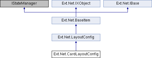
This layout manages multiple child Components, each fitted to the Container, where only a single child Component can be visible at any given time. This layout style is most commonly used for wizards, tab implementations, etc. This class is intended to be extended or created via the layout:'card' Ext.container.Container-layout config, and should generally not need to be created directly via the new keyword.
The CardLayout's focal method is setActiveItem. Since only one panel is displayed at a time, the only way to move from one Component to the next is by calling setActiveItem, passing the id or index of the next panel to display. The layout itself does not provide a user interface for handling this navigation, so that functionality must be provided by the developer.

 Public Member Functions inherited from Ext.Net.LayoutConfig
 Public Member Functions inherited from Ext.Net.BaseItem
 Properties inherited from Ext.Net.LayoutConfig
 Properties inherited from Ext.Net.BaseItem
 Properties inherited from Ext.Net.IXObject
 Protected Member Functions inherited from Ext.Net.BaseItem