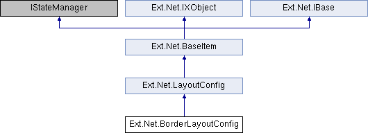
This is a multi-pane, application-oriented UI layout style that supports multiple nested panels, automatic bars between regions and built-in expanding and collapsing of regions. This class is intended to be extended or created via the layout:'border' Ext.container.Container.layout config, and should generally not need to be created directly via the new keyword.
More...
|
| override string | LayoutType [get] |
| |
| string | Padding [get, set] |
| | Sets the padding to be applied to all child items managed by this layout. More...
|
| |
| override ConfigOptionsCollection | ConfigOptions [get] |
| |
| virtual string | LayoutType [get] |
| |
| virtual string | ItemCls [get, set] |
| | An optional extra CSS class that will be added to the container. This can be useful for adding customized styles to the container or any of its children using standard CSS rules. See Ext.Component.ctCls also. More...
|
| |
| virtual bool | ReserveScrollbar [get, set] |
| | Set to true to leave space for a vertical scrollbar (if the OS shows space-consuming scrollbars) regardless of whether a scrollbar is needed. This is useful if content height changes during application usage, but you do not want the calculated width of child items to change when a scrollbar appears or disappears. The scrollbar will appear in the reserved space, and the calculated width of child Components will not change. More...
|
| |
| override ConfigOptionsCollection | ConfigOptions [get] |
| |
| virtual string | InstanceOf [get] |
| |
| ItemState | State [get] |
| |
| virtual DefaultValueMode | DefaultValueMode [get, set] |
| |
| virtual bool | DesignMode [get] |
| |
| bool | AutoDataBind [get, set] |
| |
| ResourceManager | ResourceManager [get] |
| |
| virtual Control | Owner [get, set] |
| | The Owner Control for this Listener. More...
|
| |
| virtual bool | IsDefault [get] |
| | Does this object currently represent it's default state. More...
|
| |
| bool | IsTrackingViewState [get] |
| |
| EventHandlerList | Events [get] |
| |
| EventHandler | DataBinding |
| |
| Control?? | BindingContainer [get] |
| |
| virtual ConfigItemCollection?? | CustomConfig [get] |
| | Collection of custom js config More...
|
| |
| virtual ConfigOptionsCollection | ConfigOptions [get] |
| |
| virtual ConfigOptionsExtraction | ConfigOptionsExtraction [get] |
| |
| System.Web.Mvc.HtmlHelper?? | HtmlHelper [get, set] |
| |
| ConfigOptionsCollection | ConfigOptions [get] |
| |
| ConfigOptionsExtraction | ConfigOptionsExtraction [get] |
| |
| DefaultValueMode | DefaultValueMode [get, set] |
| |
This is a multi-pane, application-oriented UI layout style that supports multiple nested panels, automatic bars between regions and built-in expanding and collapsing of regions. This class is intended to be extended or created via the layout:'border' Ext.container.Container.layout config, and should generally not need to be created directly via the new keyword.
Notes When using the split option, the layout will automatically insert a Ext.resizer.Splitter into the appropriate place. This will modify the underlying items collection in the container. Any Container using the Border layout must have a child item with region:'center'. The child item in the center region will always be resized to fill the remaining space not used by the other regions in the layout. Any child items with a region of west or east may be configured with either an initial width, or a Ext.layout.container.Box.flex value, or an initial percentage width string (Which is simply divided by 100 and used as a flex value). The 'center' region has a flex value of 1. Any child items with a region of north or south may be configured with either an initial height, or a Ext.layout.container.Box.flex value, or an initial percentage height string (Which is simply divided by 100 and used as a flex value). The 'center' region has a flex value of 1. There is no BorderLayout.Region class in ExtJS 4.0+
| string Ext.Net.BorderLayoutConfig.Padding |
|
getset |
Sets the padding to be applied to all child items managed by this layout.
This property must be specified as a string containing space-separated, numeric padding values. The order of the sides associated with each value matches the way CSS processes padding values:
If there is only one value, it applies to all sides. If there are two values, the top and bottom borders are set to the first value and the right and left are set to the second. If there are three values, the top is set to the first value, the left and right are set to the second, and the bottom is set to the third. If there are four values, they apply to the top, right, bottom, and left, respectively.

 Public Member Functions inherited from Ext.Net.LayoutConfig
 Public Member Functions inherited from Ext.Net.BaseItem
 Properties inherited from Ext.Net.LayoutConfig
 Properties inherited from Ext.Net.BaseItem
 Properties inherited from Ext.Net.IXObject
 Protected Member Functions inherited from Ext.Net.BaseItem